

Five Spice
Components: Branding, Illustration, Typography, Packaging, Print Design, Signage, Environmental Design

Overview
Five Spice is a brand for a restaurant that serves herbal soups based on Traditional Chinese Medicine (TCM). Aimed at English-speaking audiences who want to experience the benefits of TCM-based cooking, Five Spice incorporates food illustration, bilingual typographic patterns, and references to both ancient culinary practices and modern cultural context.
In TCM, food is also medicine. Five Spice offers rotating menus for each of the five seasons in TCM: Spring, Early Summer, Late Summer, Autumn, and Winter. During these seasons, one of five flavors is emphasized: sweet, salty, bitter, spicy, and sour. These flavors are believed to offer different health benefits according to the body’s seasonal needs for systemic support. The relationship between the five seasons and flavors is central to this restaurant branding system.
The challenge for this graduate student project was to create a design project inspired by a book. I chose A Tradition of Soup: Flavors from China’s Pearl River Delta, a cookbook and educational resource by Teresa M. Chen about Chinese medicinal herbal soups.
The Problem
As a third generation Chinese-American who is not fluent in Chinese, I discovered through my research that not much information is available on traditional Chinese herbal soups in English. Knowledge of this style of cuisine is difficult for many Chinese-Americans to access because of the language barrier. Additionally, it is rare to find a restaurant in the United States that focuses specifically on these types of soups. This lack of access presents a lost opportunity for Chinese-Americans to stay connected to their ancestral culture, as well as for Americans in general to enjoy this special type of Chinese food.
The Solution
Teresa M. Chen’s cookbook emphasizes the importance of keeping the tradition of herbal soups alive among Chinese-Americans, many of whom have ancestors from the soups’ region of origin, the Pearl River Delta (my family included). Inspired by her research and documentation of these dishes, I conceptualized a restaurant that allows speakers of both English and Chinese to eat herbal soups and learn about their ties to the principles of TCM. Because the ingredients have medicinal properties, the restaurant would have herbalists on staff to offer consultations to customers.

Mood Boards
In my visual research for this brand, I created two mood boards. First, I was interested in exploring the visual vernacular of businesses owned by Chinese immigrants in the United States, including the use of typography, color, composition, and imagery. I photographed the storefronts of Chinese-American businesses in Philadelphia and New York City for inspiration. Certain themes emerged, most notably the use of primary colors, especially the auspicious combination of red and yellow. The type on these storefronts often breaks the rules of “good” typography: they use standard fonts found in programs like Microsoft Word, and the letters are often stretched to fit the dimensions of the sign. Through conversations with Chinese-American family and friends, I learned that these signs are often designed by business owners who have little knowledge of graphic design. However, these common attributes comprise a visual language cohesive enough to immediately identify these stores as a specific type of business: stores and restaurants owned by Asian-American immigrants and families.

While the concept for Five Spice is deeply inspired by tradition, its audience is generally younger generations who appreciate contemporary aesthetics. I made a second mood board to collect design inspiration that draws on the vernacular of Chinese restaurant storefronts, but updates it with modern typography choices, punchy imagery, and clean layouts. My goal was to merge a reverence for ancient cultural knowledge with playful and contemporary sensibilities to resonate with the target audience.

Brand Development
Color Palette
For the brand palette, I drew inspiration from reference photos of Chinese restaurants. Some of the colors are inspired by the primary and secondary hues on many of these restaurants’ signs, while others are drawn from environmental elements like the materials of buildings. The palette is also informed by ingredients that appear in the soups the restaurant would serve: leafy greens, red goji berries, and brown mushrooms, for example.


Final Palette

Naming
I consulted with bilingual family and friends to select a name for the brand in English and Chinese. The name needed to communicate both the tastiness of the food, and its link to the principles of TCM. The name Five Spice in English references both the five flavors that are central to the brand identity, and a popular spice blend used in Chinese cooking. For the Chinese name, I chose the phrase 五 味 (Wu Wei in Mandarin, or Ng Mei in Cantonese), which translates to Five Flavors. I received the feedback that this phrase sounded best in Chinese compared to the direct translation for Five Spice.

Typography & Logo
Inspired by the stretching of letters that takes place on many Chinese-American restaurant signs, I chose Obviously Variable as the primary brand font, a typeface with a wide range of widths and weights. Since the brand is bilingual, I also experimented with various typefaces in Chinese to pair seamlessly with Obviously, ultimately selecting Noto Sans.
The lockup of the English and Chinese brand names in the logo draws inspiration from traditional Chinese signature seals. The half circle shapes in the variable logo can be interpreted as bowls of soup, or as half moons to indicate the passage of the seasons.
Logo Sketches

Early Logo Iterations


Final Logos & Style Tile

Patterns
I developed a set of brand patterns for application on restaurant menus, packaging, and interior design. The first is a bilingual typographic pattern that names the five flavors in TCM in both English and Chinese. I referenced the vernacular use of stretched and warped typography to add movement and playfulness to the type treatments. The second pattern uses the half circle bowl icon in five brand colors to contrast in density with the typographic pattern.
Early Pattern Explorations


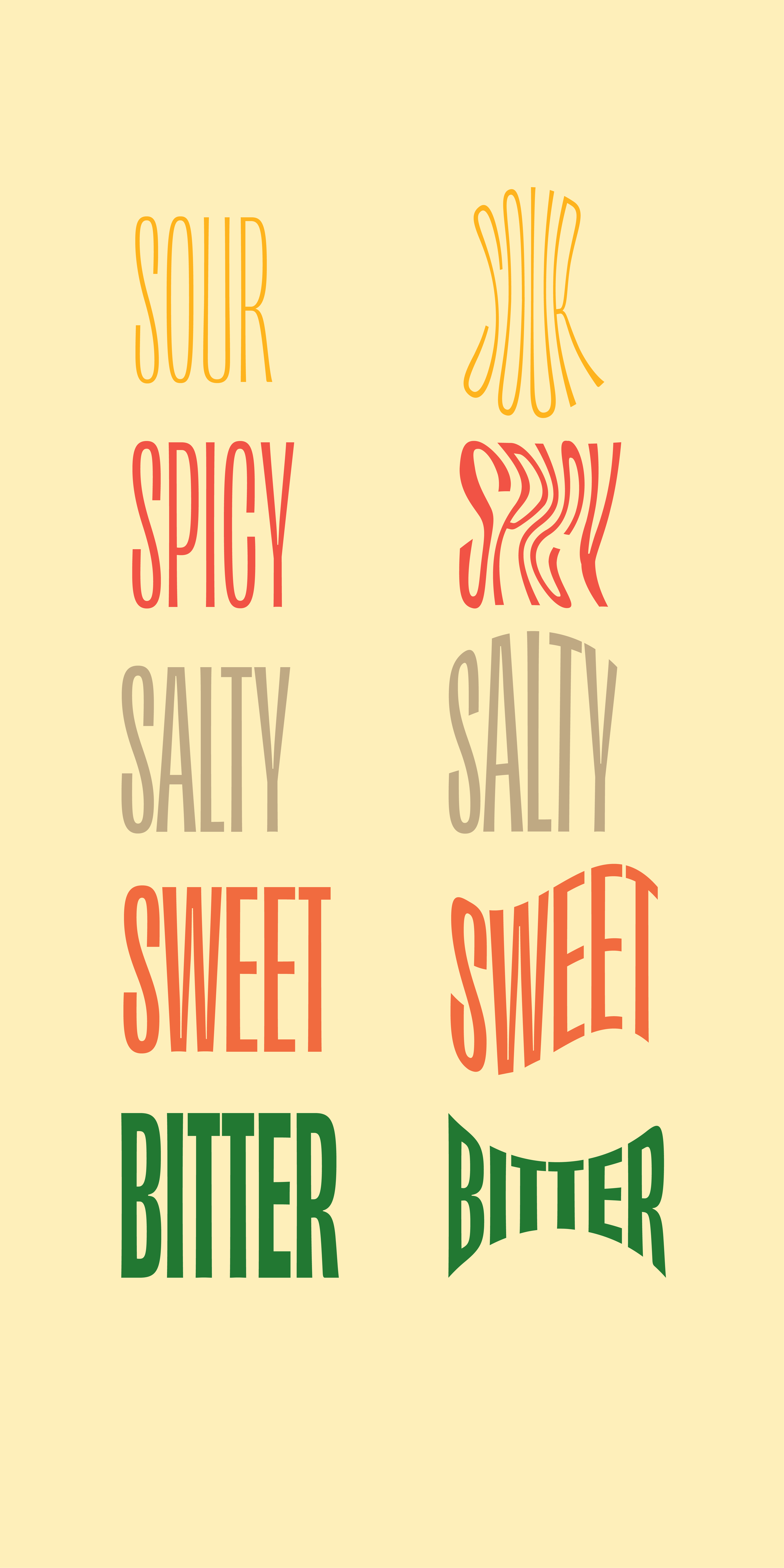
Final Patterns


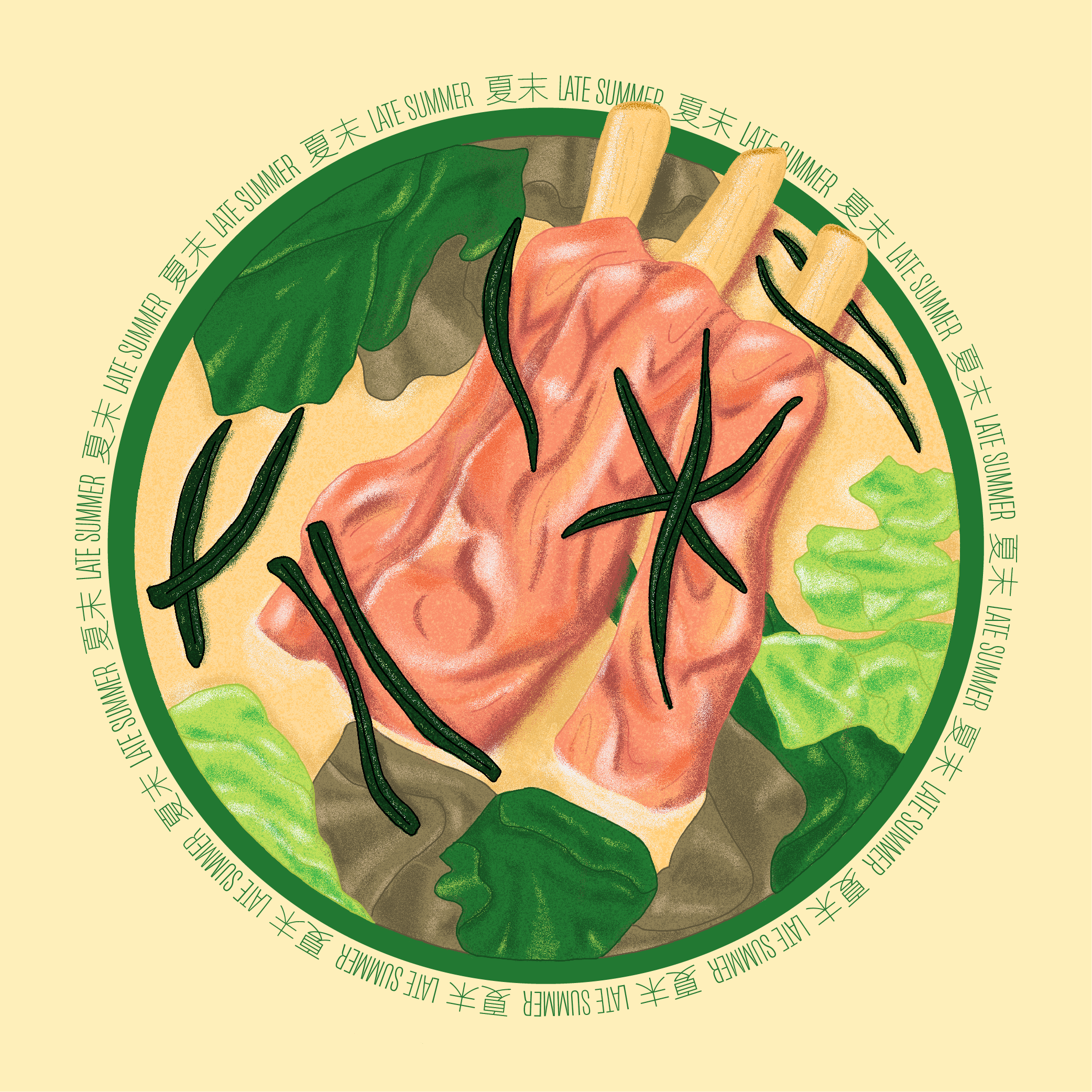
Illustrations
Because the soups served at Five Spice are rarely referenced in English language sources, high-quality photographs of these dishes were not readily available. I decided instead to illustrate one featured soup for each of the seasonal menus Five Spice offers. Referencing photos from A Tradition of Soup: Flavors from China’s Pearl River Delta and additional images found online, I created illustrations of these dishes using an expanded version of the brand palette.

References
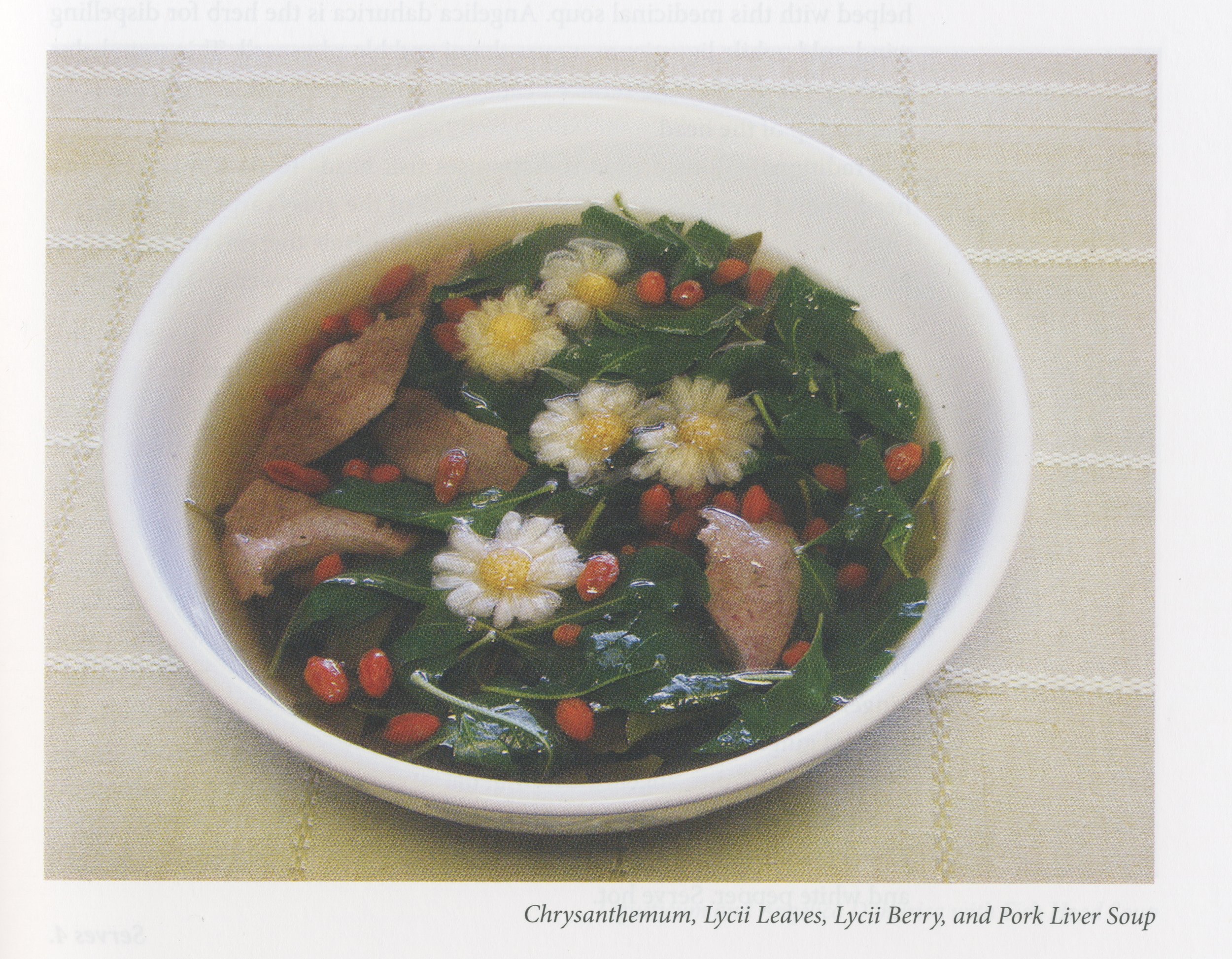

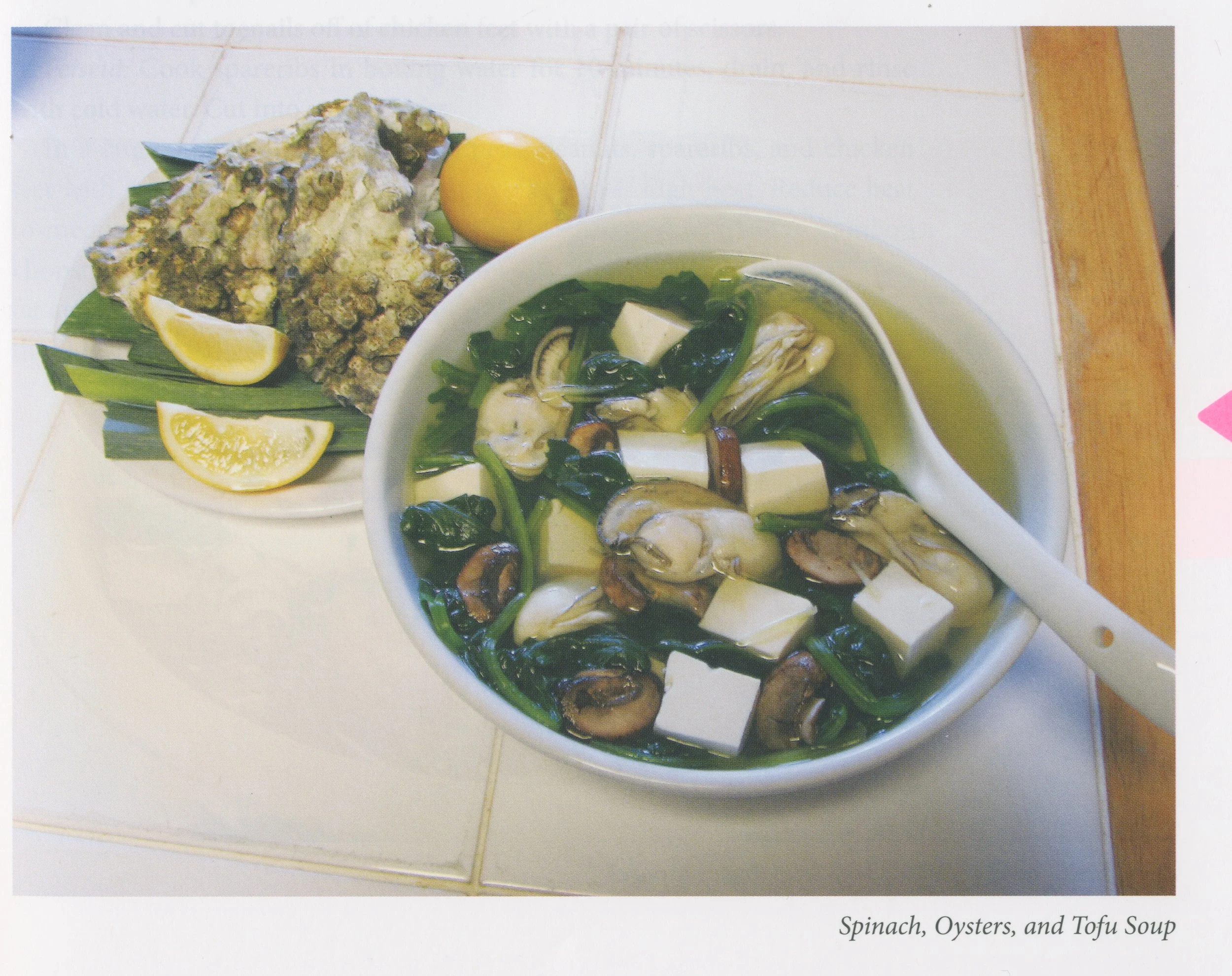

Illustration Sketches


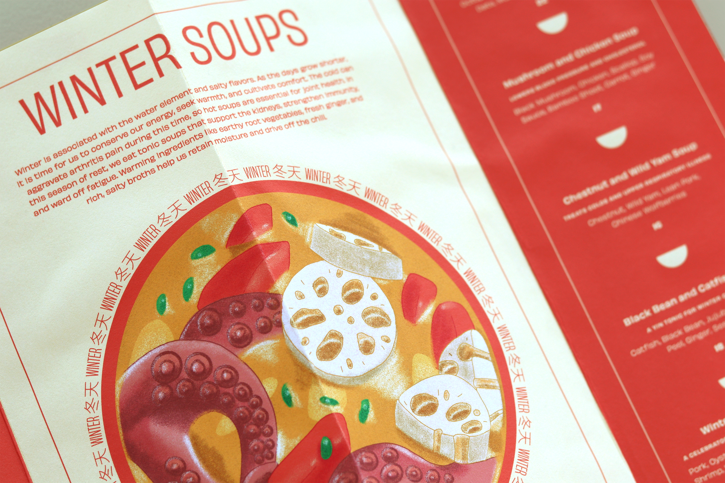
Final Illustrations


Menu Design
With all of the brand elements finalized, I designed five seasonal menus, each offering appropriate soups for different times of the year. The menu explains the mission of Five Spice, its dual offerings of food and herbalism, the relationships between the five seasons and flavors in TCM, and the health benefits of each dish.

Menu Sketches

Final Menu Designs


Packaging
The takeout packaging for Five Spice incorporates the variable logo and graphic brand pattern, as well as custom labels for each dish listing its ingredients and their properties.


Signage & Environmental Design
Finally, I designed signage and an interior design concept for the restaurant. The typographic brand pattern lends itself well to both small and large scale applications, such as menu end paper and wallpaper. The signage fits well in a surrounding environment like New York’s Chinatown, where primary colors and bilingual typography abound.


Conclusion
Developing the brand for Five Spice was a fascinating deep dive into the world of Traditional Chinese Medicine, soups from the Pearl River Delta, and the specific context of Chinese-American culture. My research inspired unexpected and delightful approaches to typography, illustration, logo design, print layout, and more. A modern take on an ancient tradition, Five Spice blends old and new, familiar and fresh, and most importantly, nourishing and tasty.