

Cahun: a Geometric Serif Font
Components: Typeface Design, Branding, Photo Treatments
Overview
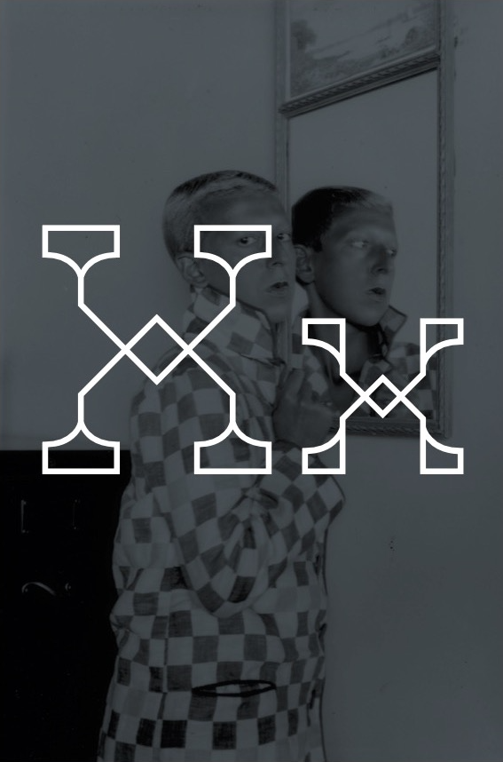
Cahun is a display typeface I created for a student project. My goal was to design a geometric, high-contrast typeface with surprising, yet harmonious pairings of curves and sharp angles. Since combining contrasting elements was my goal, I named this typeface after surrealist photographer Claude Cahun, whose self-portraiture work mixes masculine and feminine presentation.


Design Approach
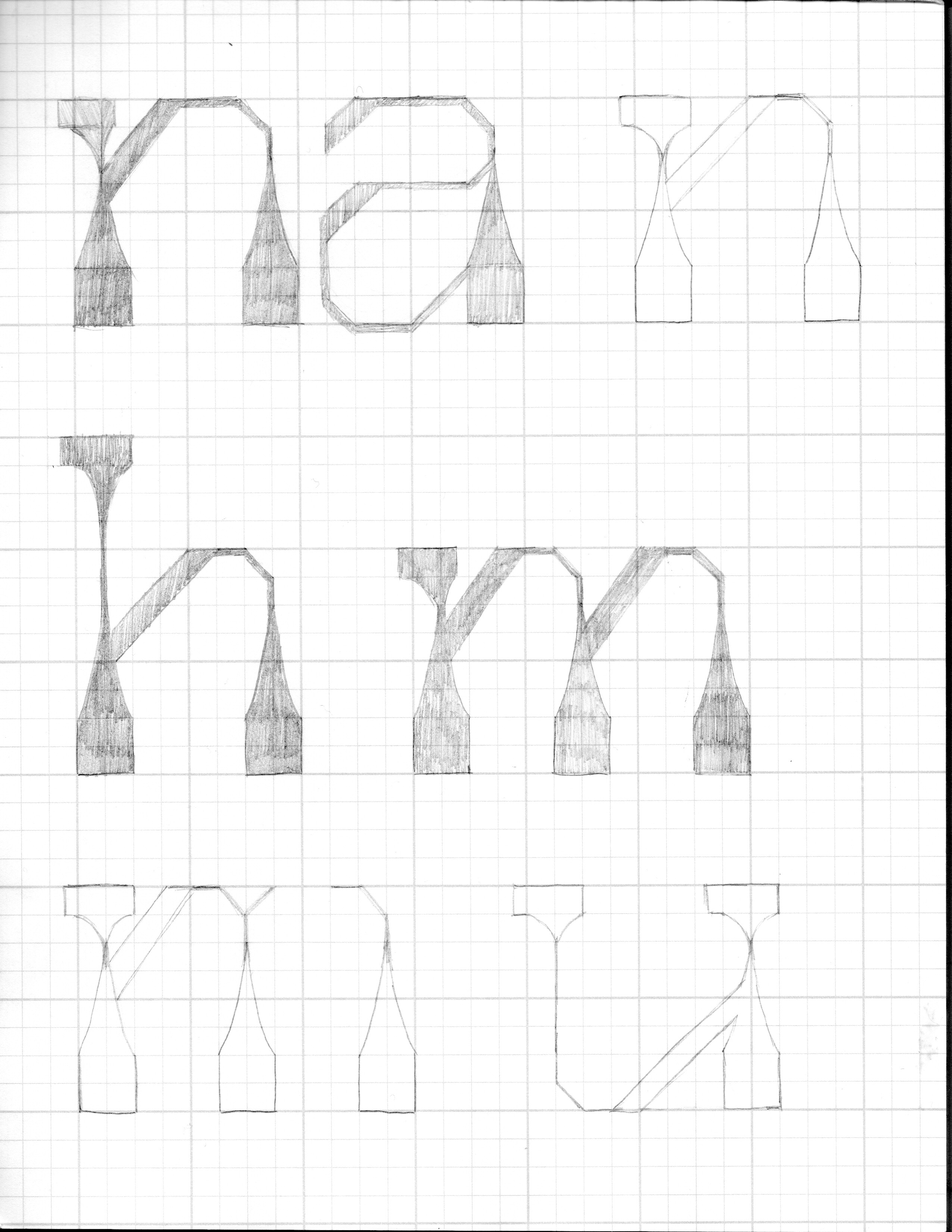
I designed both upper and lowercase alphabets for Cahun, as well as some punctuation. The typeface uses mostly 45-degree and right angles, with tapered and scalloped serifs. Letters that normally use diagonal lines and rounded shapes were the most challenging to design in this style. My solution was to use trapezoidal and octagonal shapes throughout the typeface.


Process
I started the design process with pencil sketches of the lowercase n, m, h, u, and a. Starting with these letters allowed me to explore solutions for both straight and curved elements of the letterforms, as well as the design of the serifs, and the incorporation of high contrast between thick and thin lines.


Applications
Since Cahun is a display typeface, it works well at large sizes appropriate for a logo or signage. Here are some examples of how Cahun could be used in a branding project.


Credits
Photography: Claude Cahun and x10