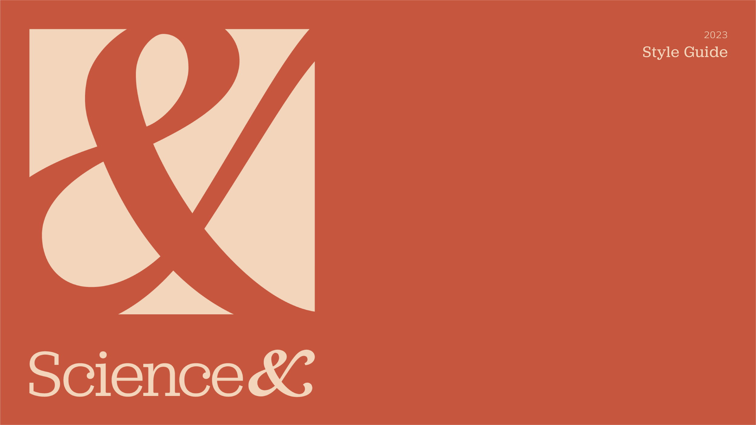
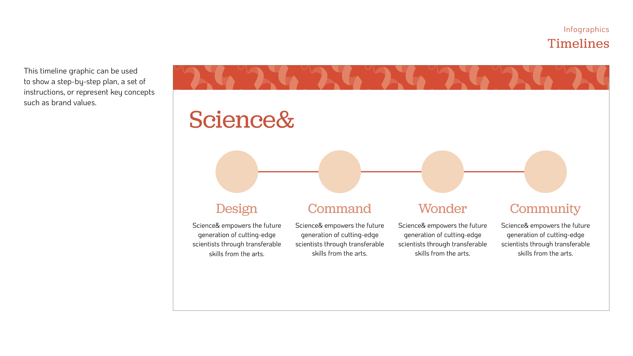
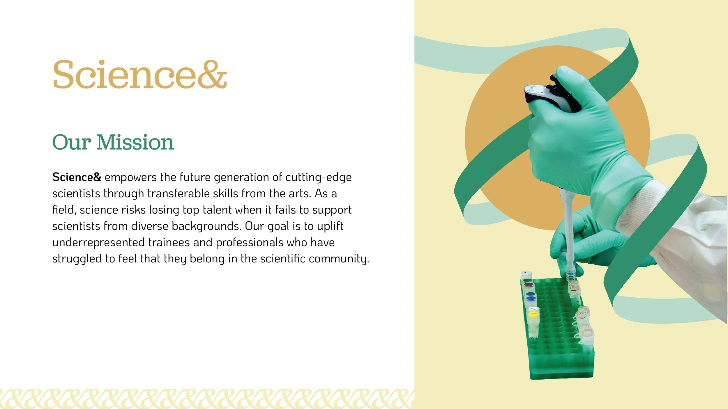
Science&
Components: Branding, UX/UI, Web Design, Motion, Design Research, Pattern Design, Instructional Design
Collaborators: Mike Ray, Nghi To, Ha Tran, Francesca Tuazon
Overview
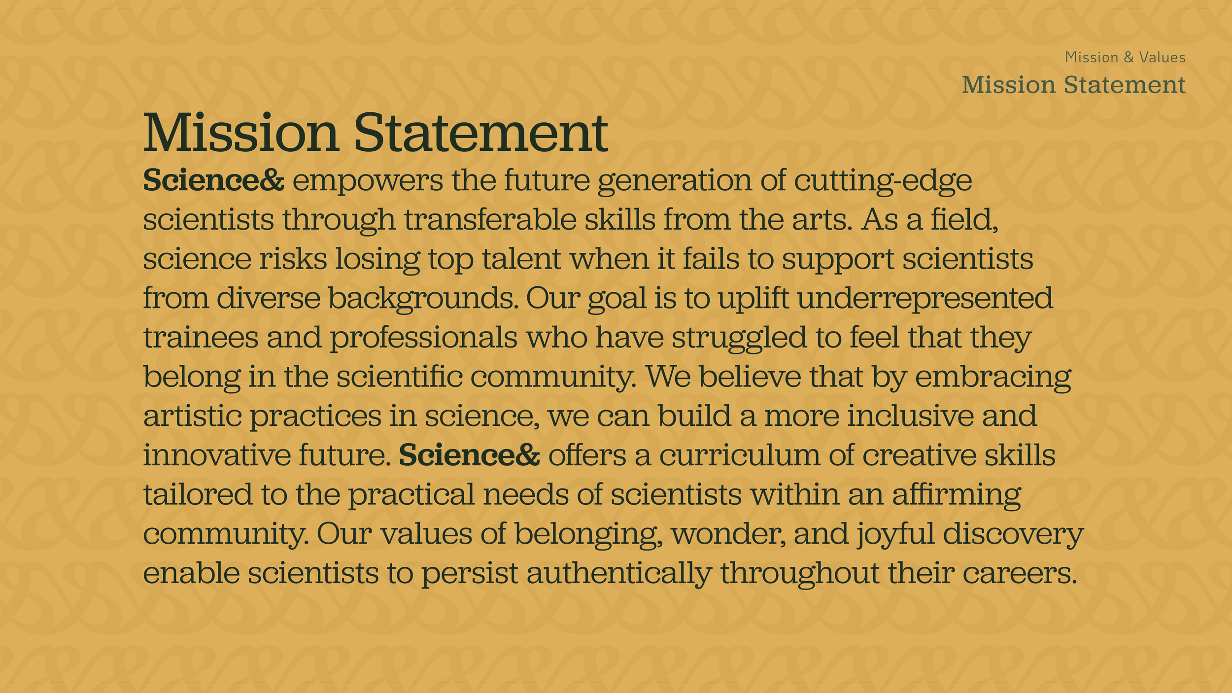
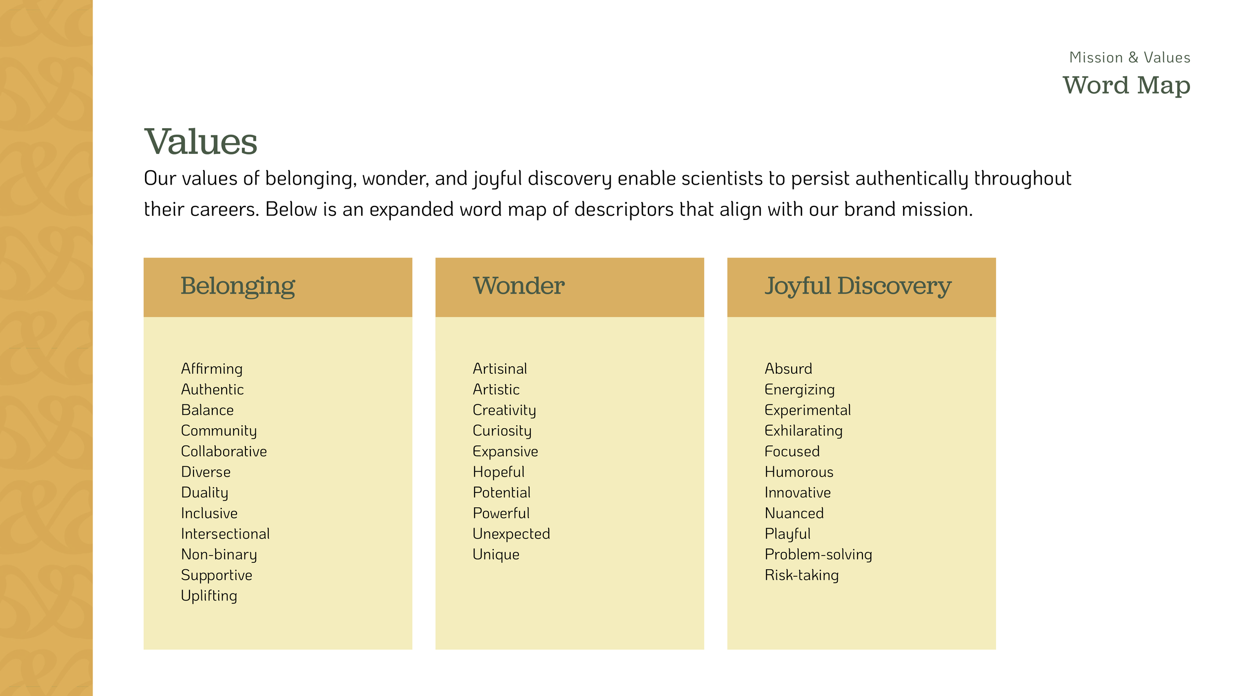
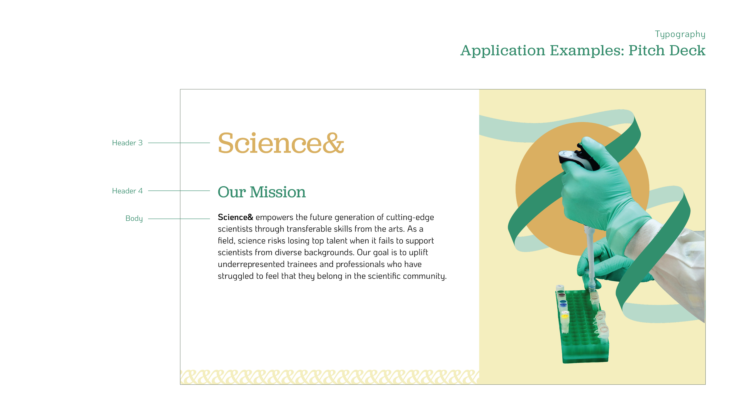
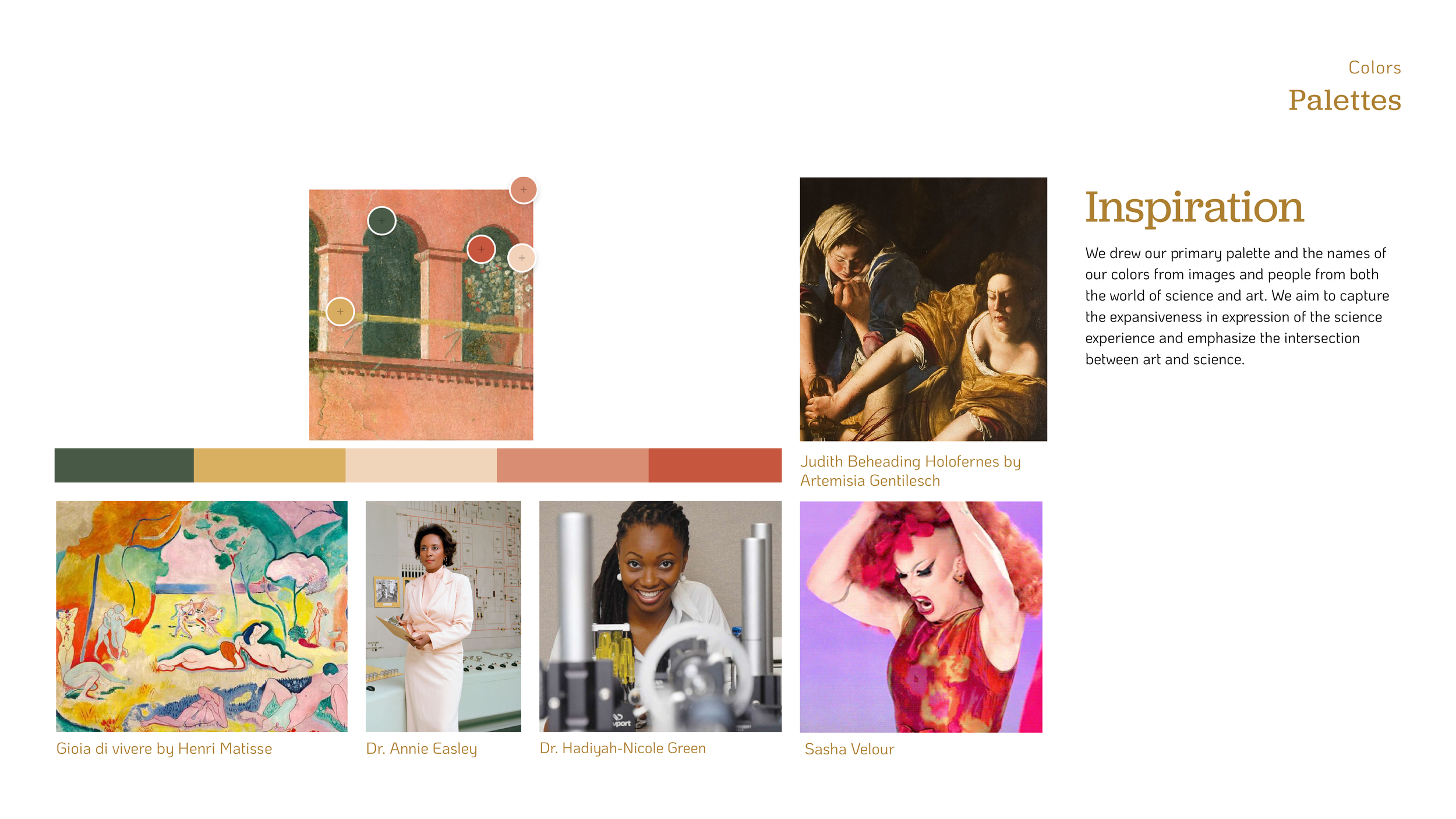
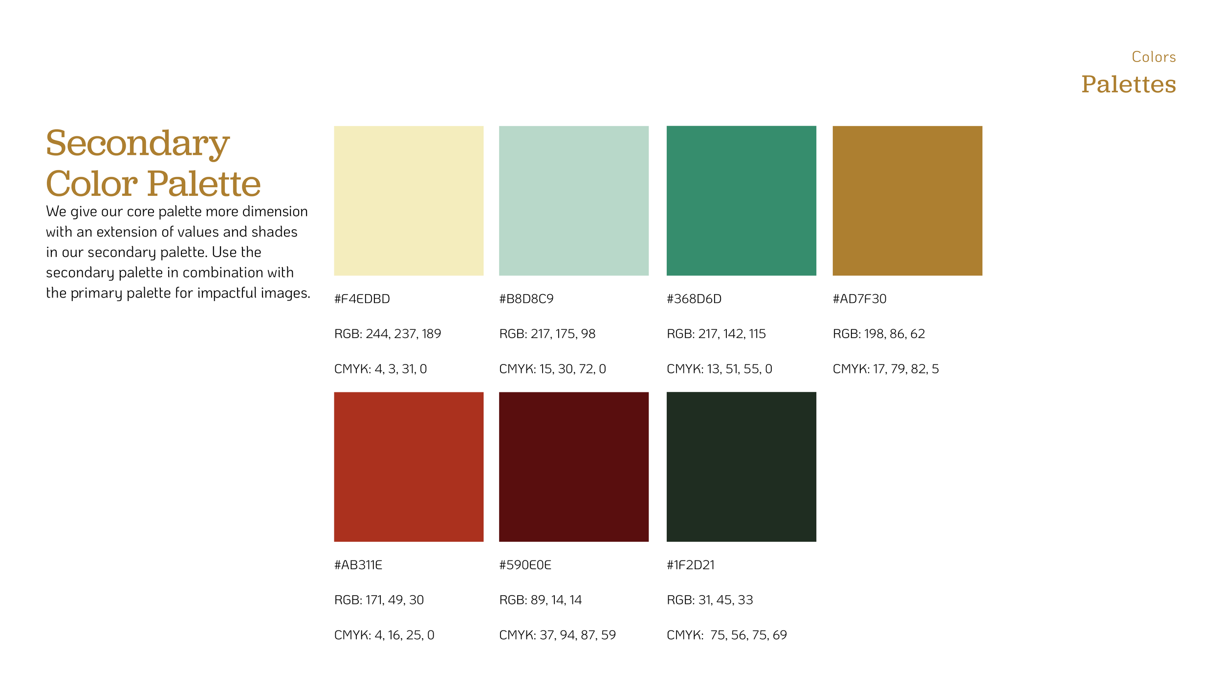
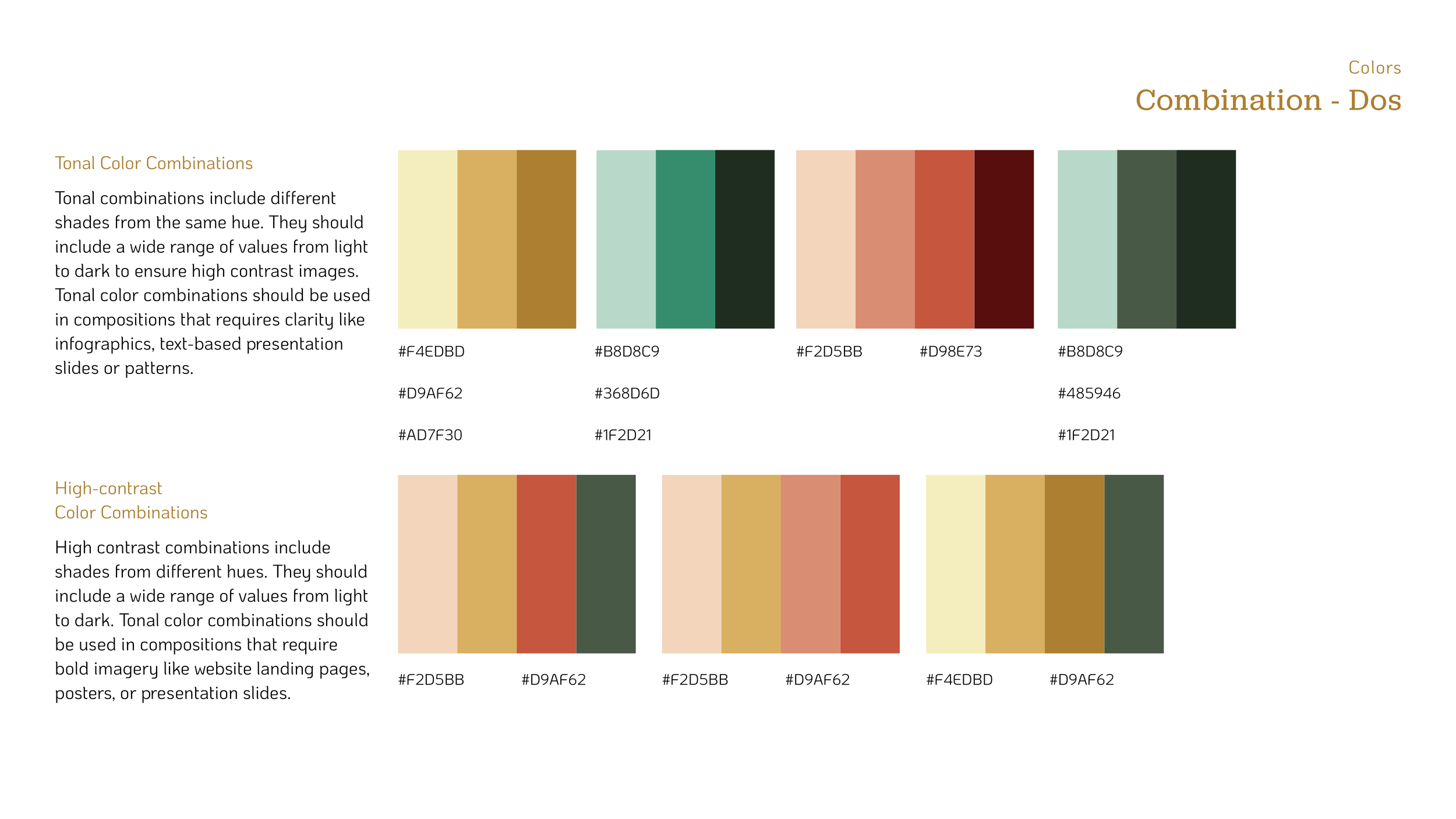
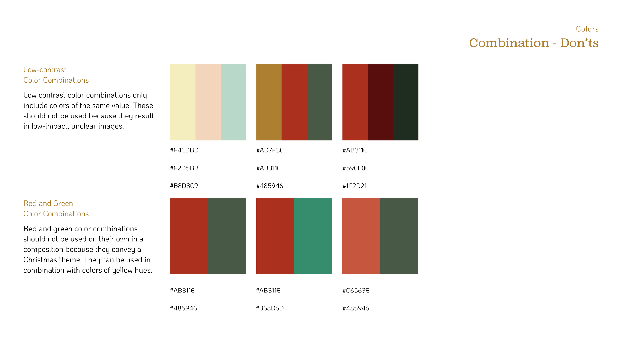
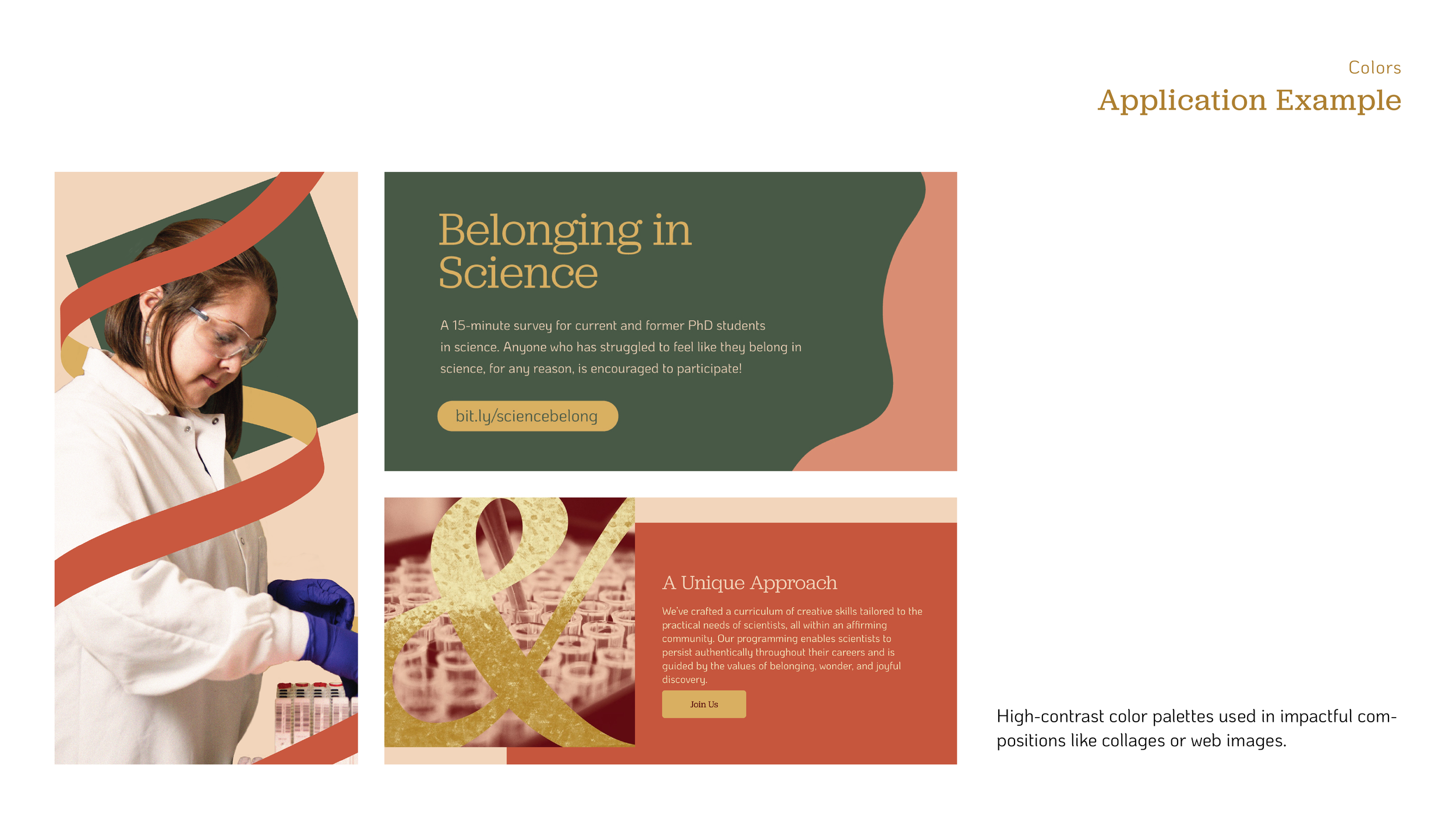
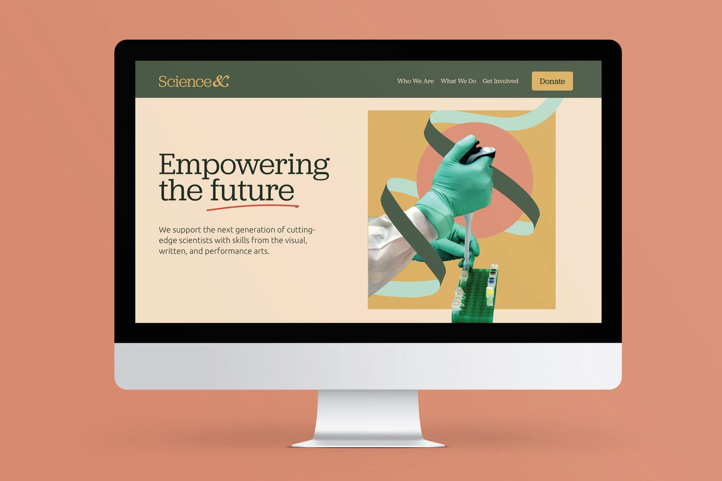
This is a branding and identity system for the nonprofit Science&, which empowers the future generation of cutting-edge scientists through transferable skills from the arts. The brand is centered around the core values of belonging, wonder and joyful discovery. It was created in a collaboration between the founder/CEO, Francesca Tuazon, and MFA students MeiLi Carling, Mike Ray, Nghi To and Ha Tran. Through thoughtful image making, humanistic typography, and a color palette inspired by some of the founder’s favorite artwork, the team hopes to inspire the future generation of scientists and emphasize the duality that exists in their practice. We see scientists as artisans, and know the value of having diverse teams with varied perspectives. The brand name and ampersand logo stand as a symbol for the inclusive nature of the brand’s approach and the intersection of art & science. It speaks to the many things the nonprofit plans to pair with science, and the expansive community it is looking to build.
Following our brand development project, I worked with Francesca Tuazon to develop Science&’s pilot talk, Figuring it Out: Graphic Design Principles for Scientists. We have delivered this talk to science trainees at the University of Pennsylvania and the Wistar Institute.
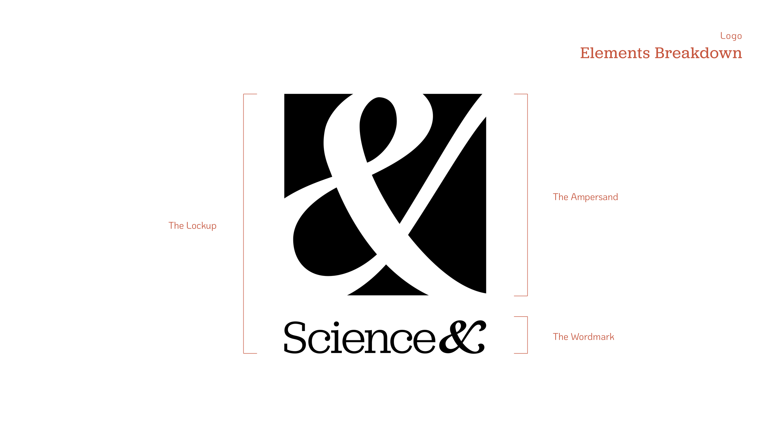
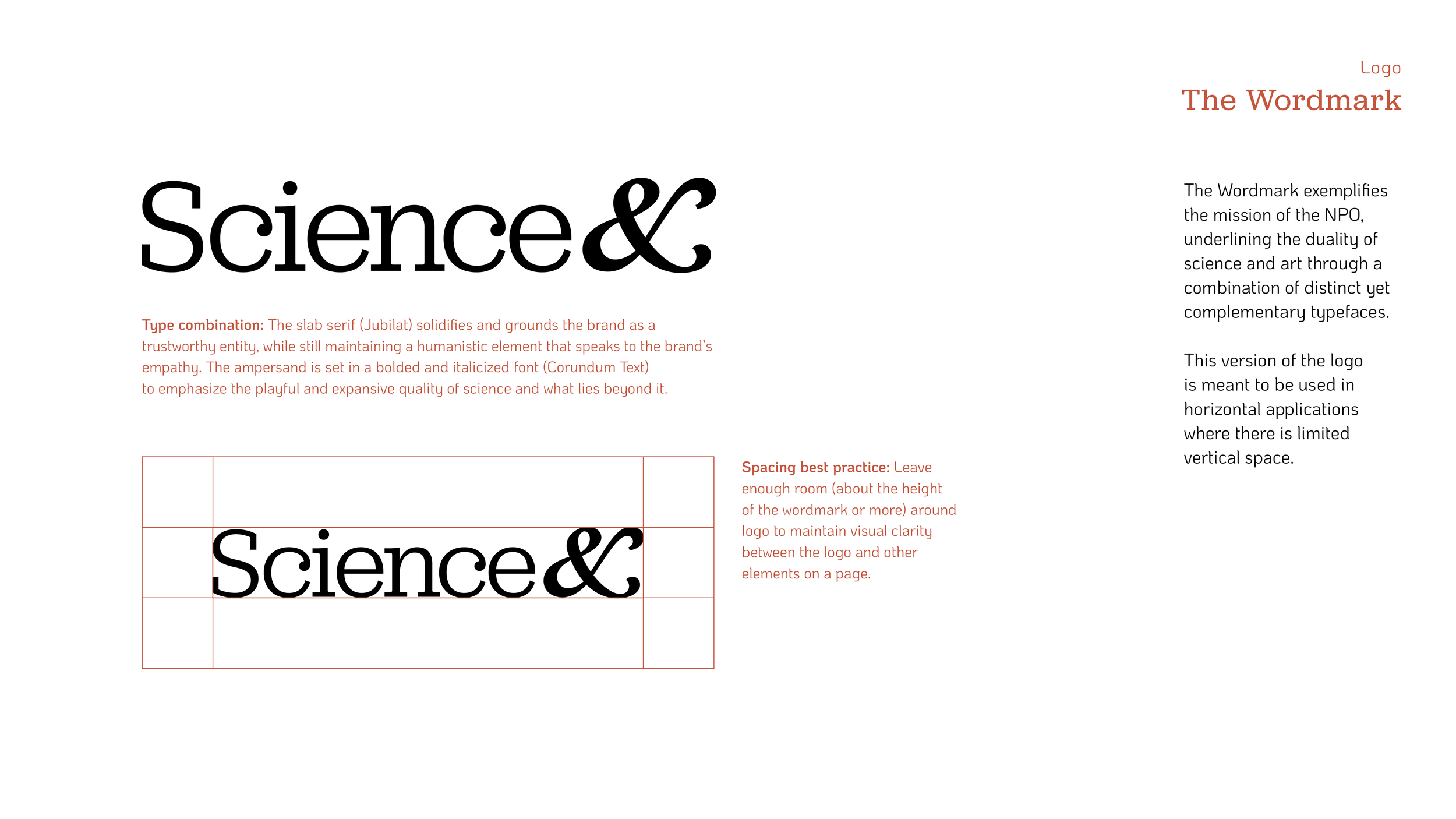
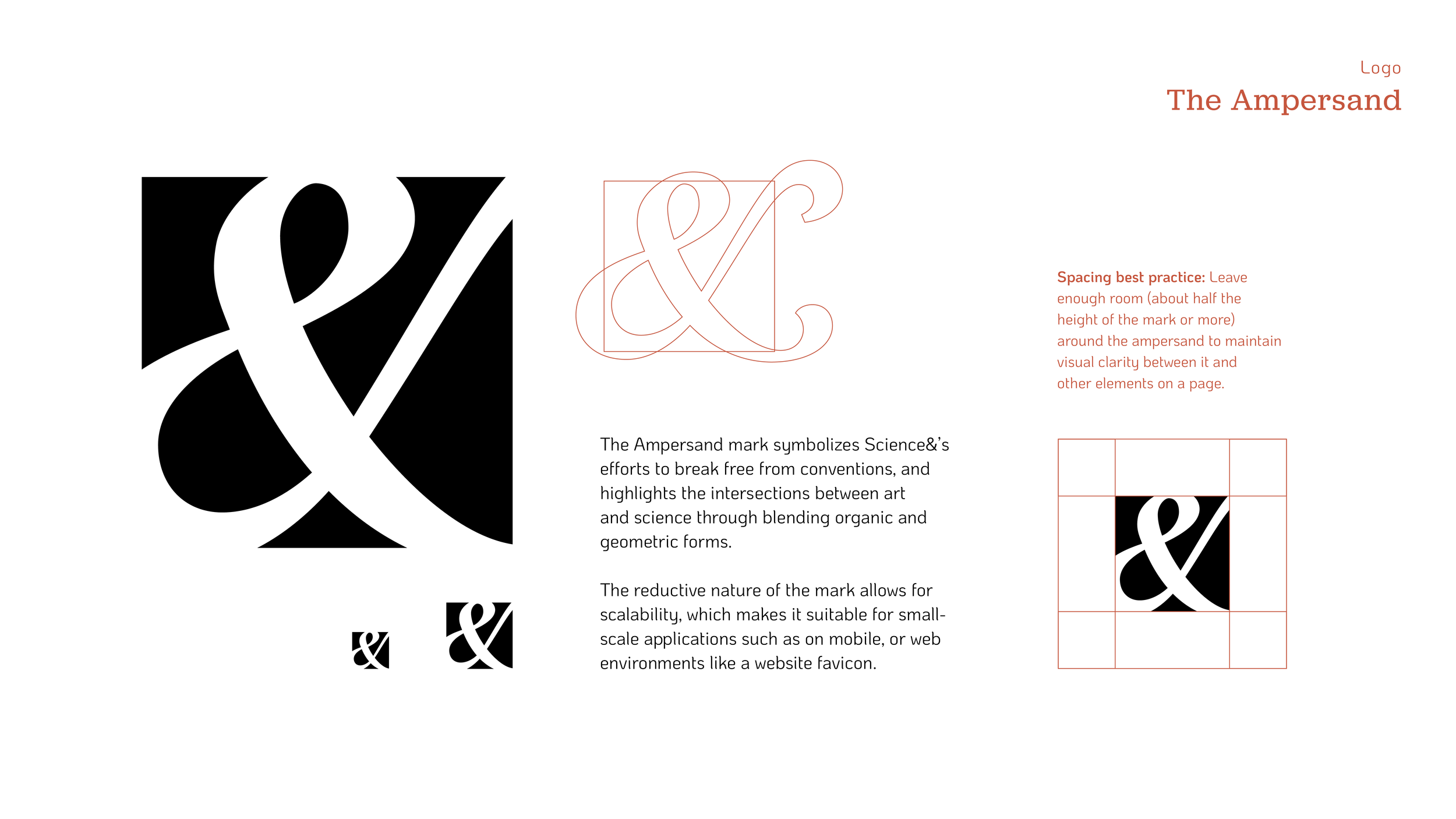
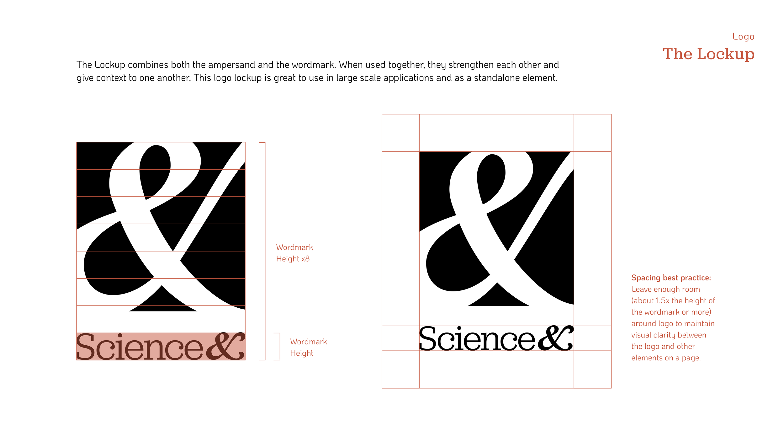
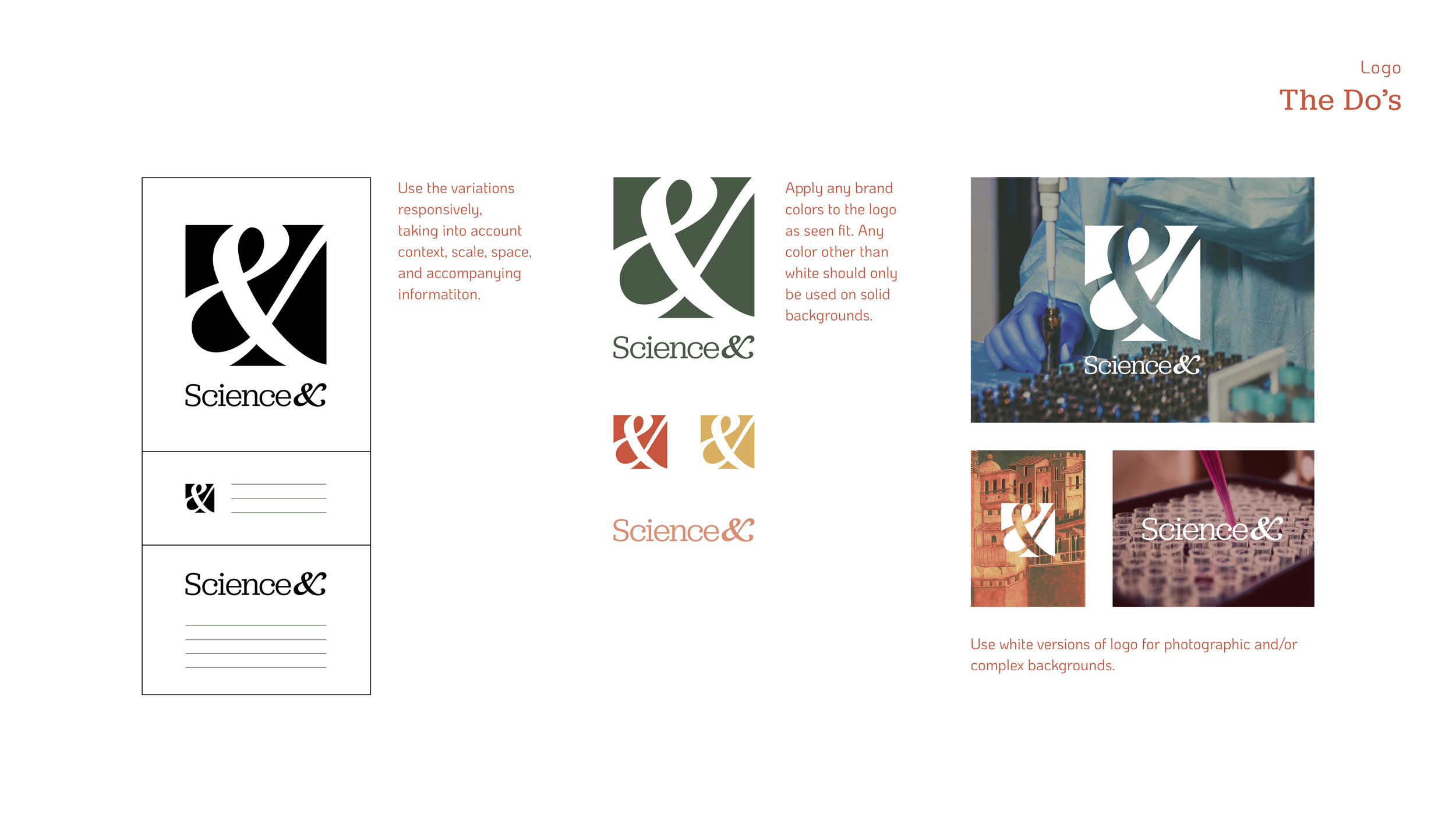
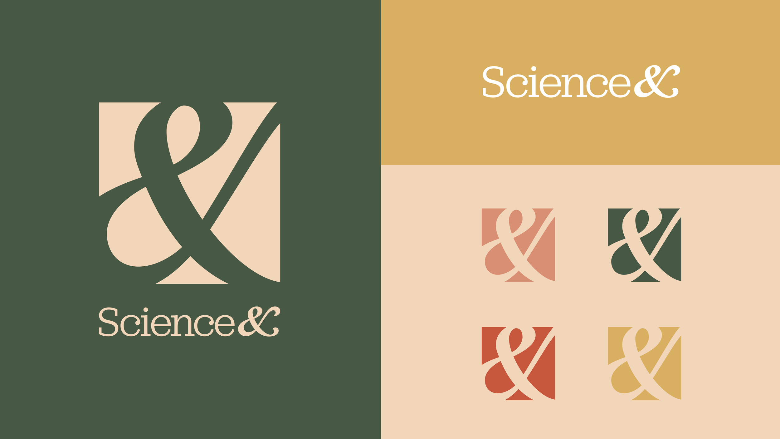
Name & Logo
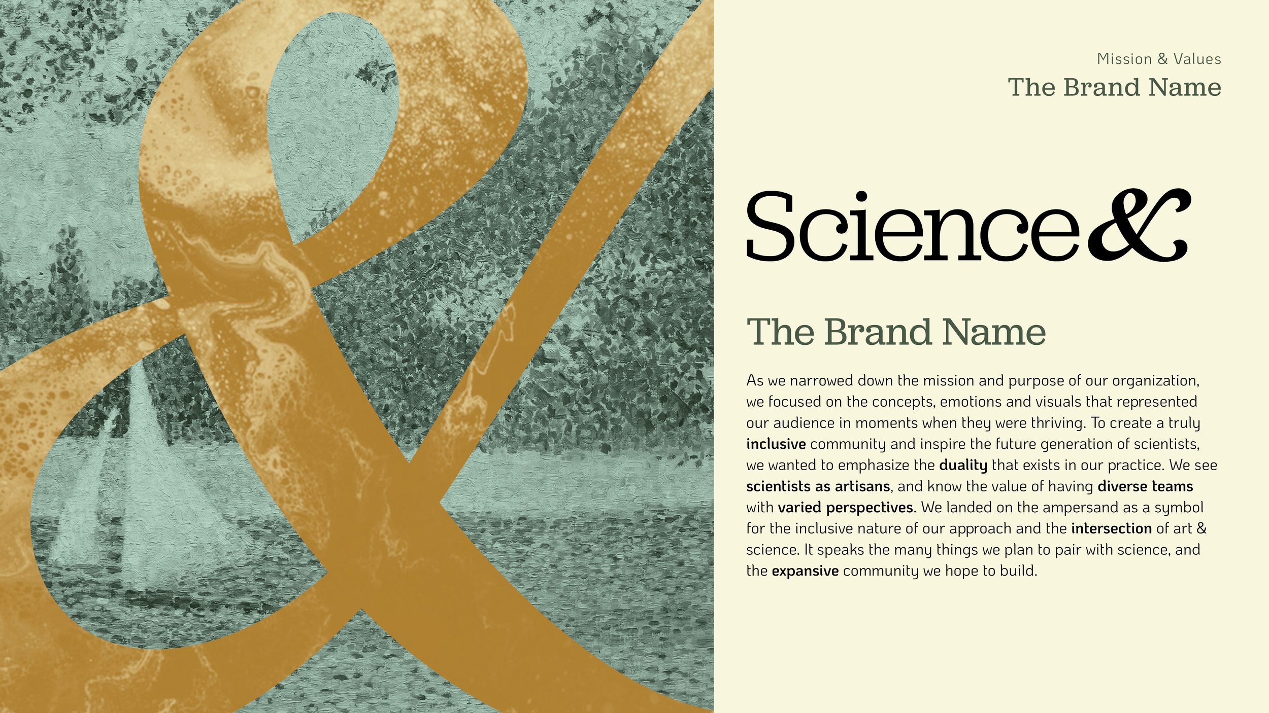
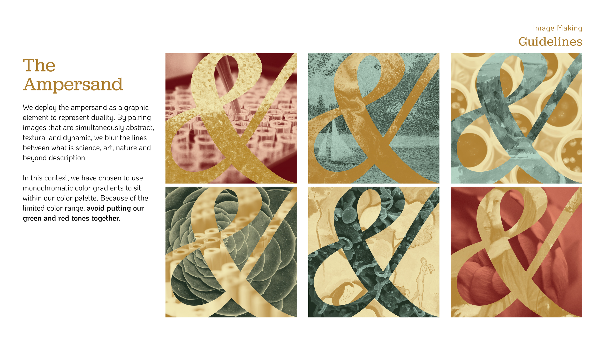
As we narrowed down the mission and purpose of the organization, we focused on the concepts, emotions and visuals that represented our audience in moments when they were thriving. To create a truly inclusive community and inspire the future generation of scientists, we wanted to emphasize the duality that exists in our practice. We see scientists as artisans, and know the value of having diverse teams with varied perspectives. We landed on the ampersand as a symbol for the inclusive nature of our approach and the intersection of art & science.
Logo Development

Final Logo
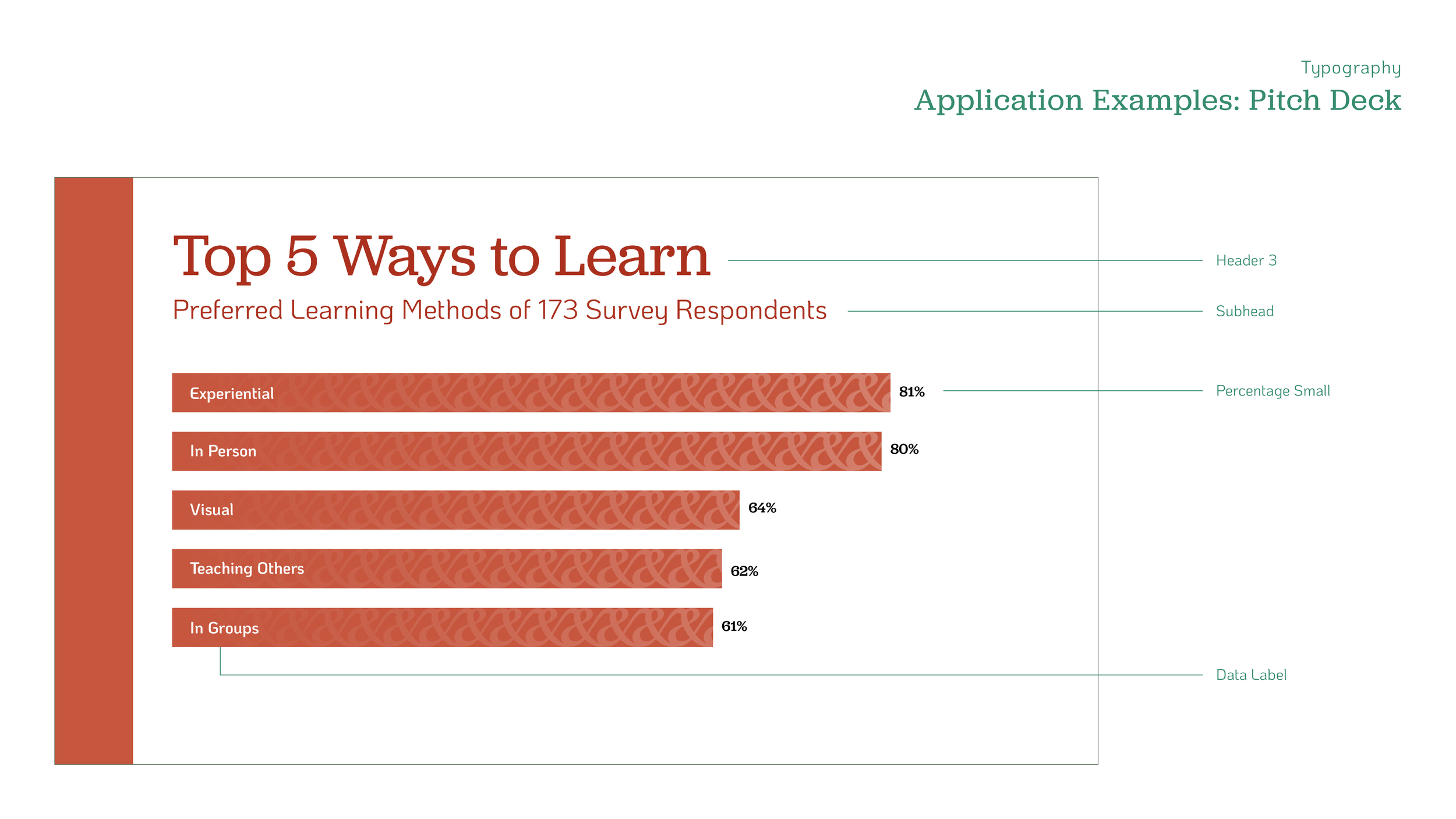
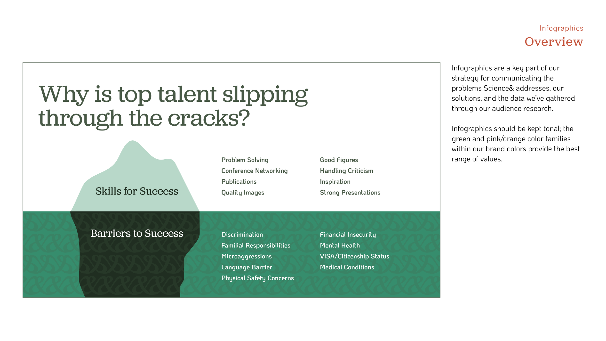
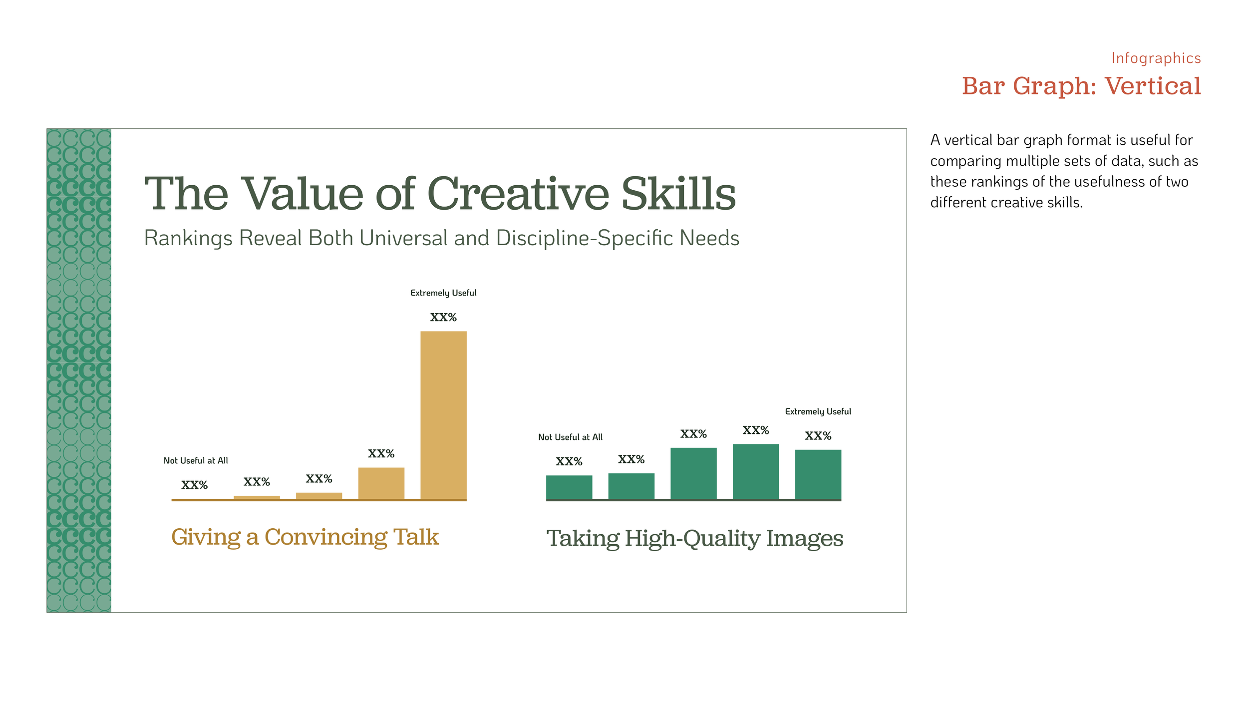
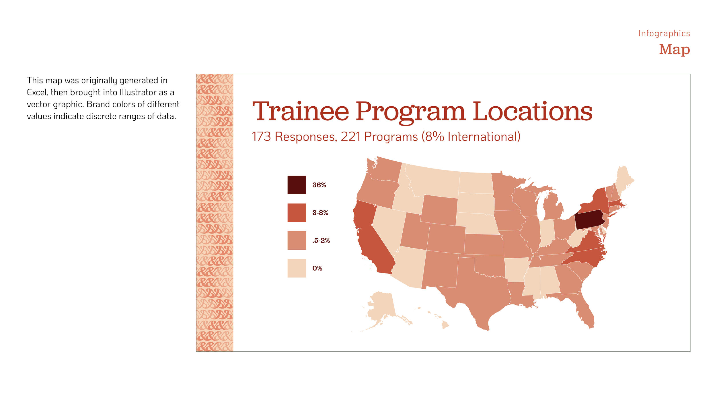
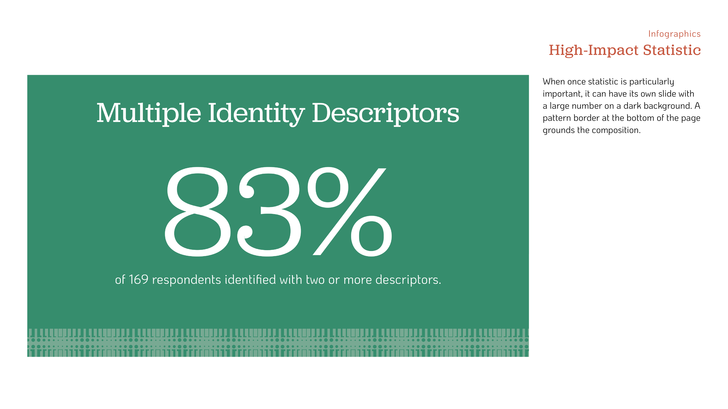
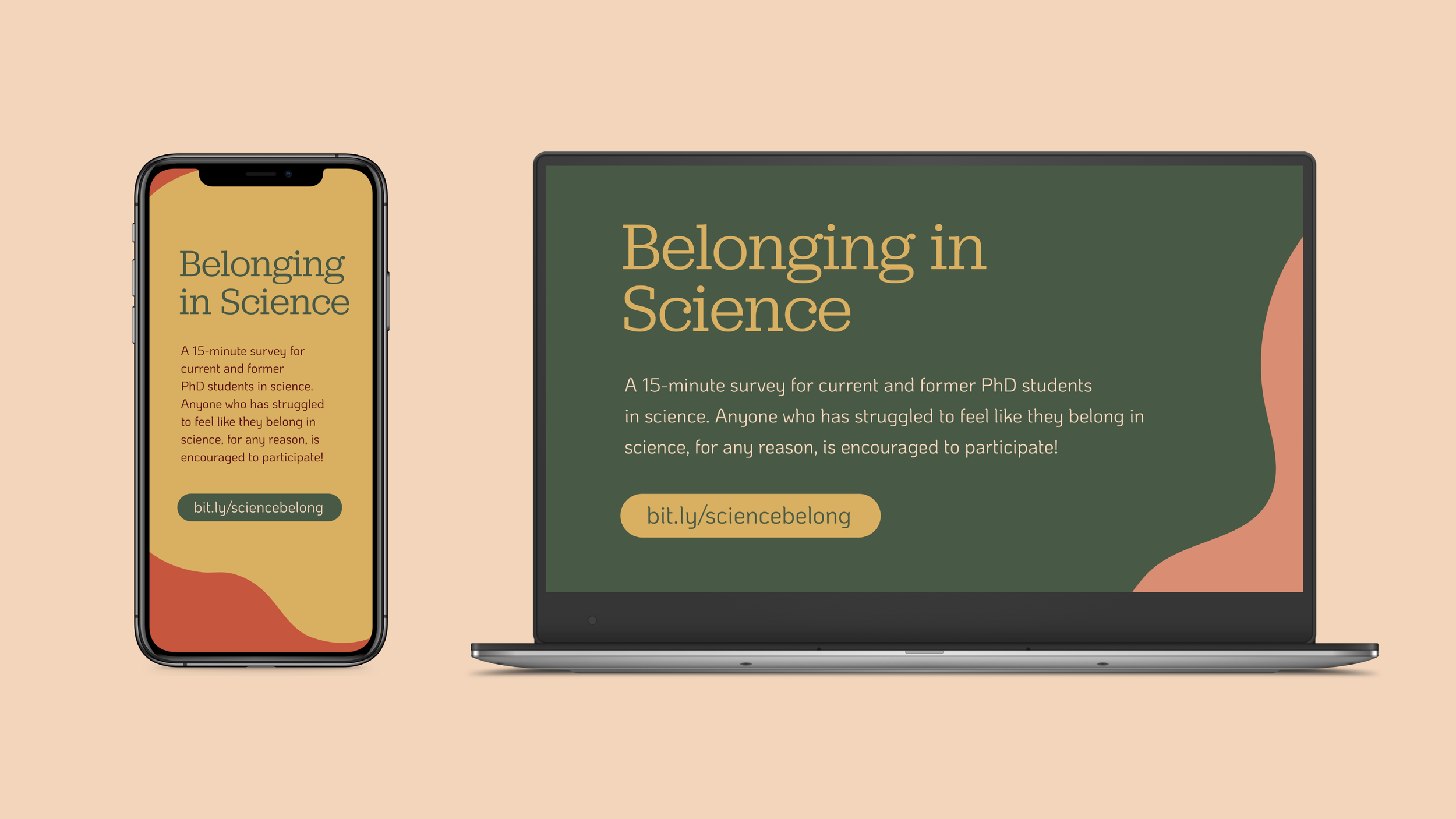
Belonging in Science Survey
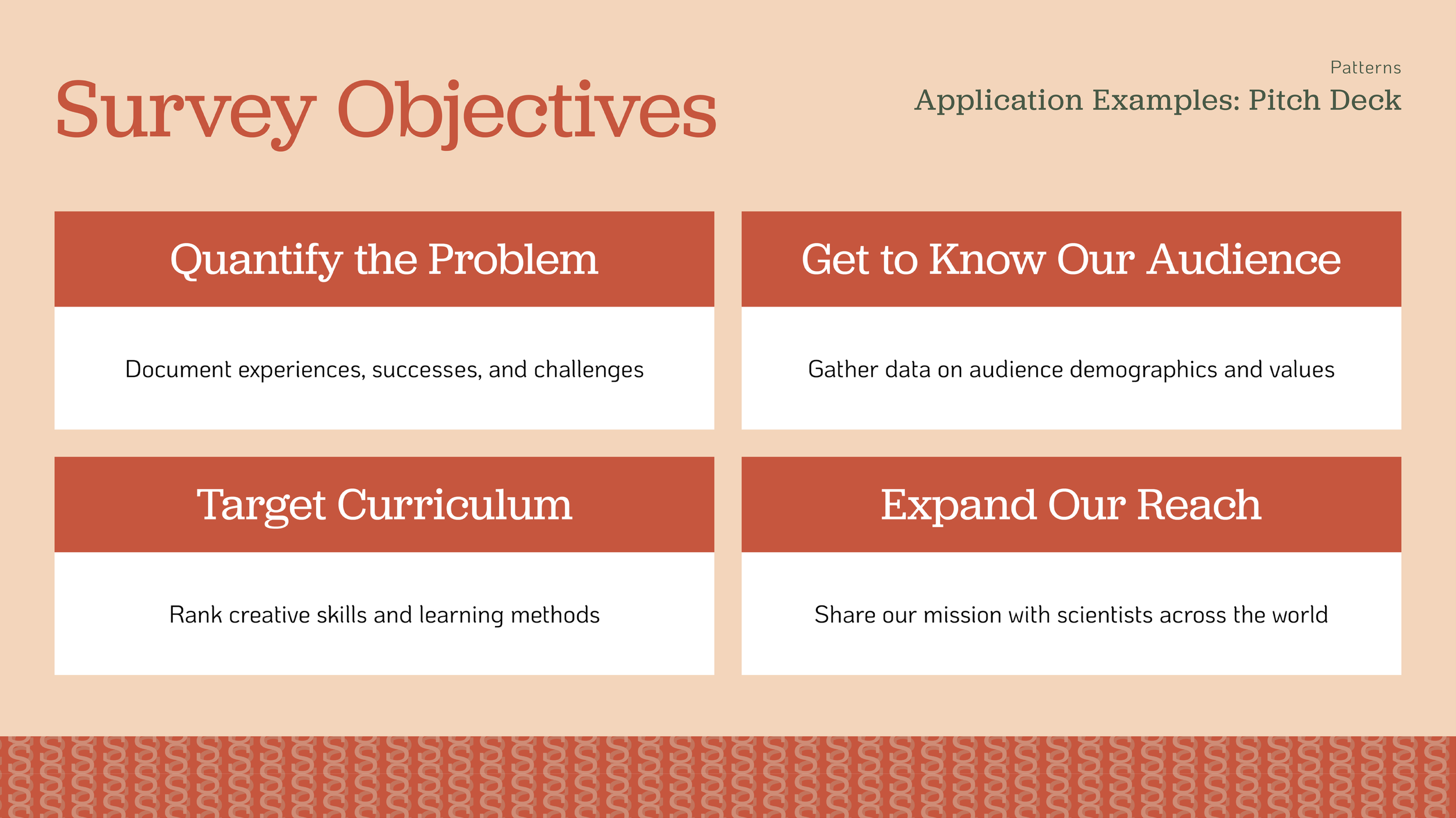
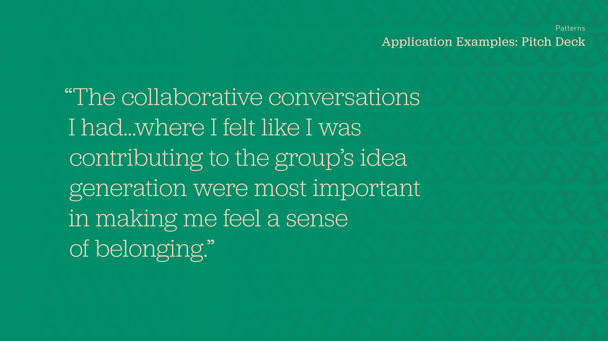
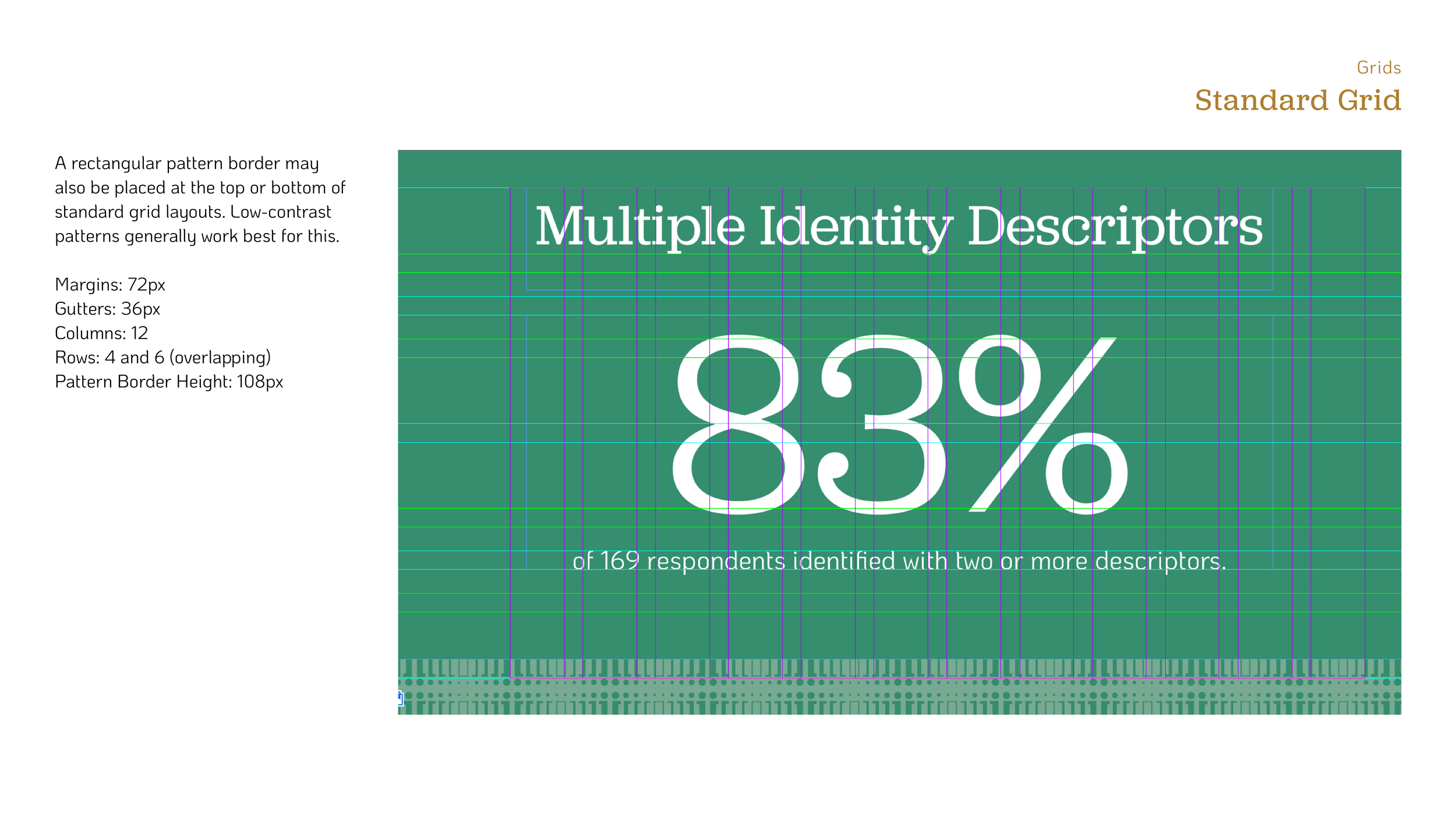
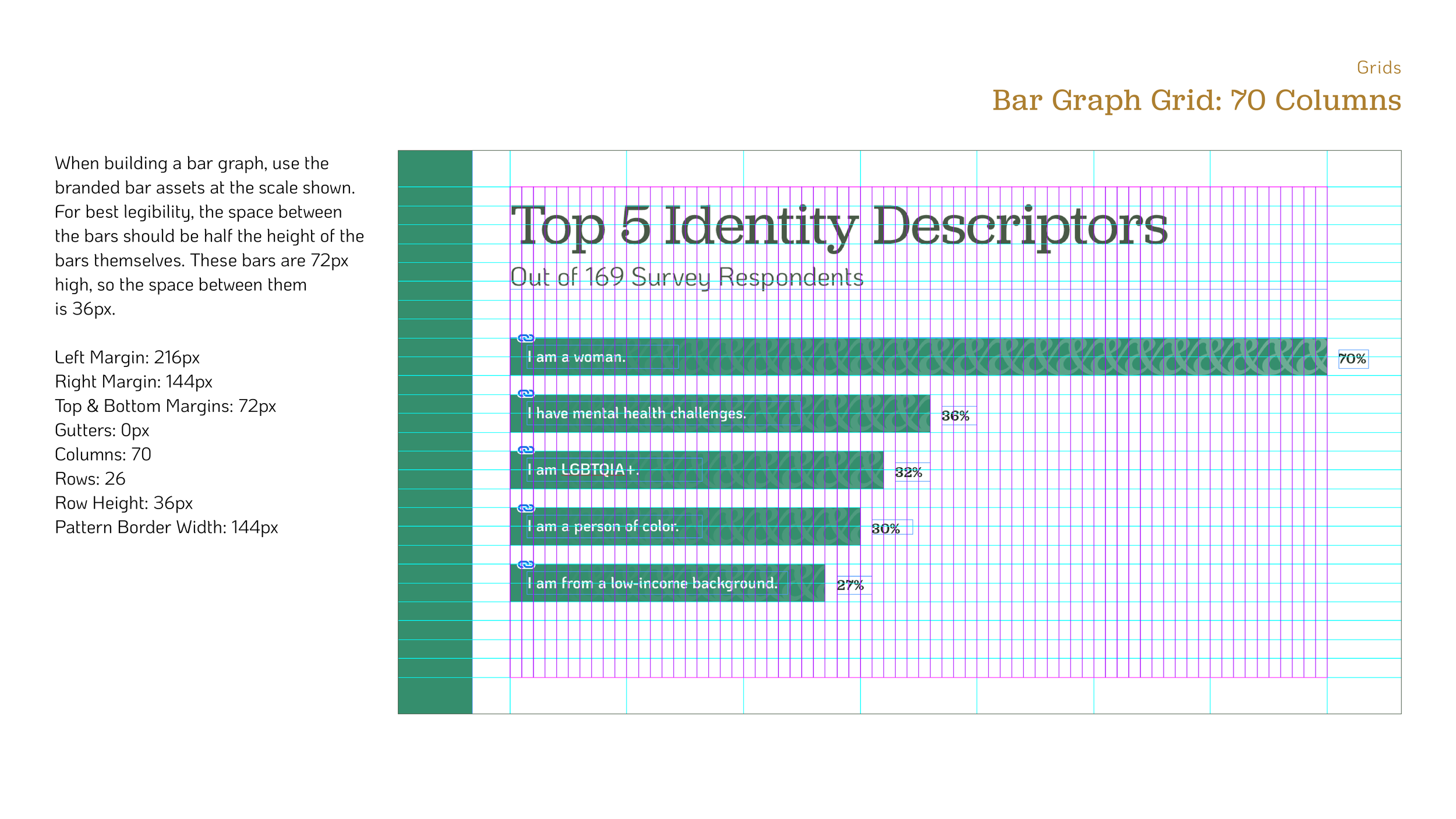
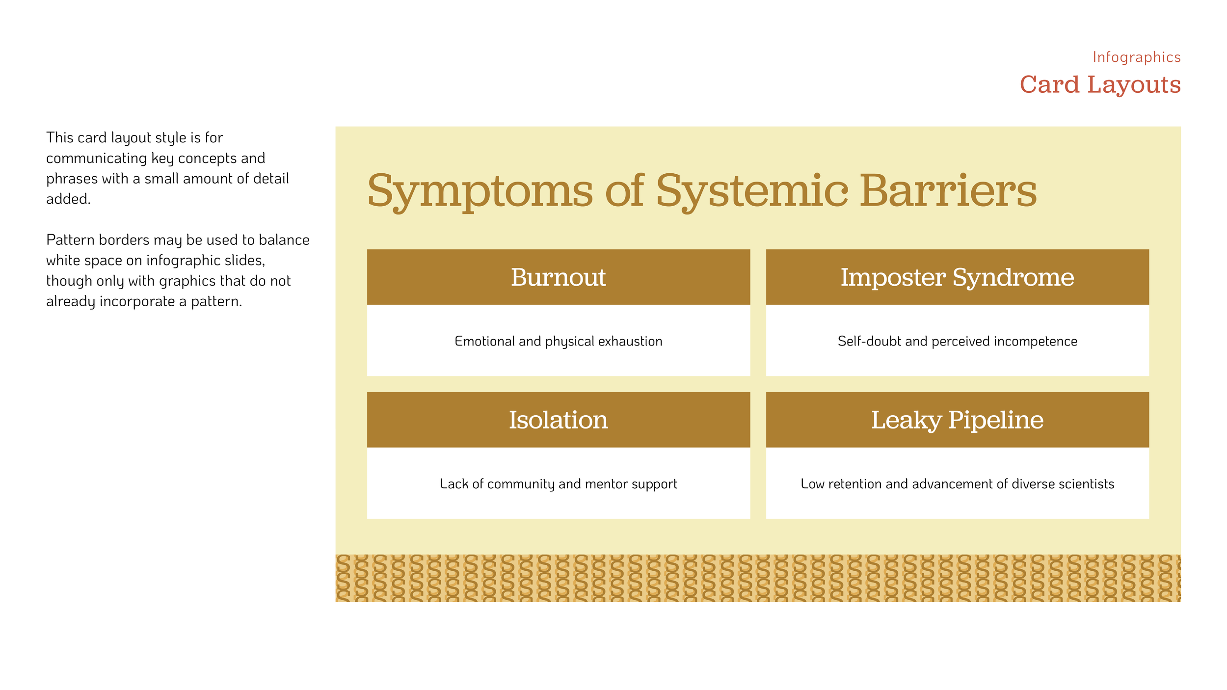
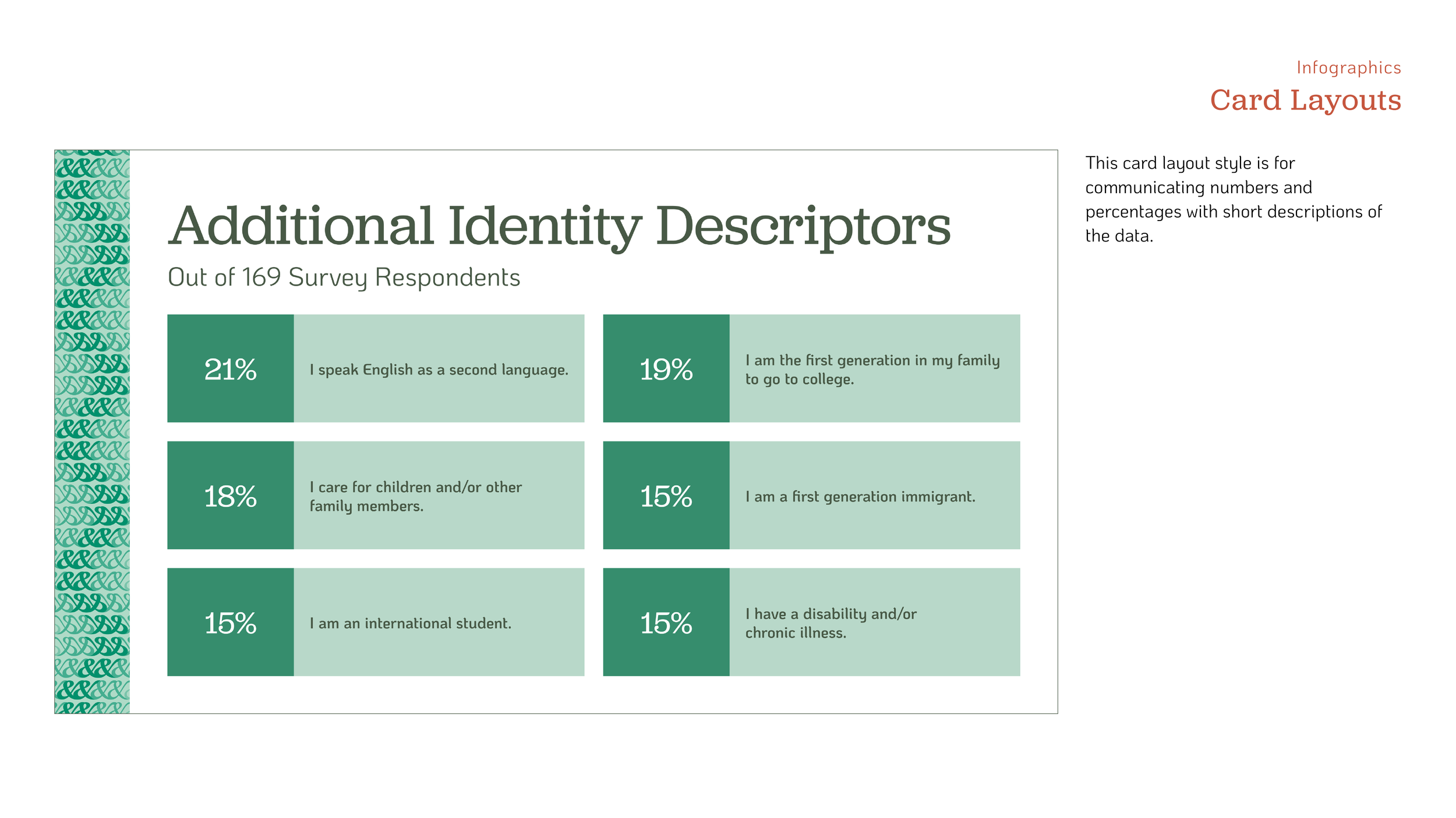
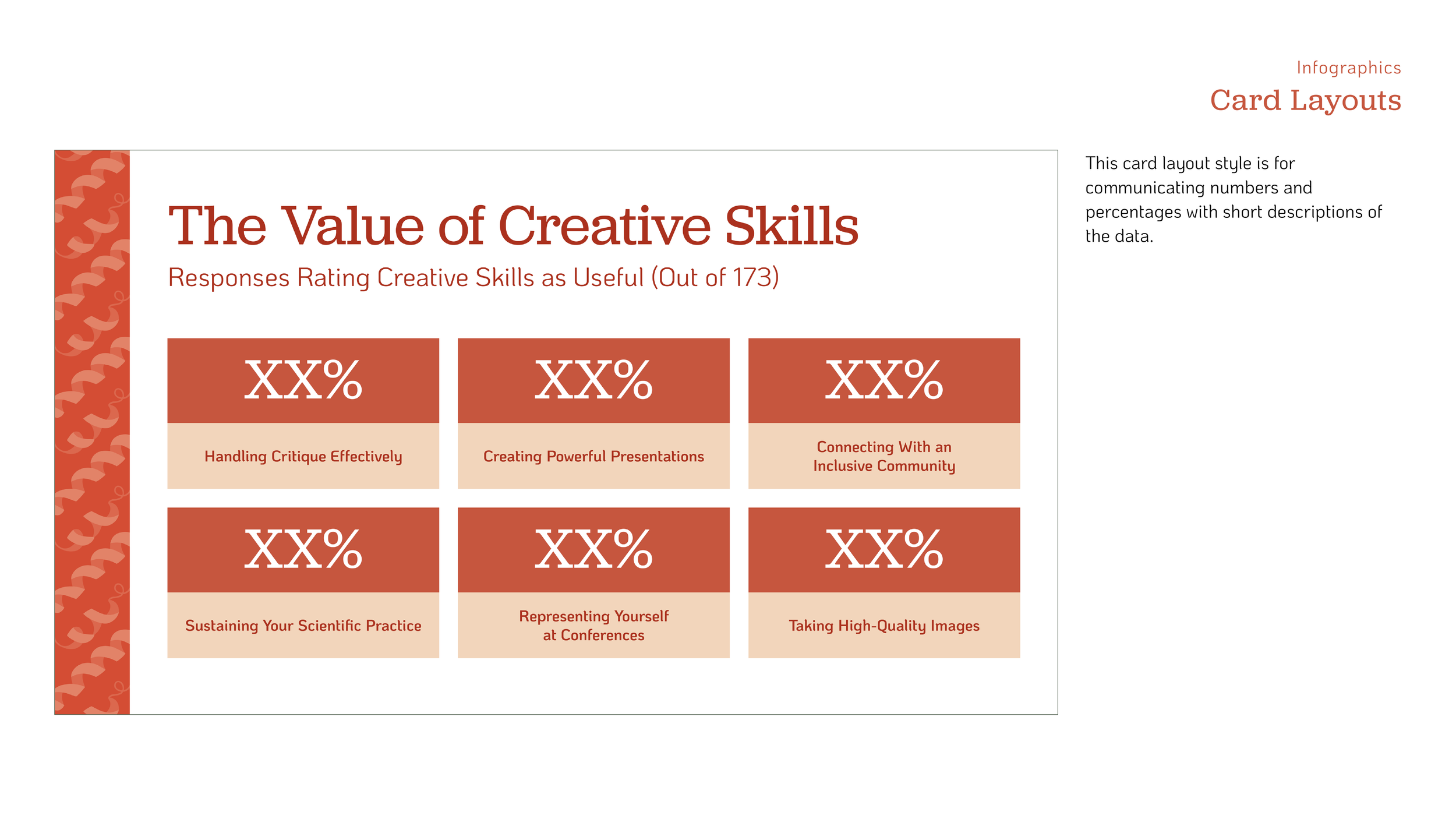
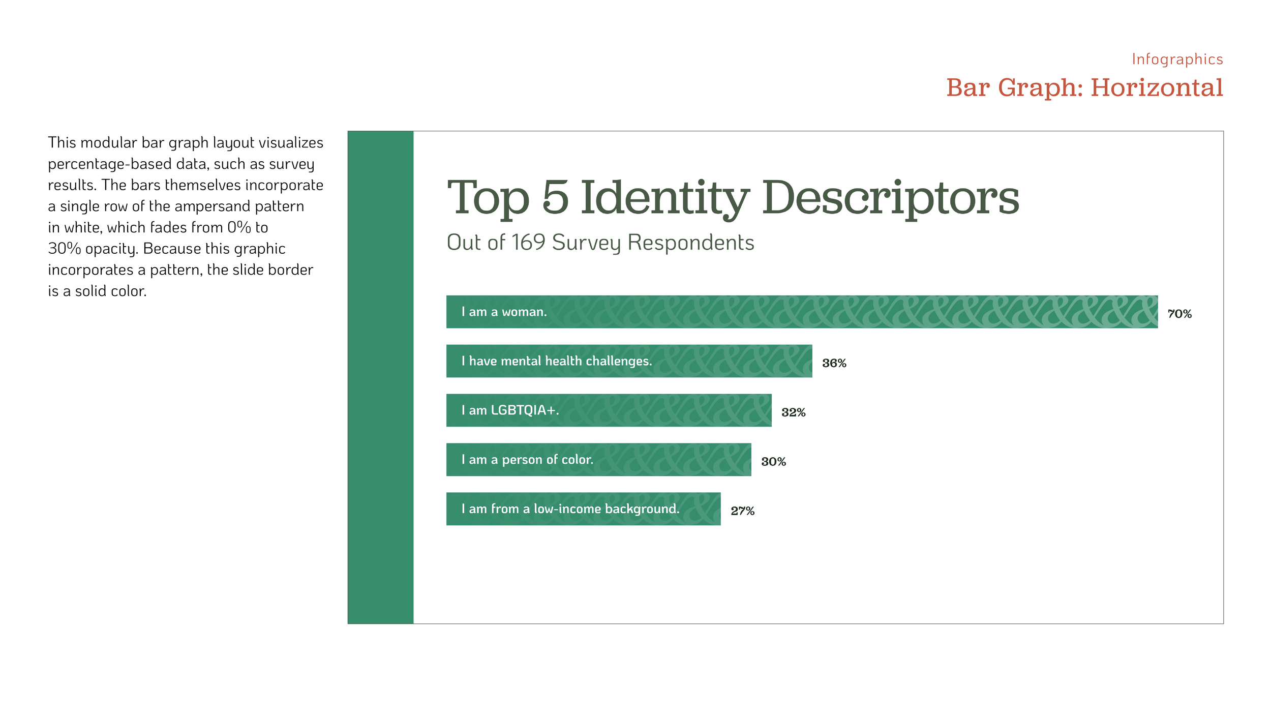
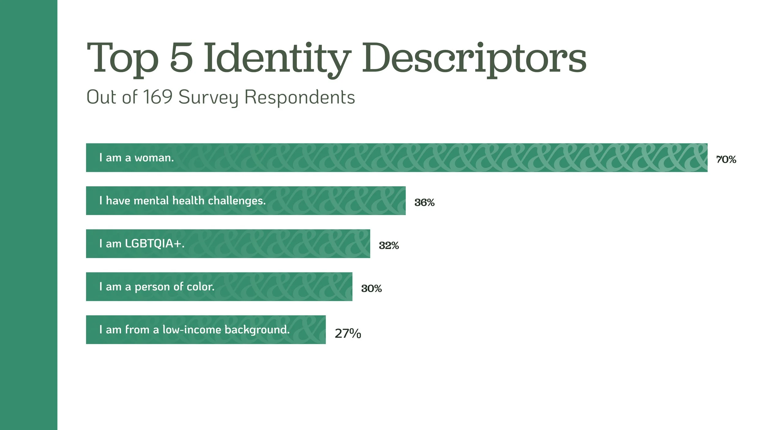
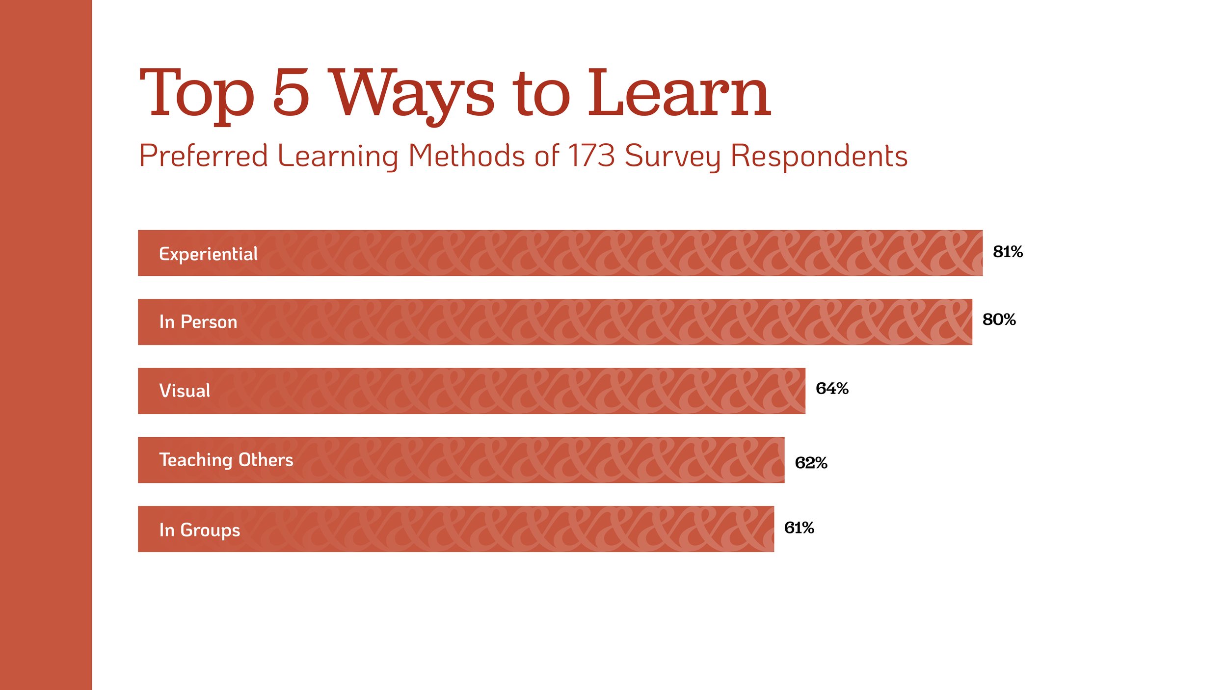
We conducted an audience survey to gather data on the barriers underrepresented scientists face in education and beyond. The Belonging in Science Survey received 179 responses, and has allowed us to legitimize the problem to investors and stakeholders, better understand our audience, and spread the word about Science&’s mission. As the lead strategist on the branding team, I created info graphics to summarize our impactful findings. Some proprietary data has been redacted below.


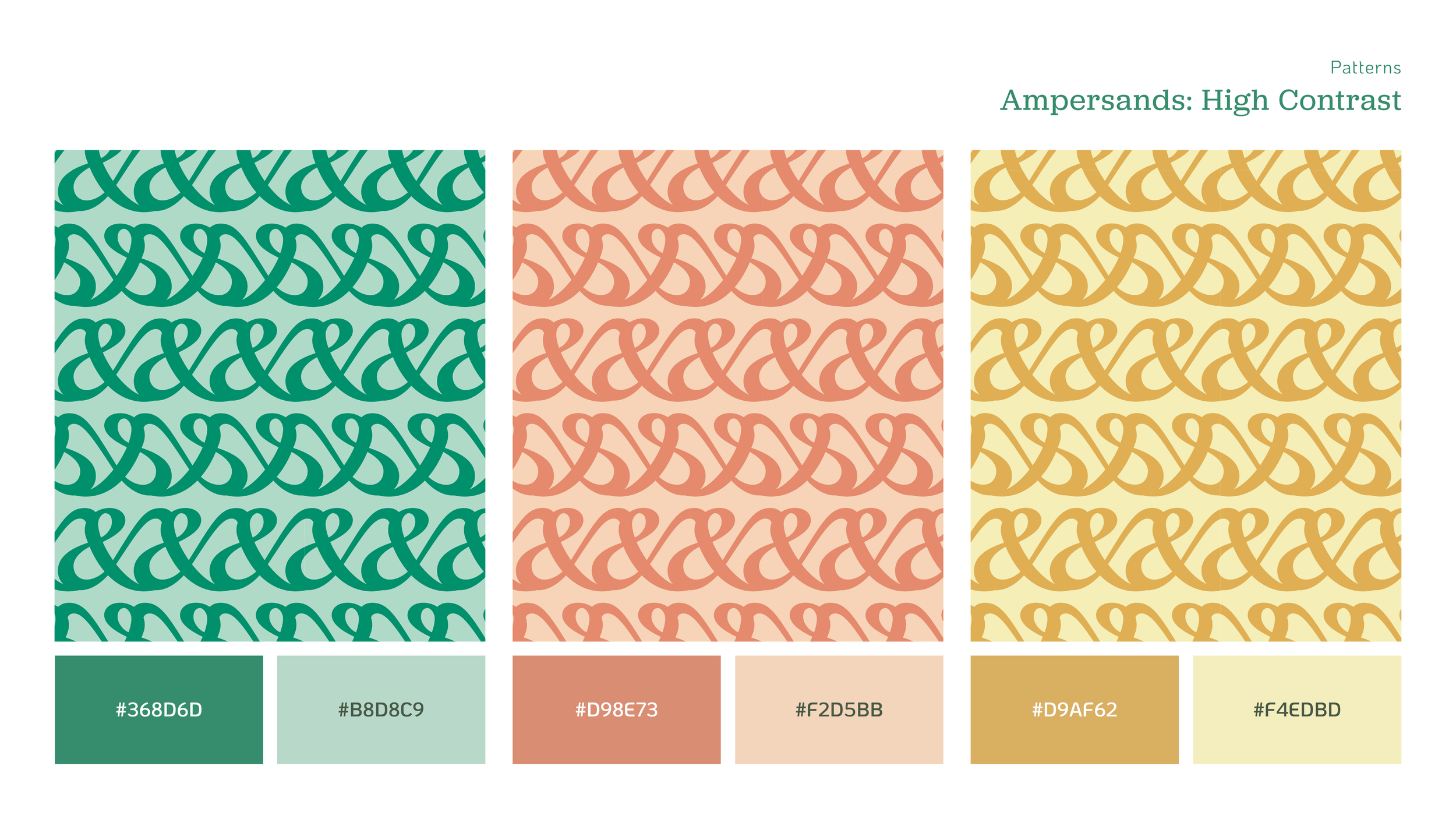
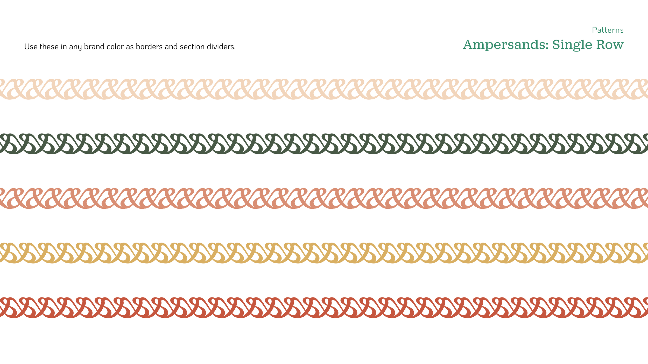
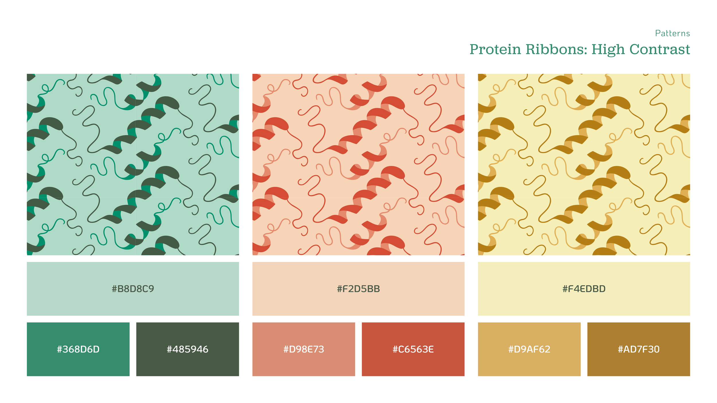
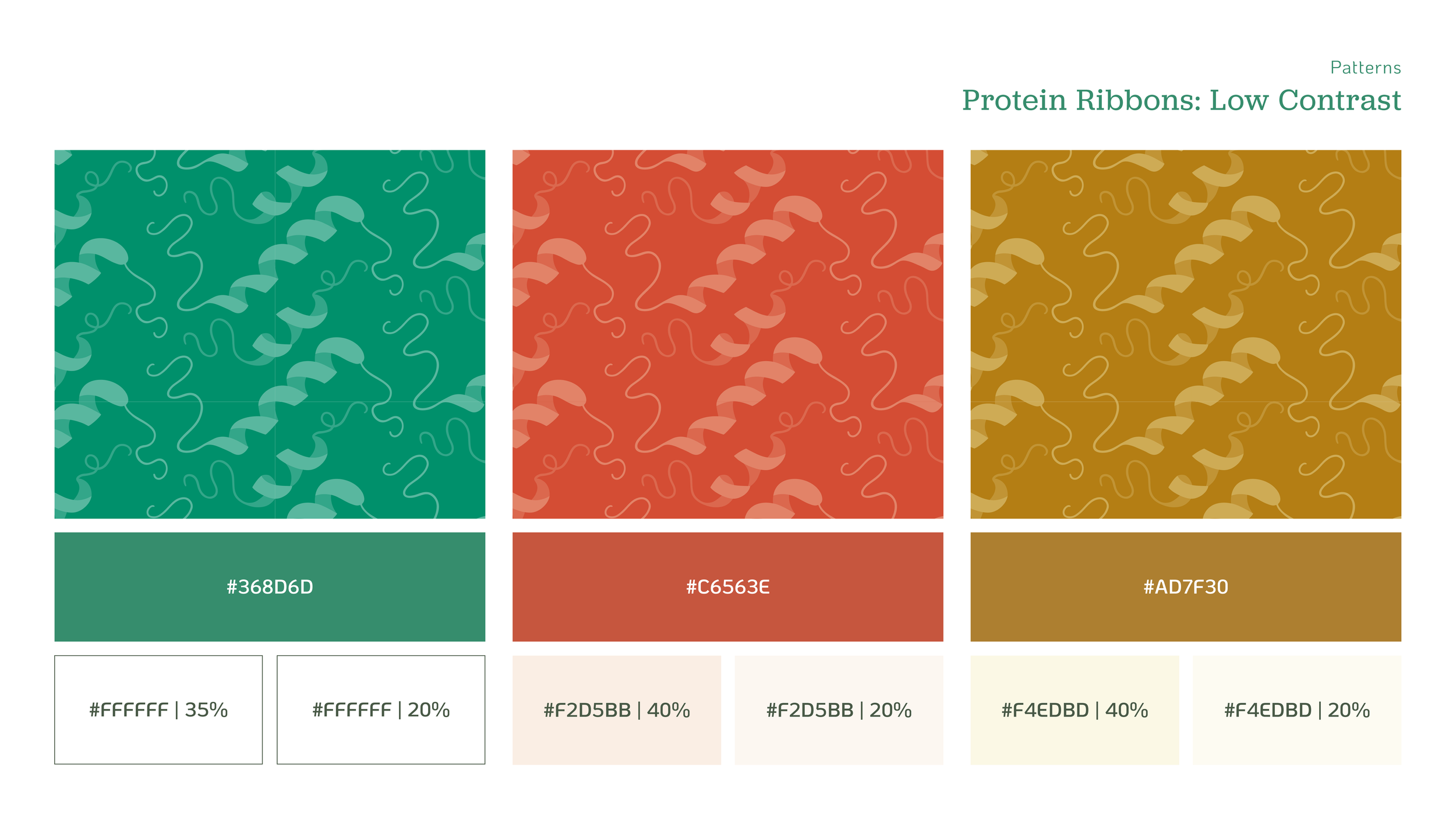
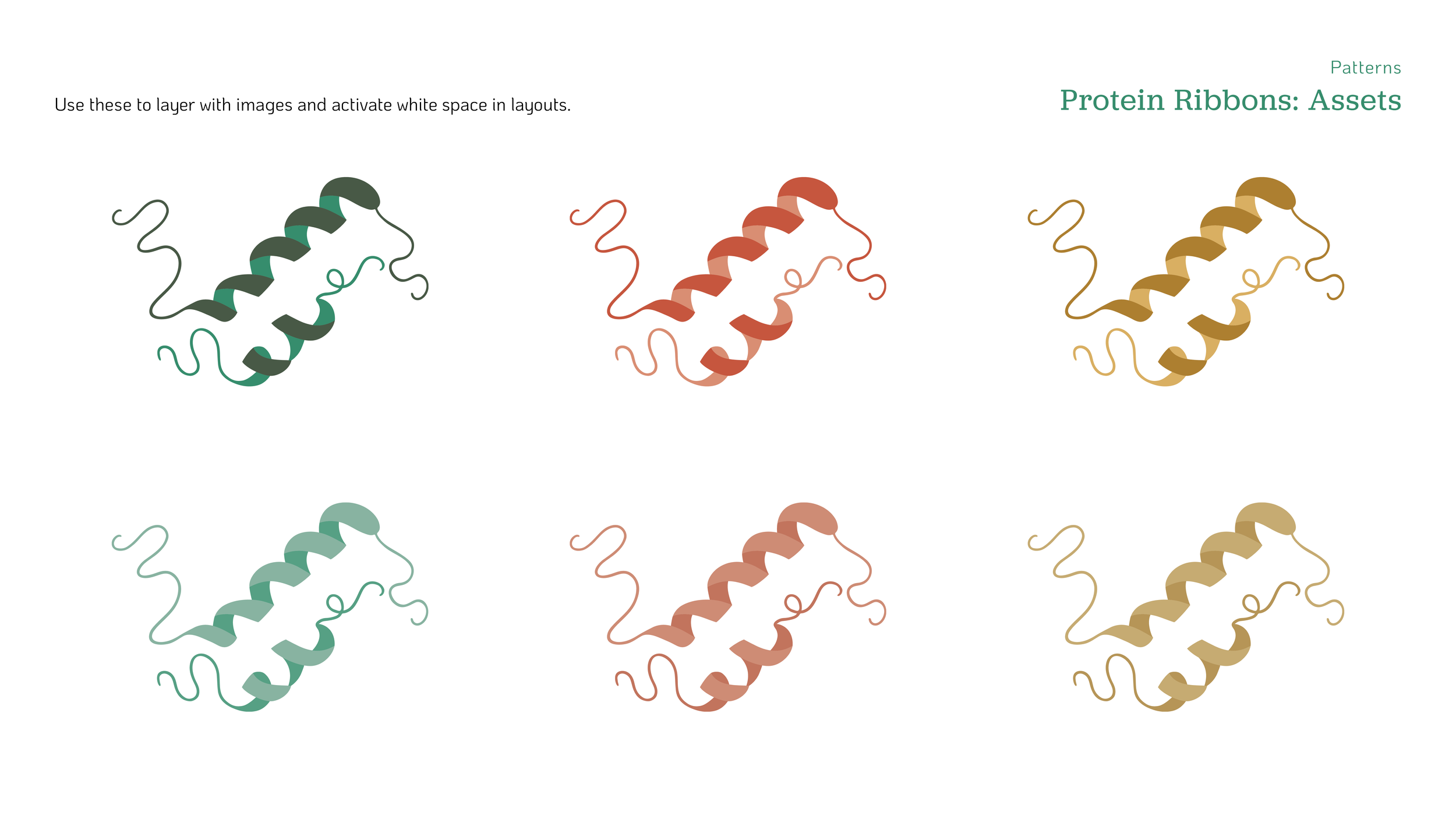
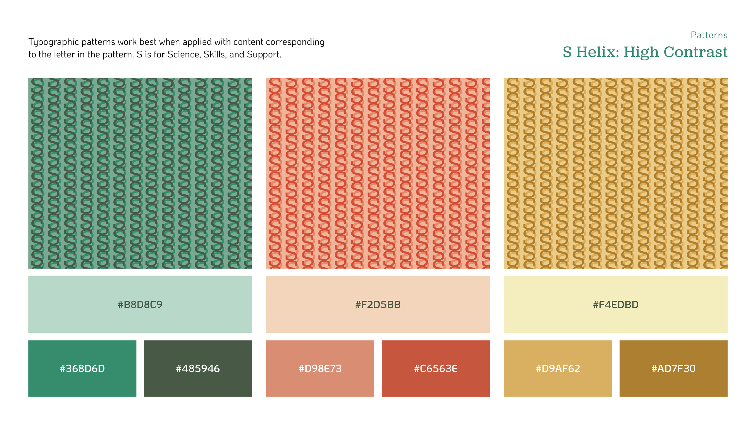
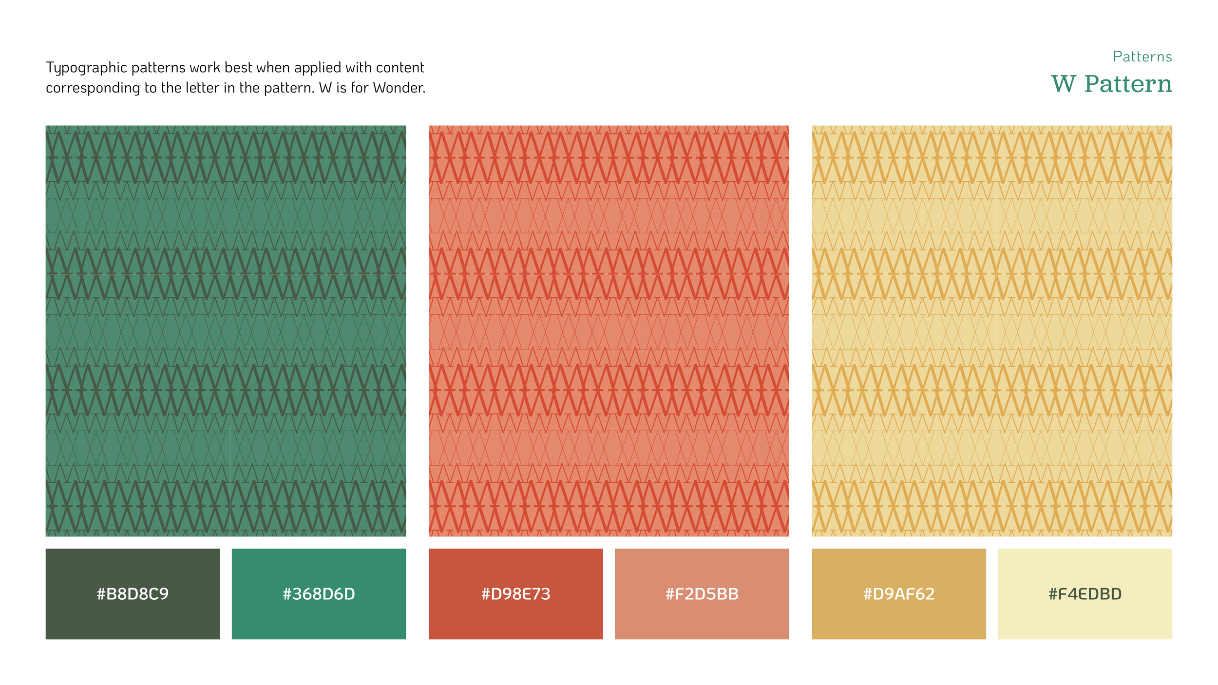
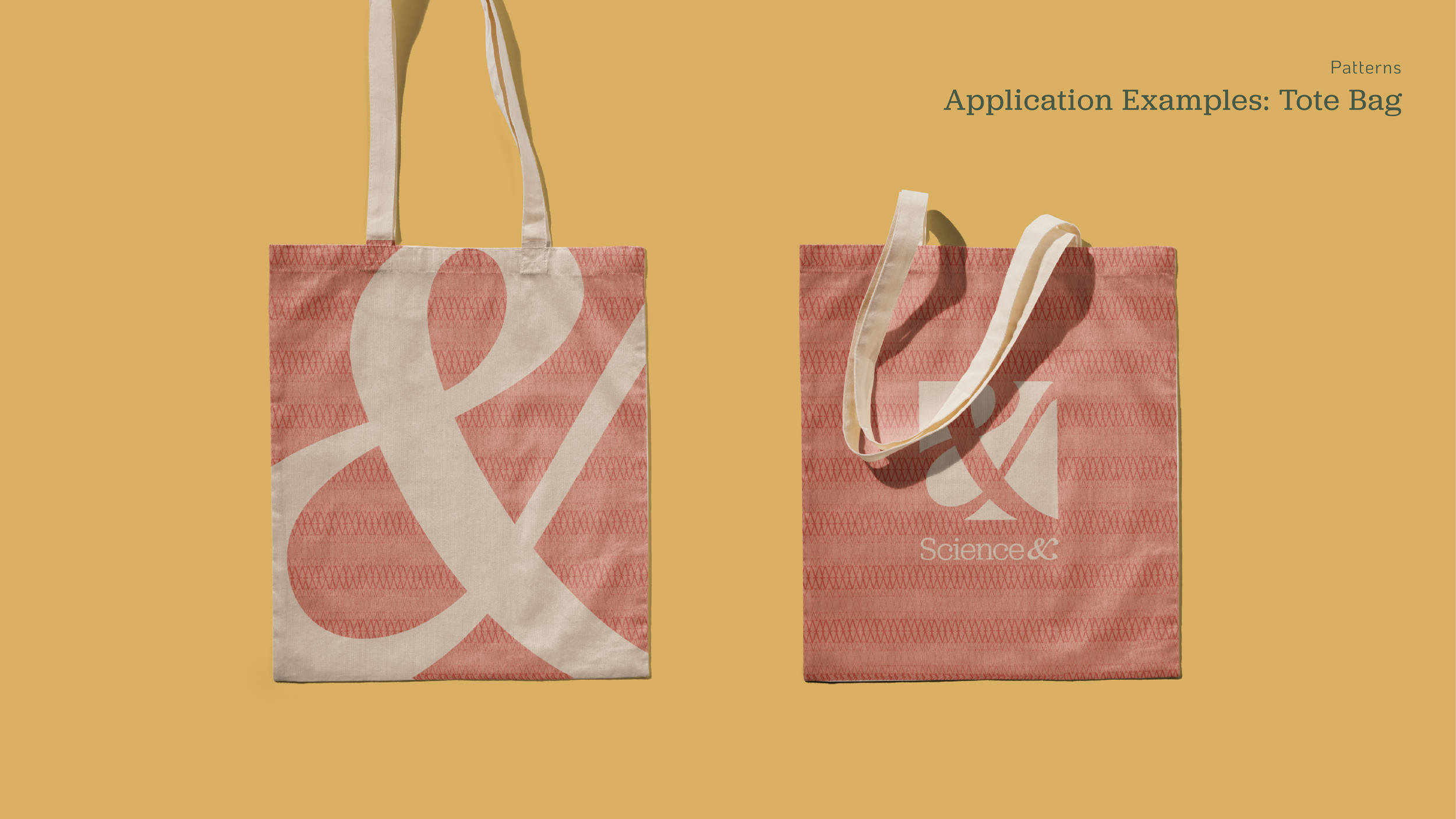
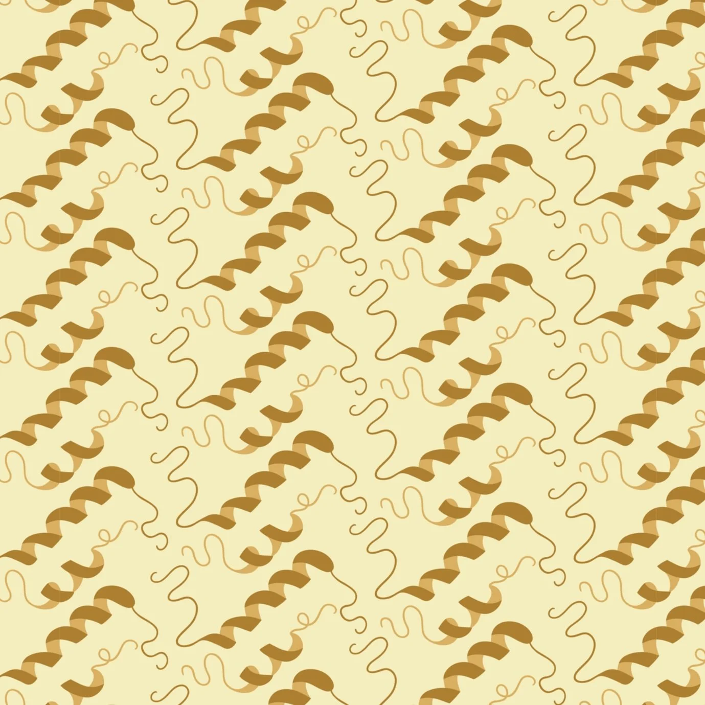
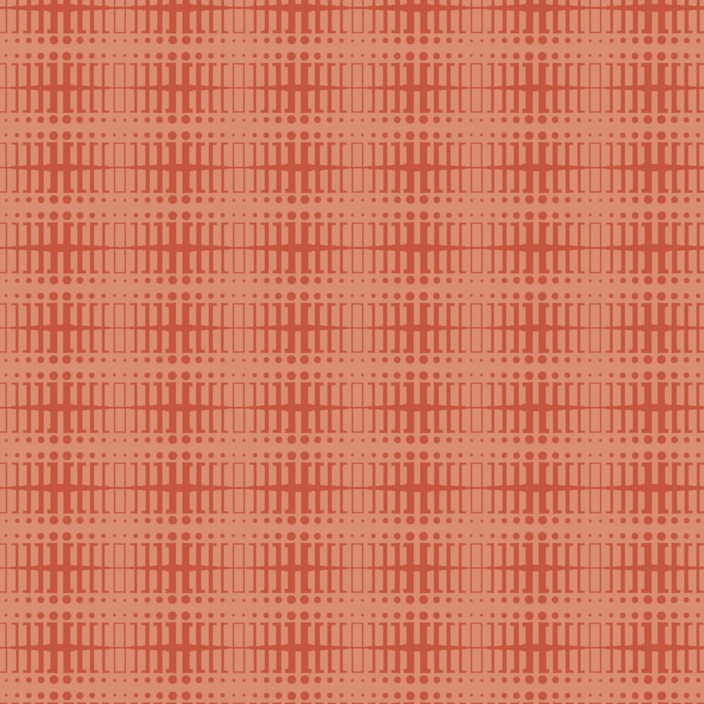
Patterns
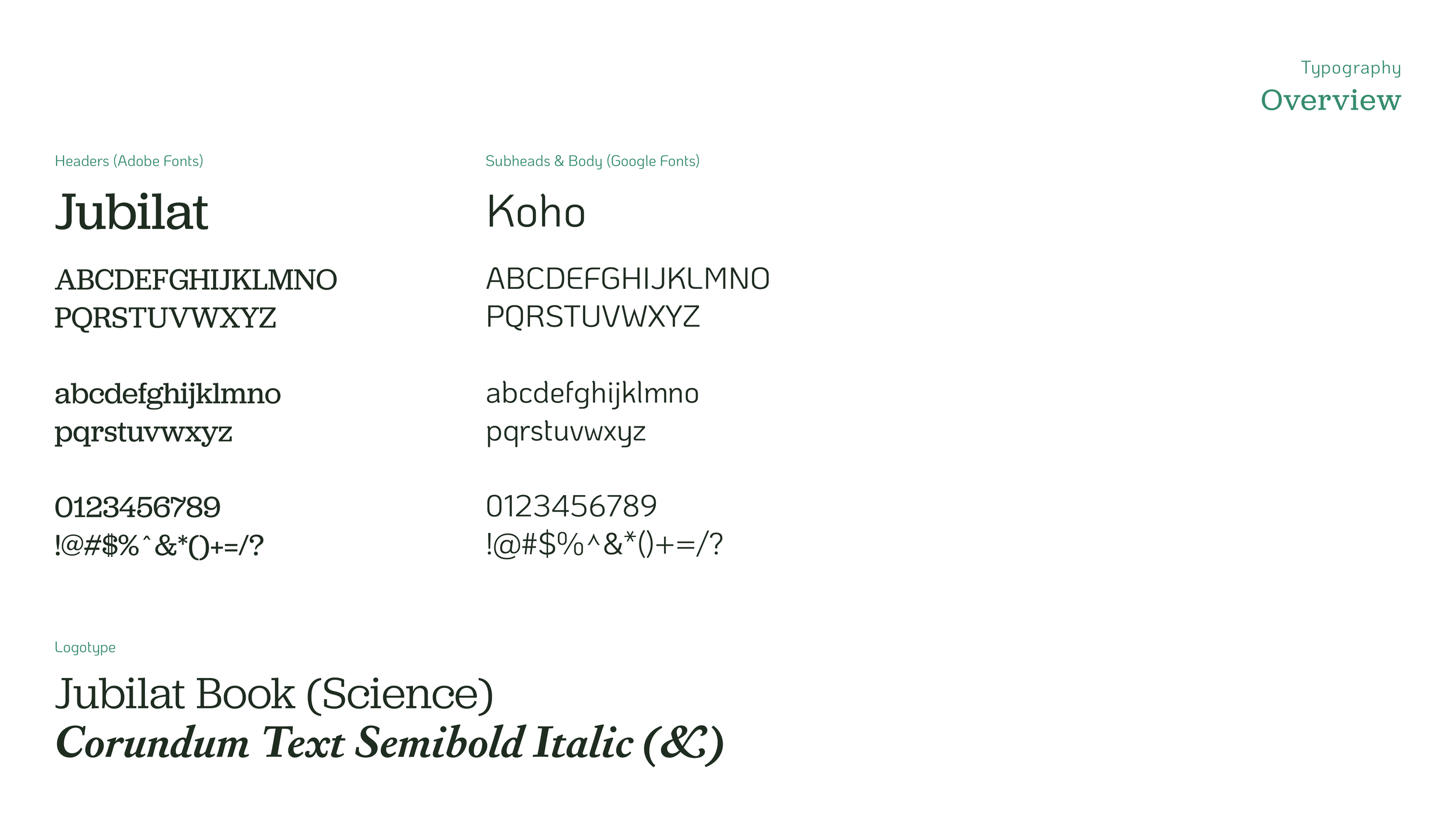
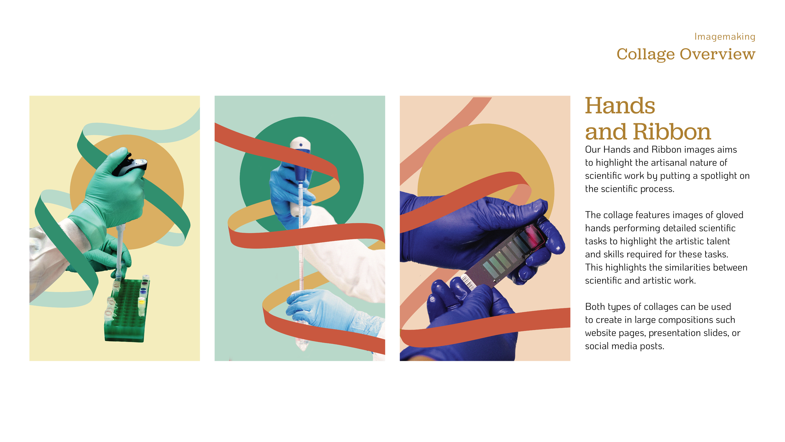
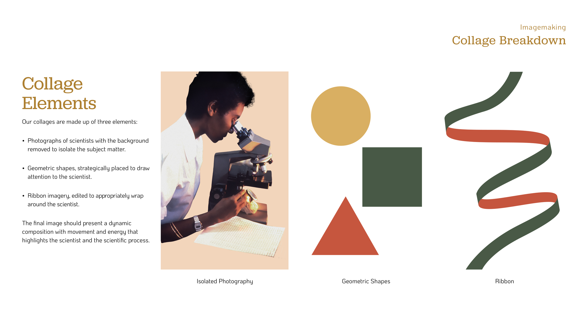
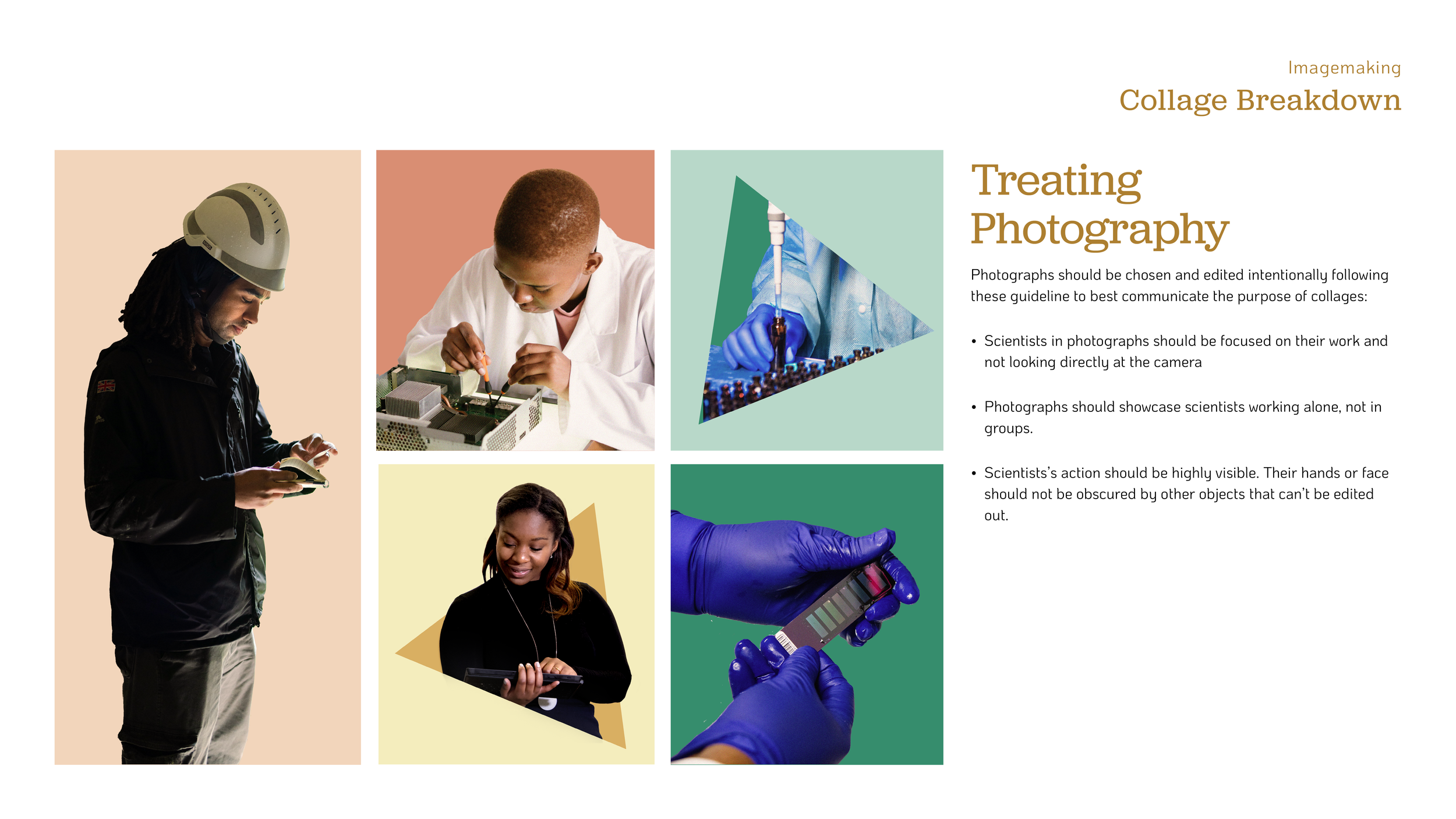
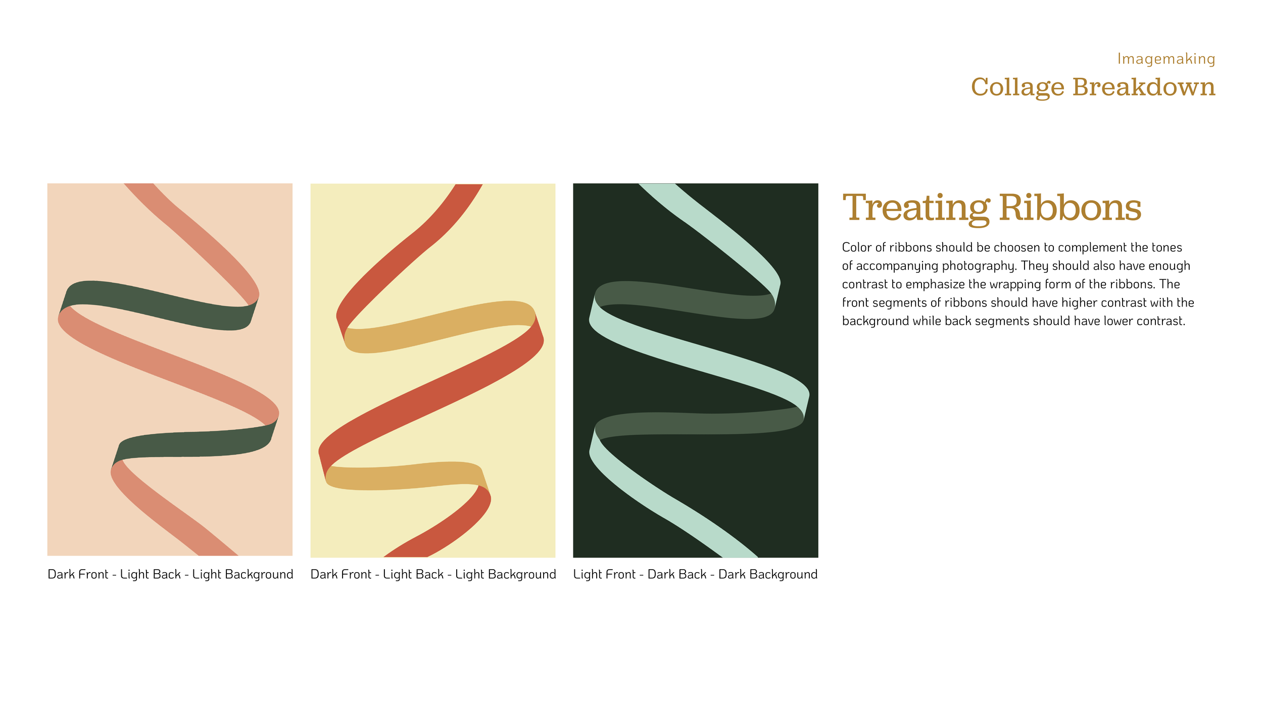
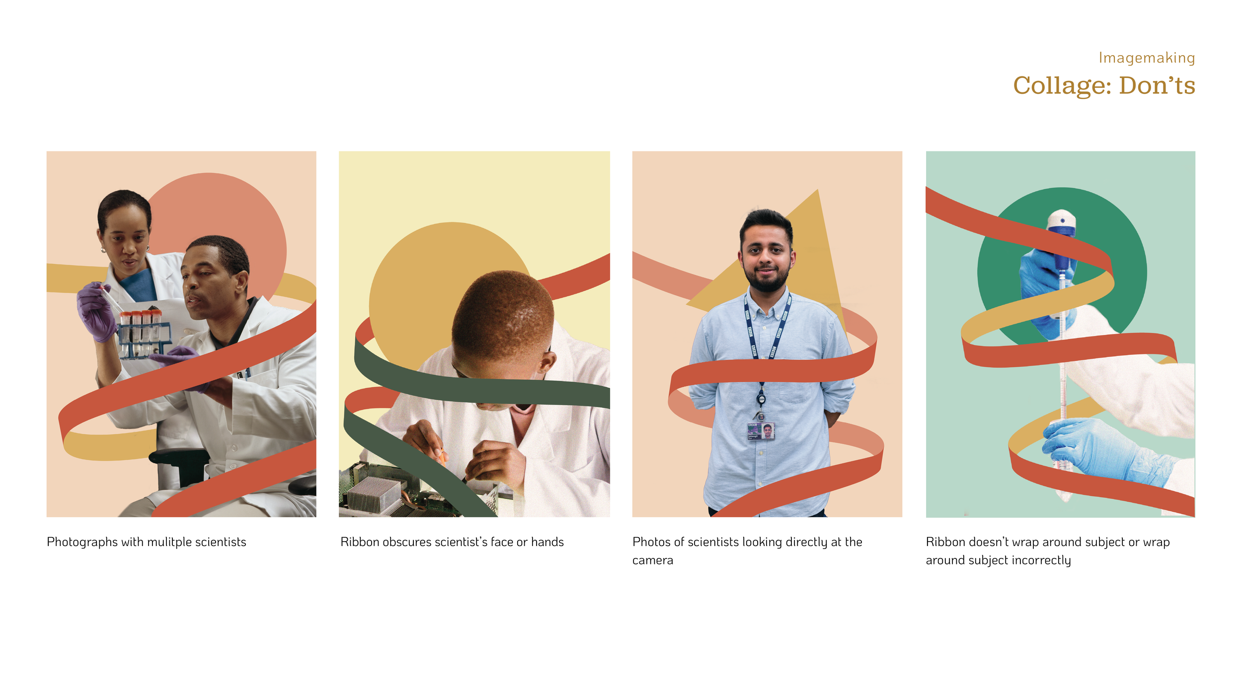
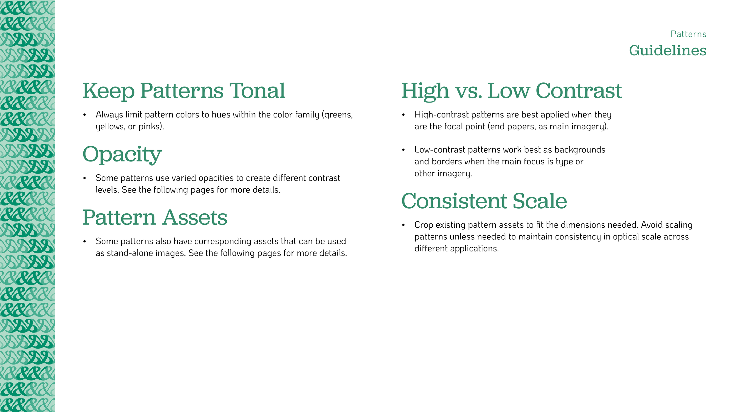
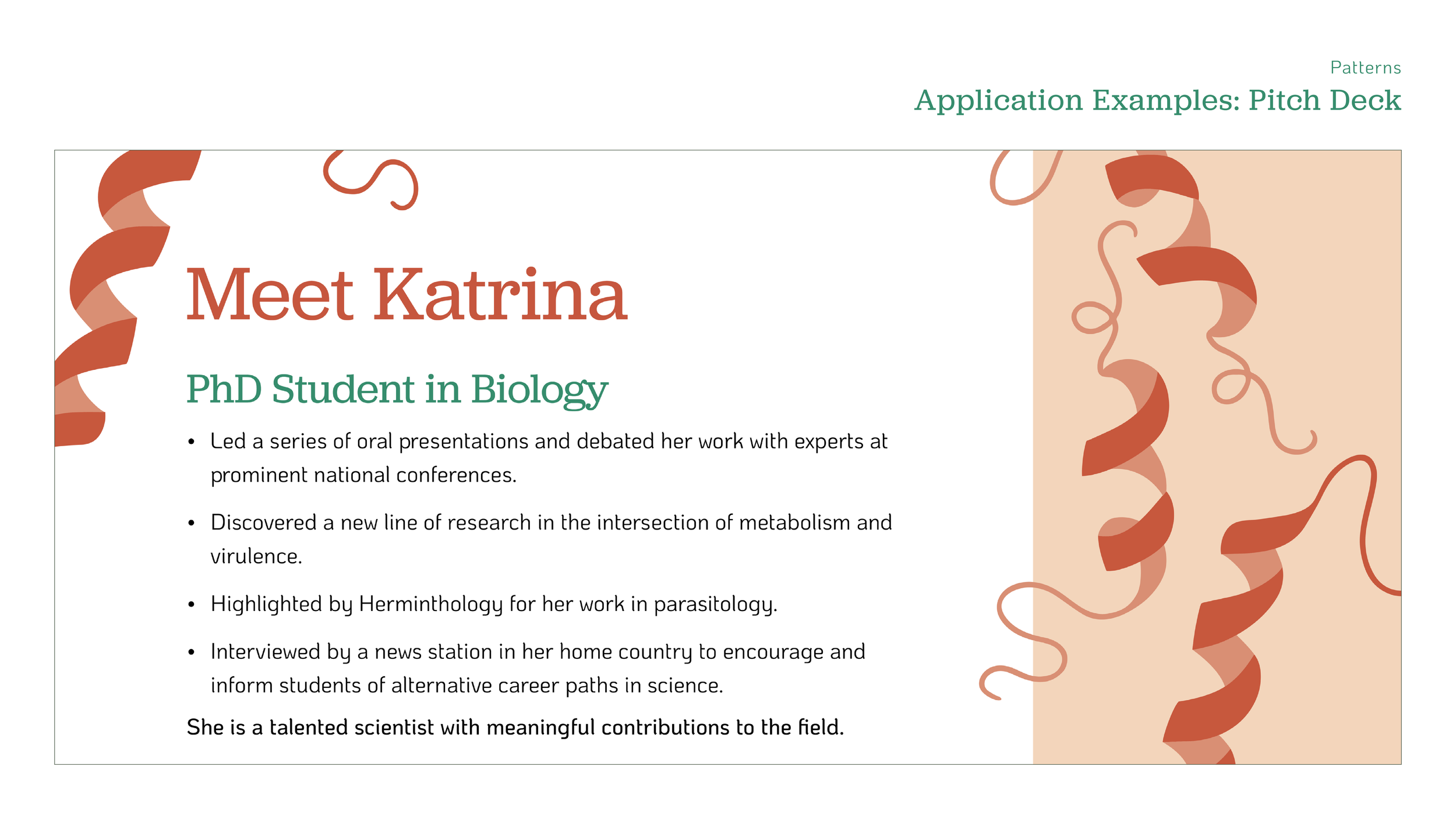
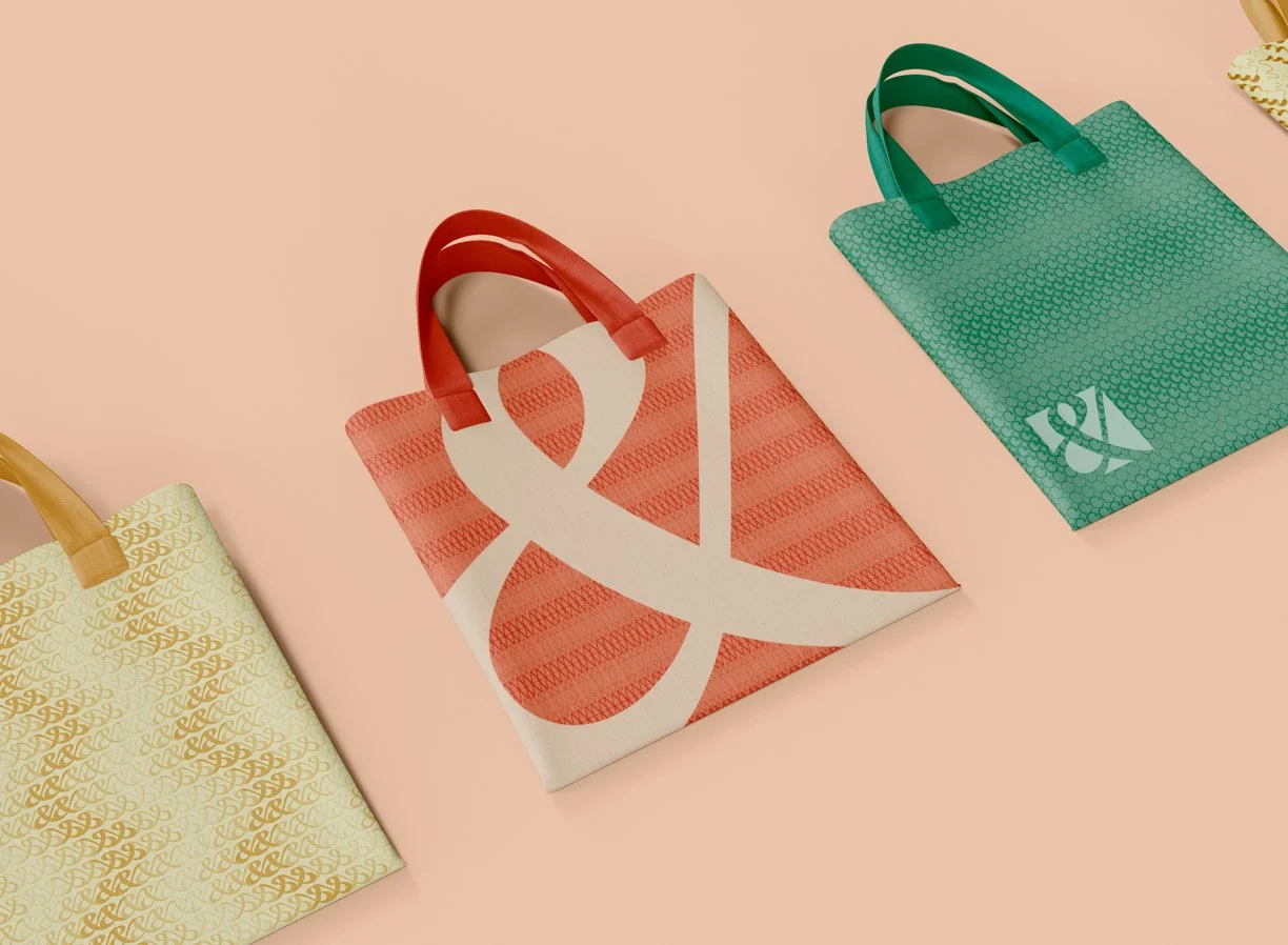
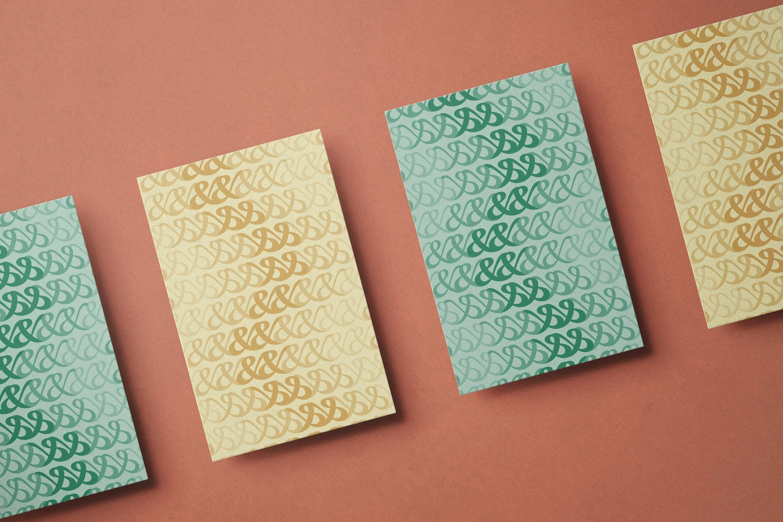
One of my major contributions to Science&’s branding was a library of patterns inspired by both imagery and typography related to the nonprofit’s core values. Ribbon-like illustrations inspired by protein diagrams highight the overlap between art and science, while patterns based on the ampersand and letters from the brand name represent concepts like duality, creativity, and innovation.


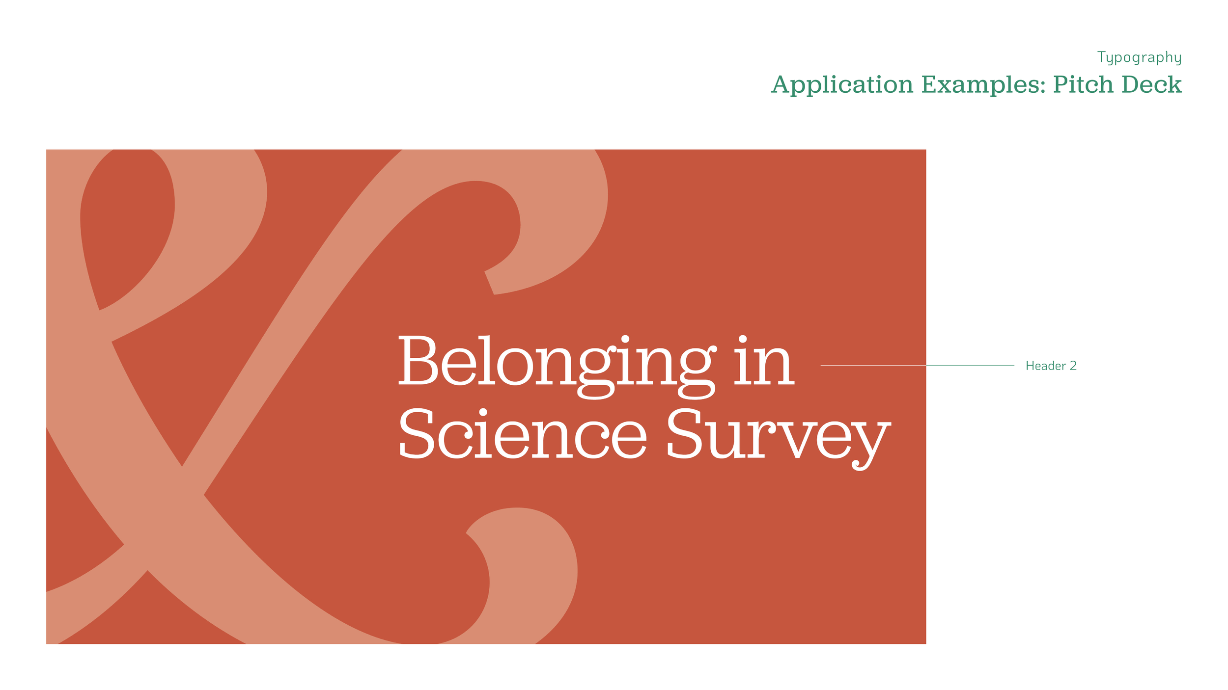
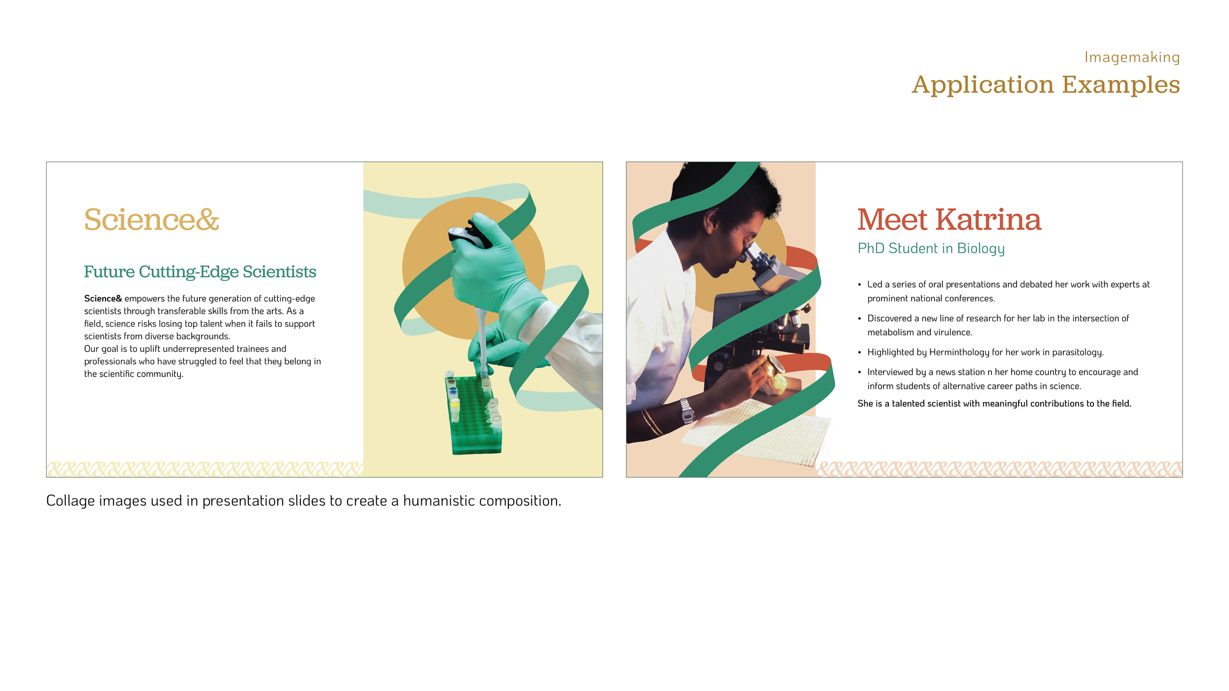
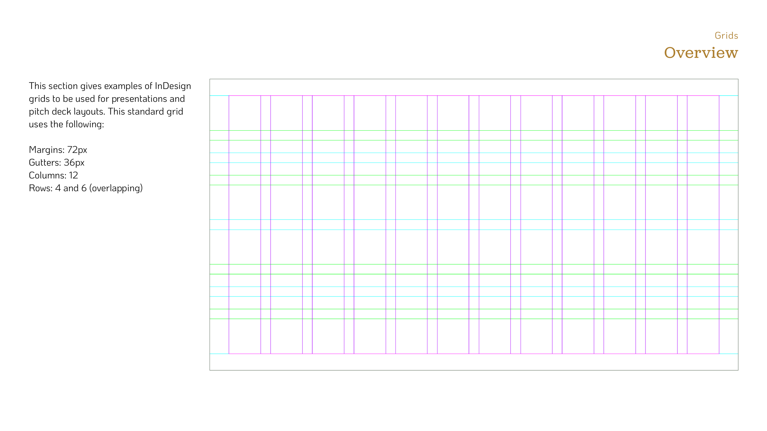
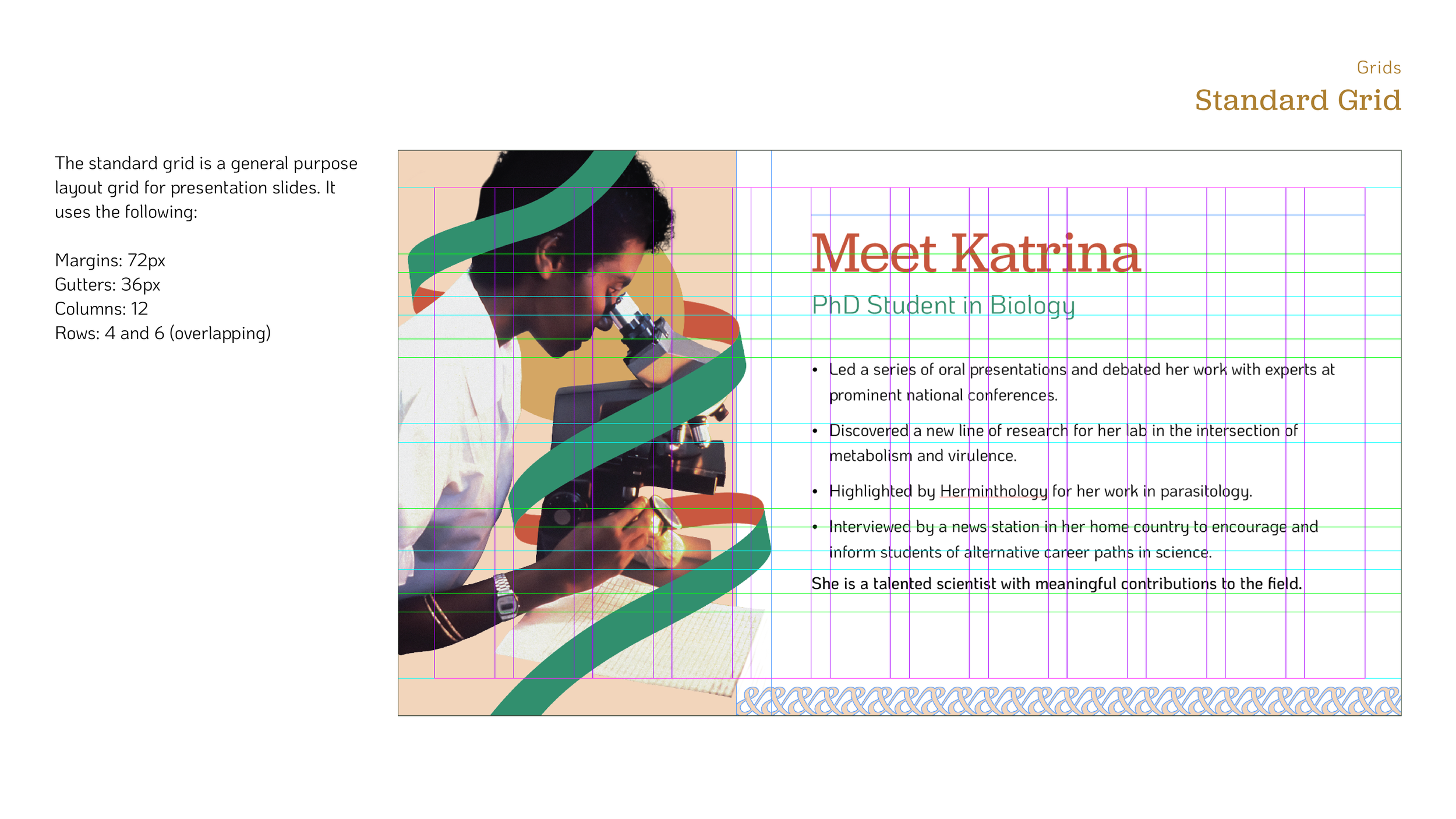
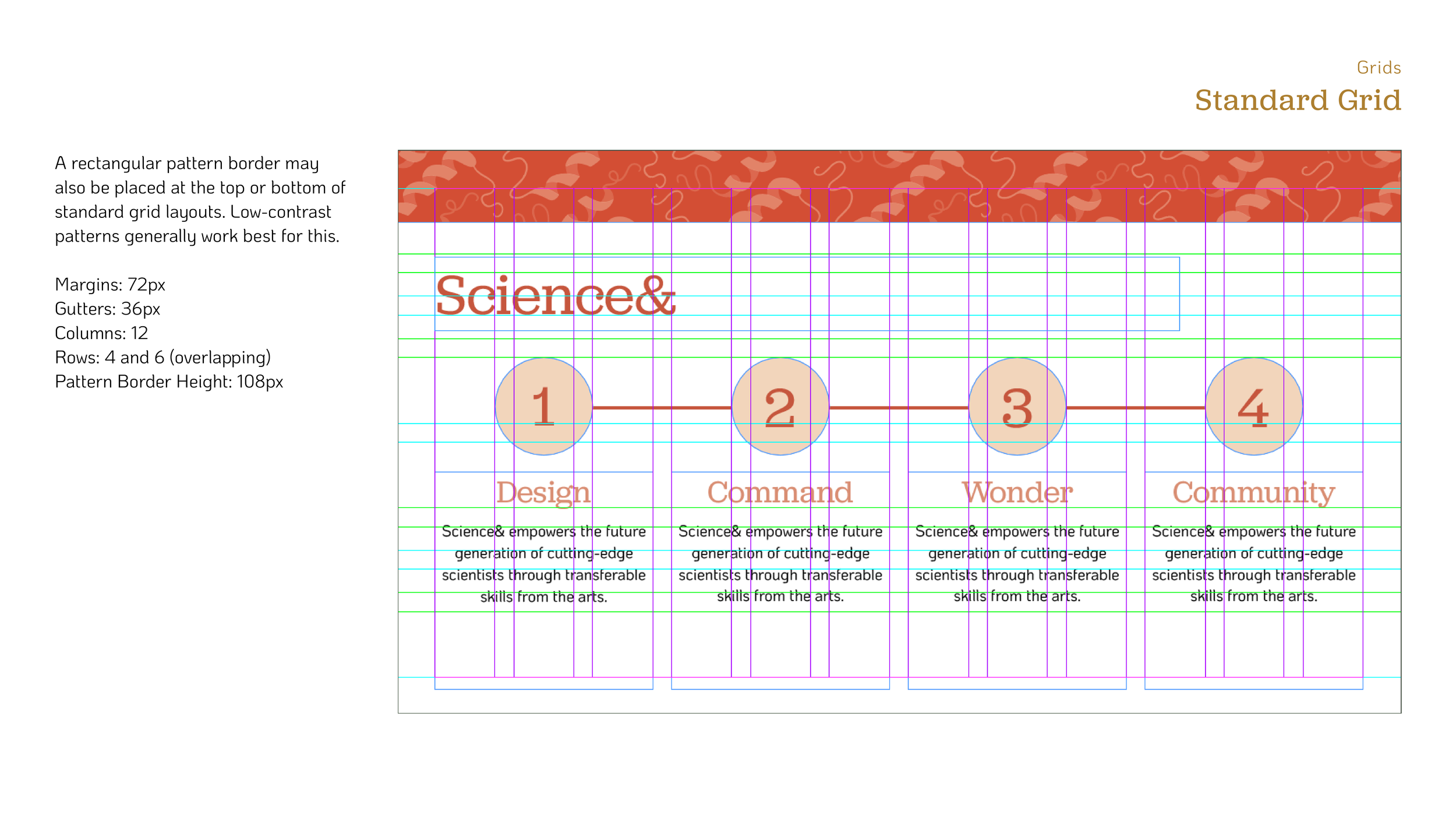
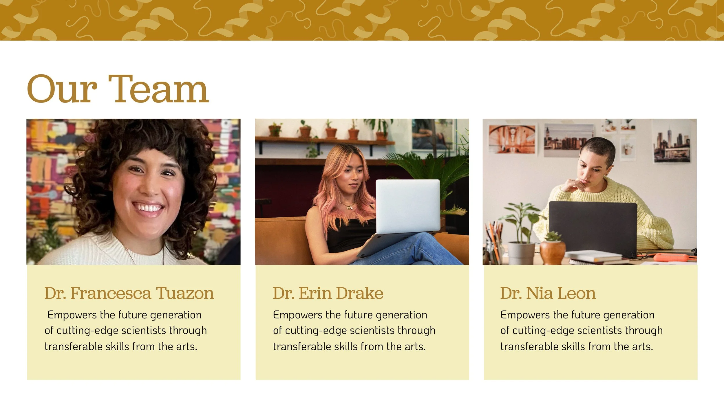
Pitch Deck
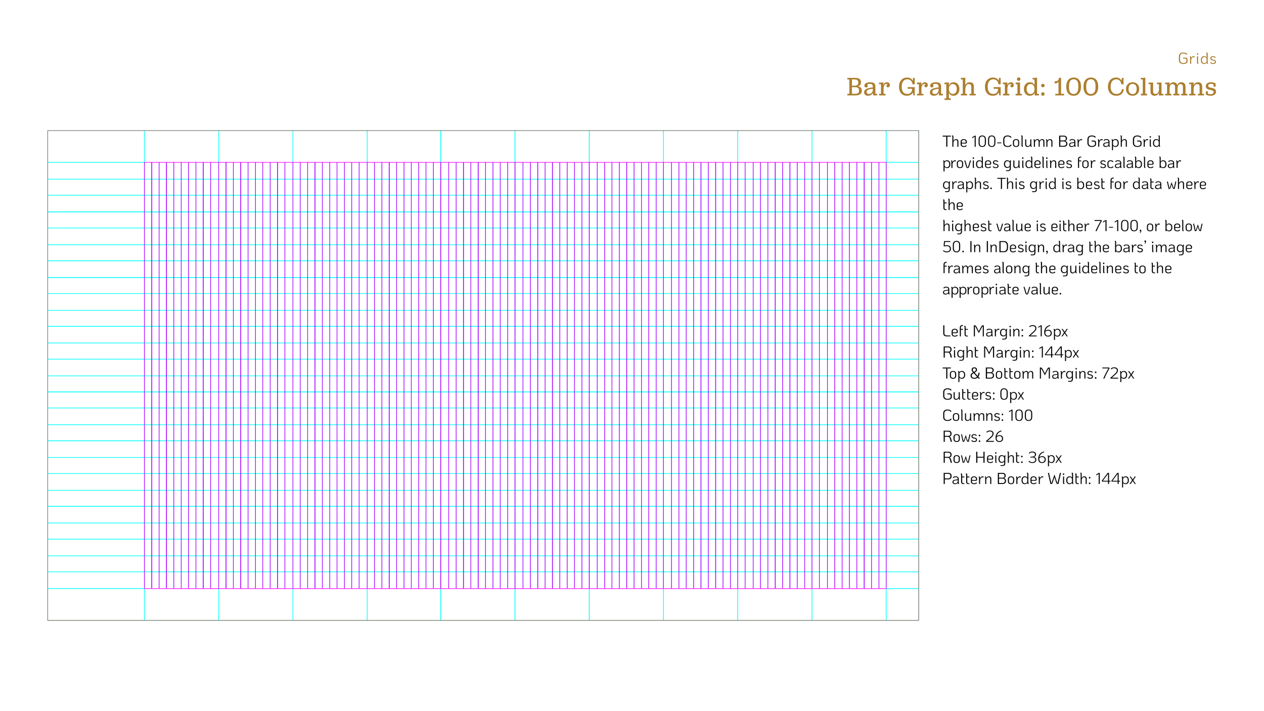
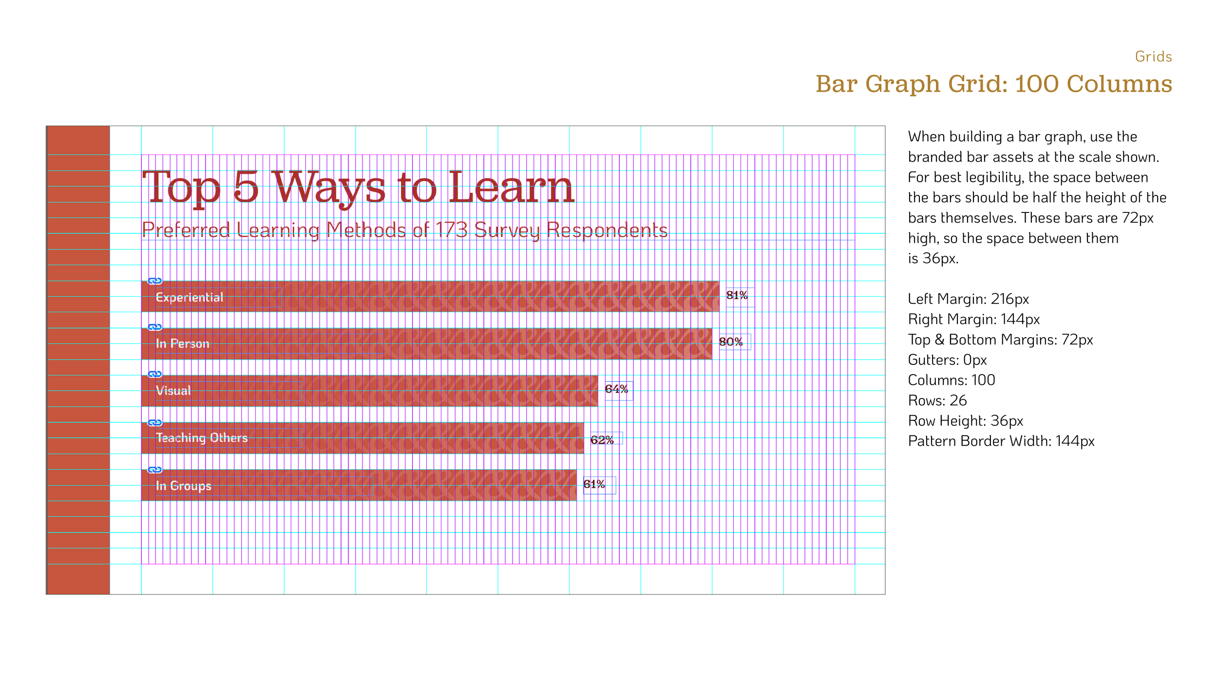
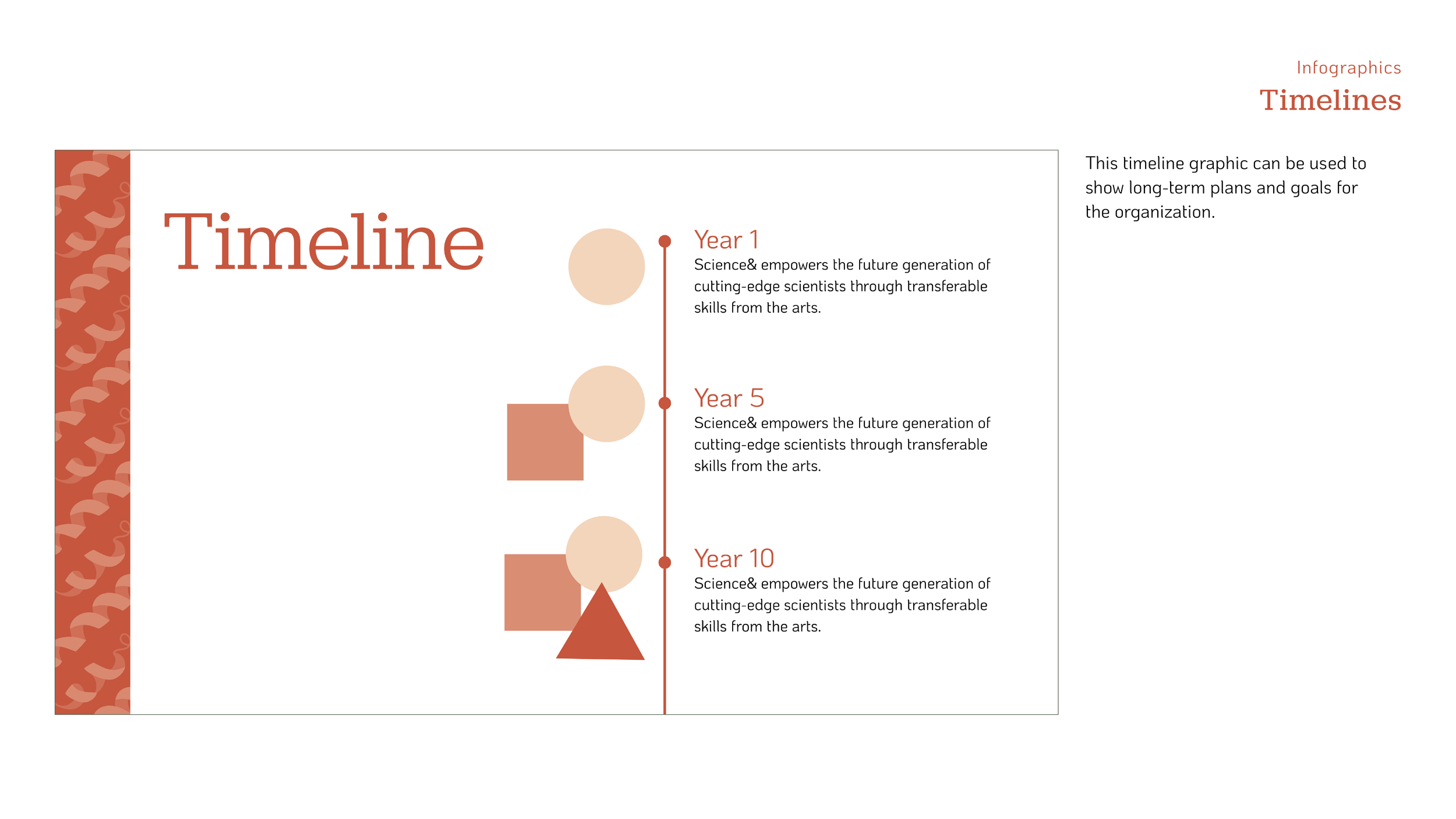
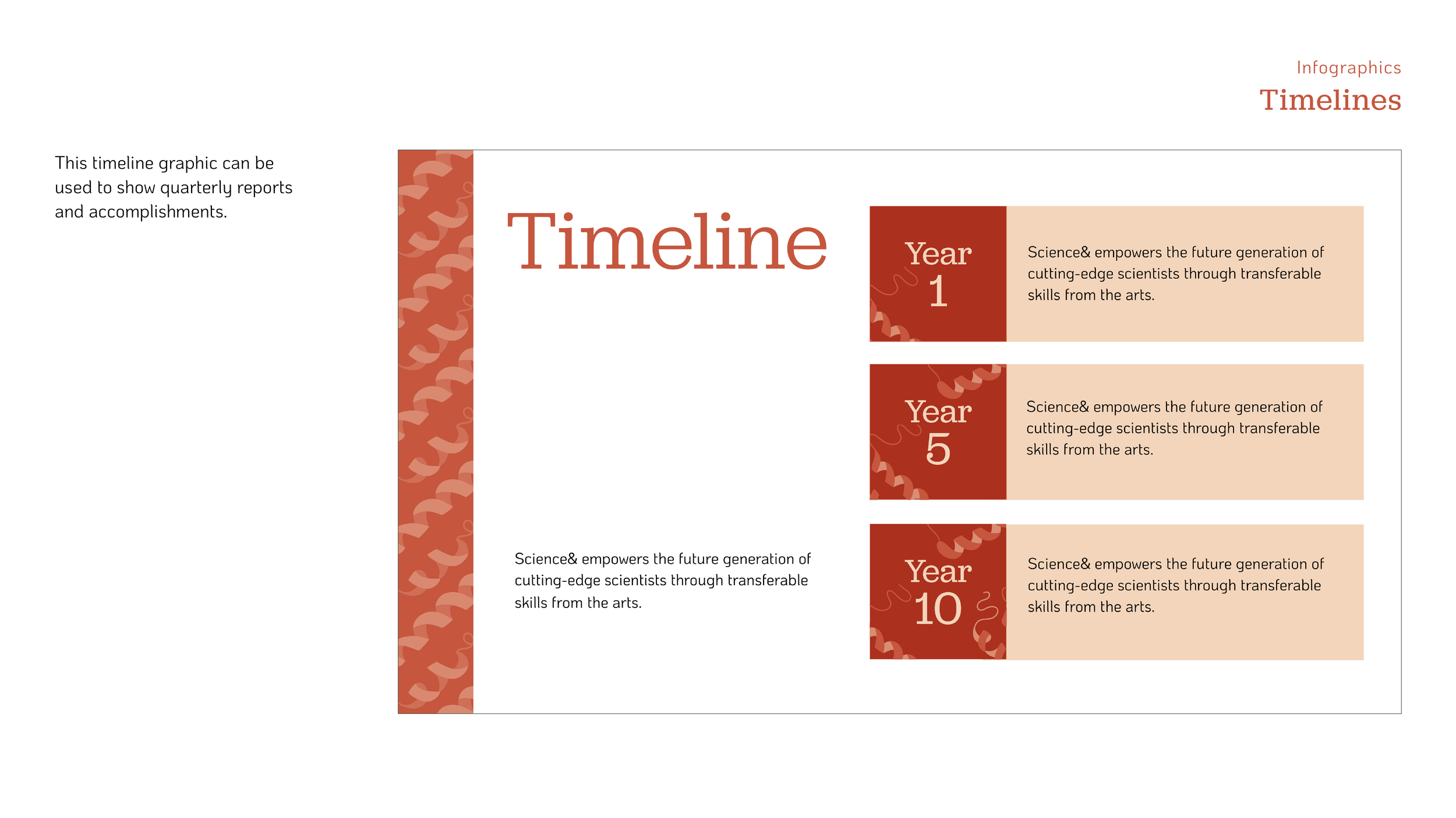
To assist our client with pitching the nonprofit to potential investors, we created a set of layout templates for a pitch deck. It includes slide templates for presenting the brand’s mission, values, problem and solution, user personas, survey data, accomplishments, timelines, and more.


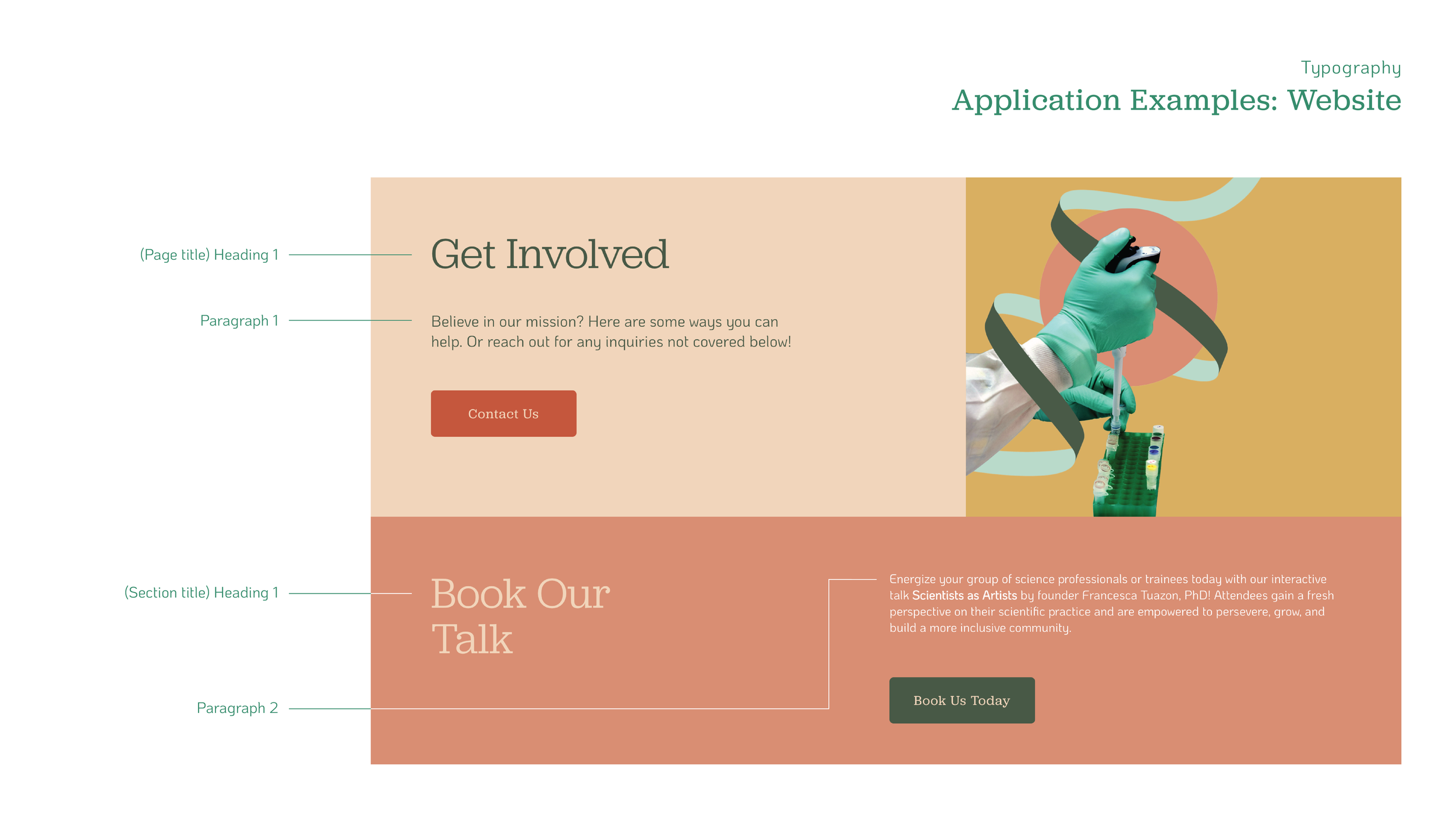
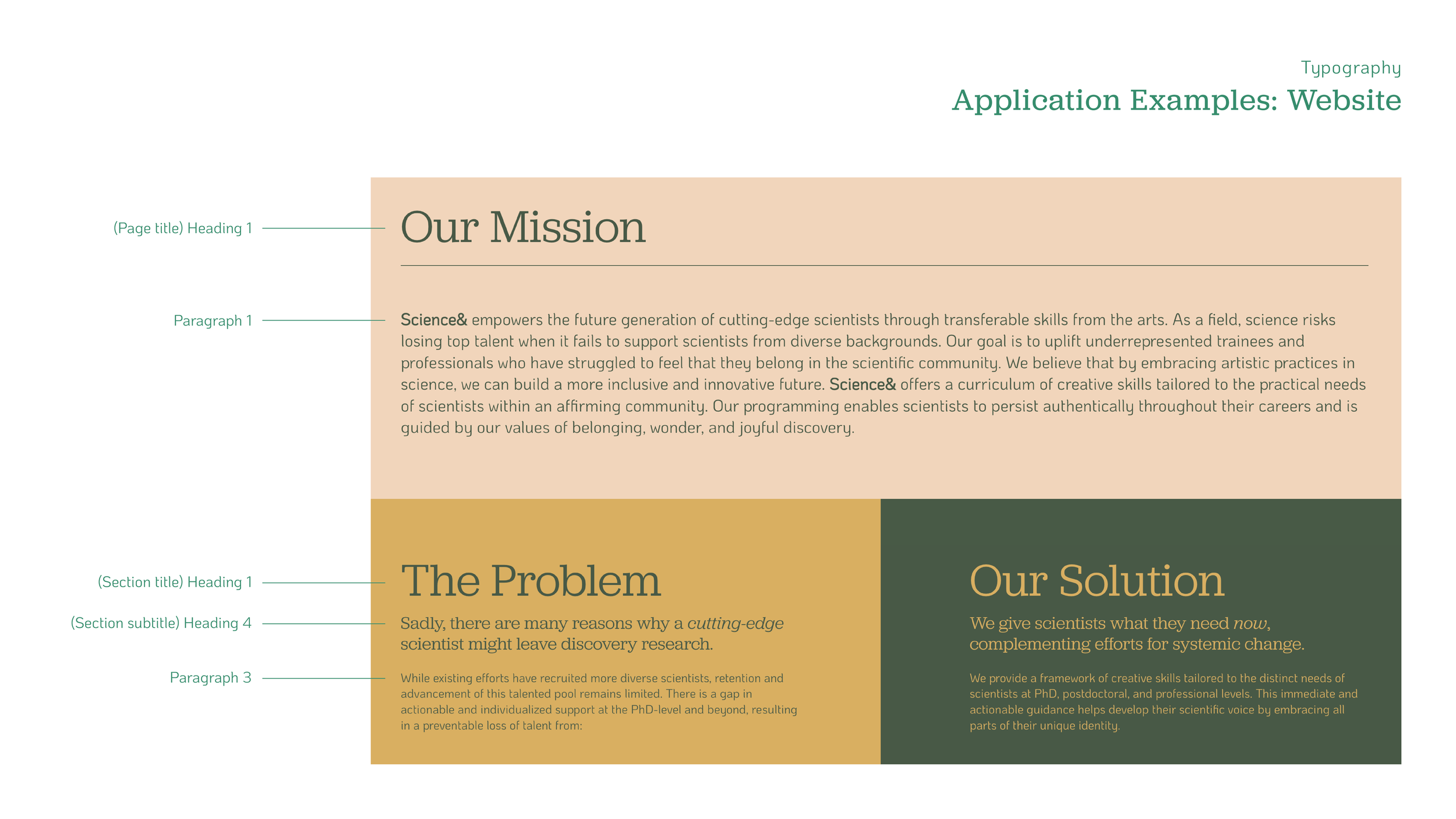
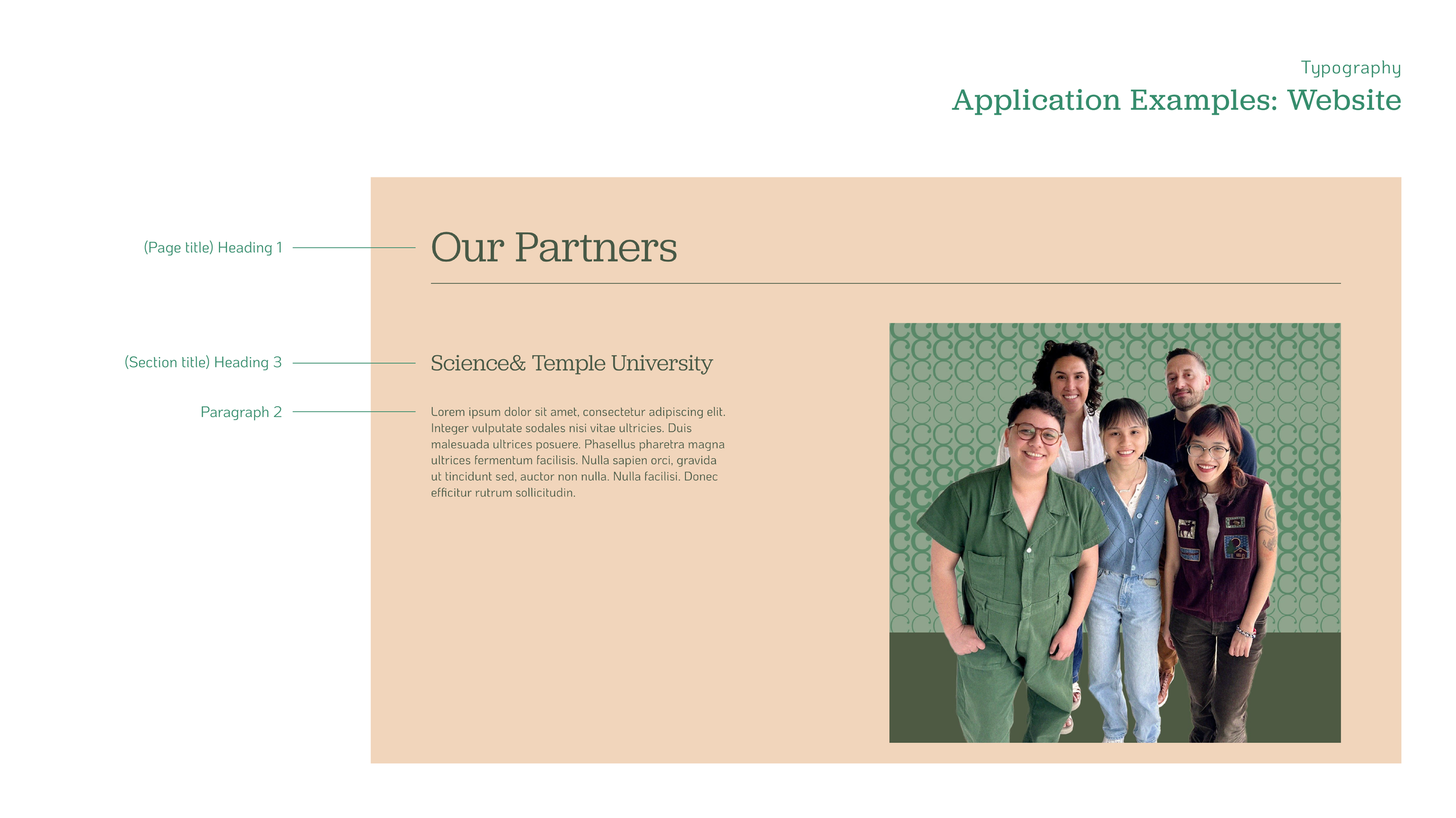
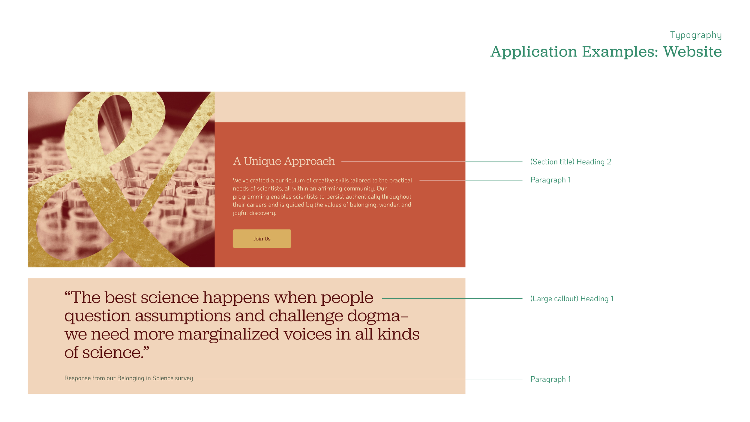
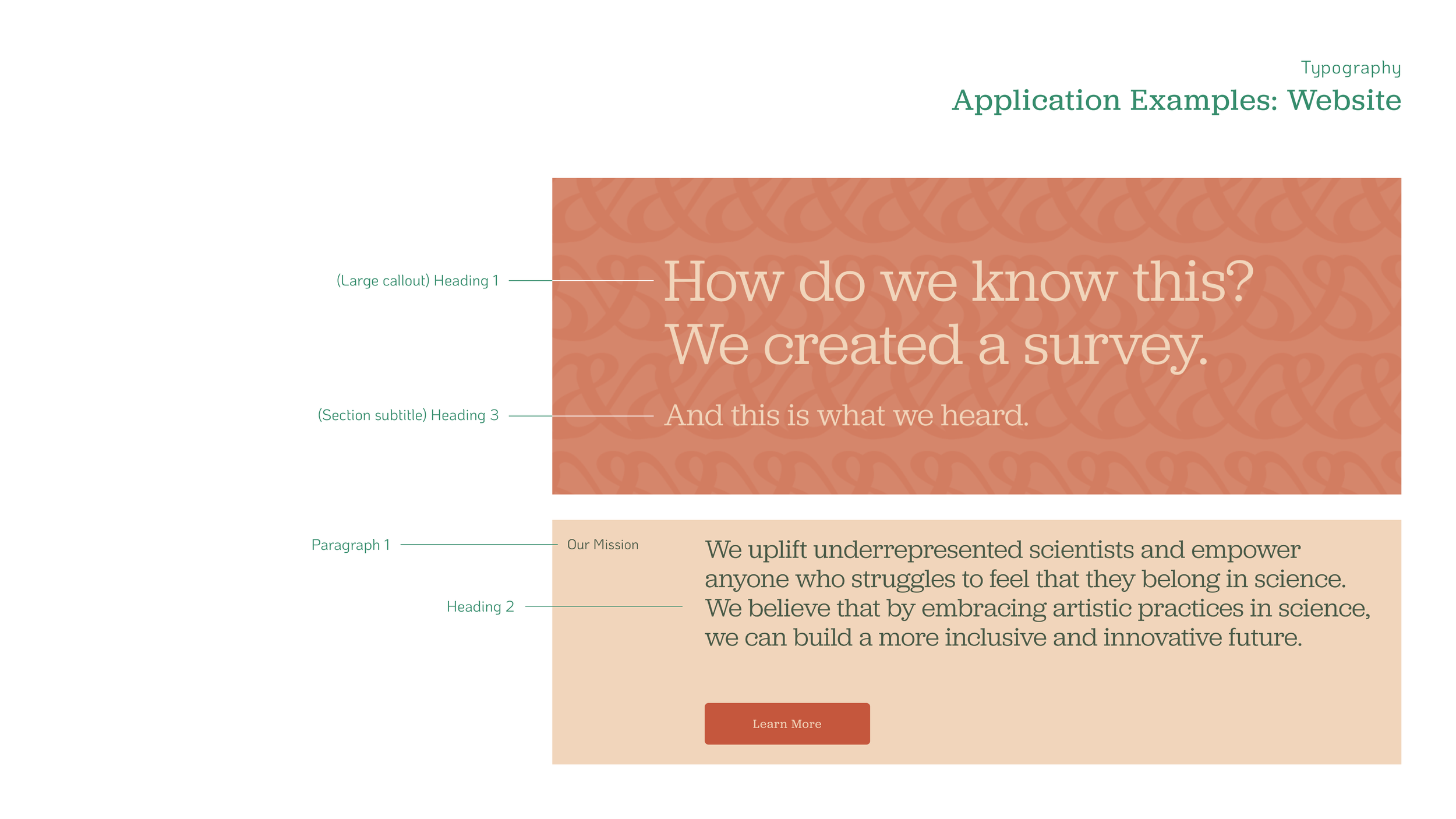
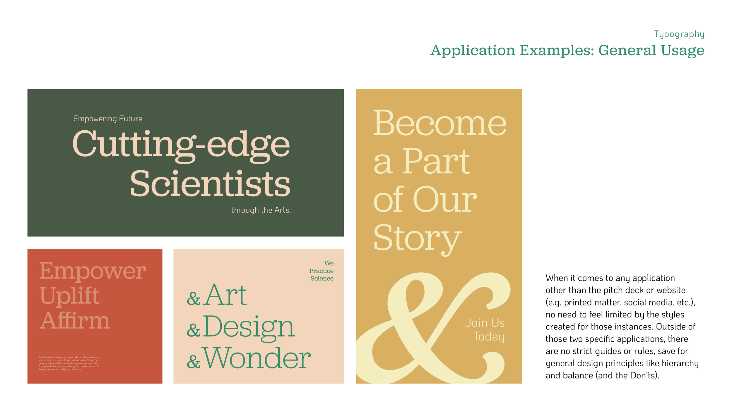
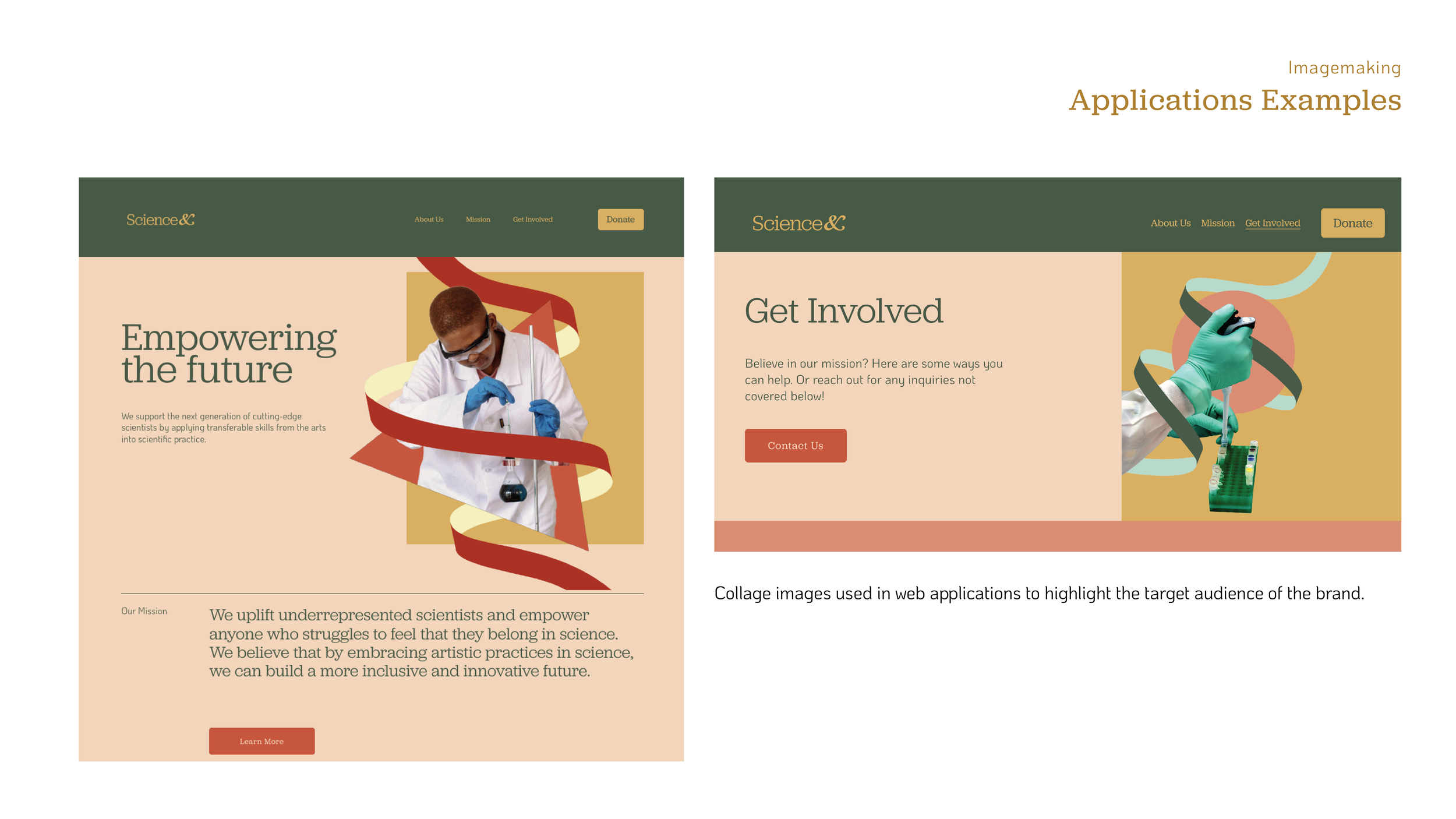
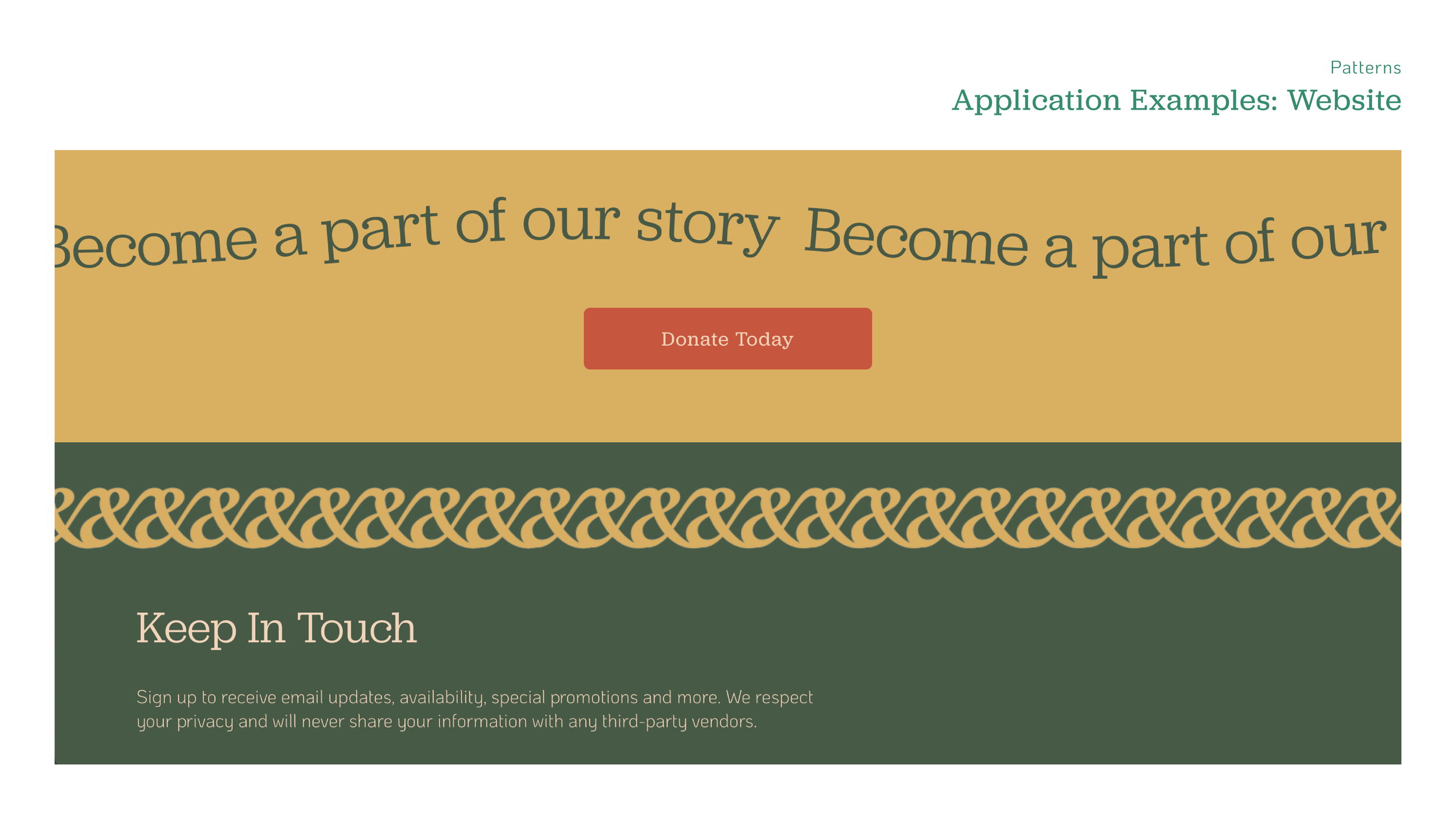
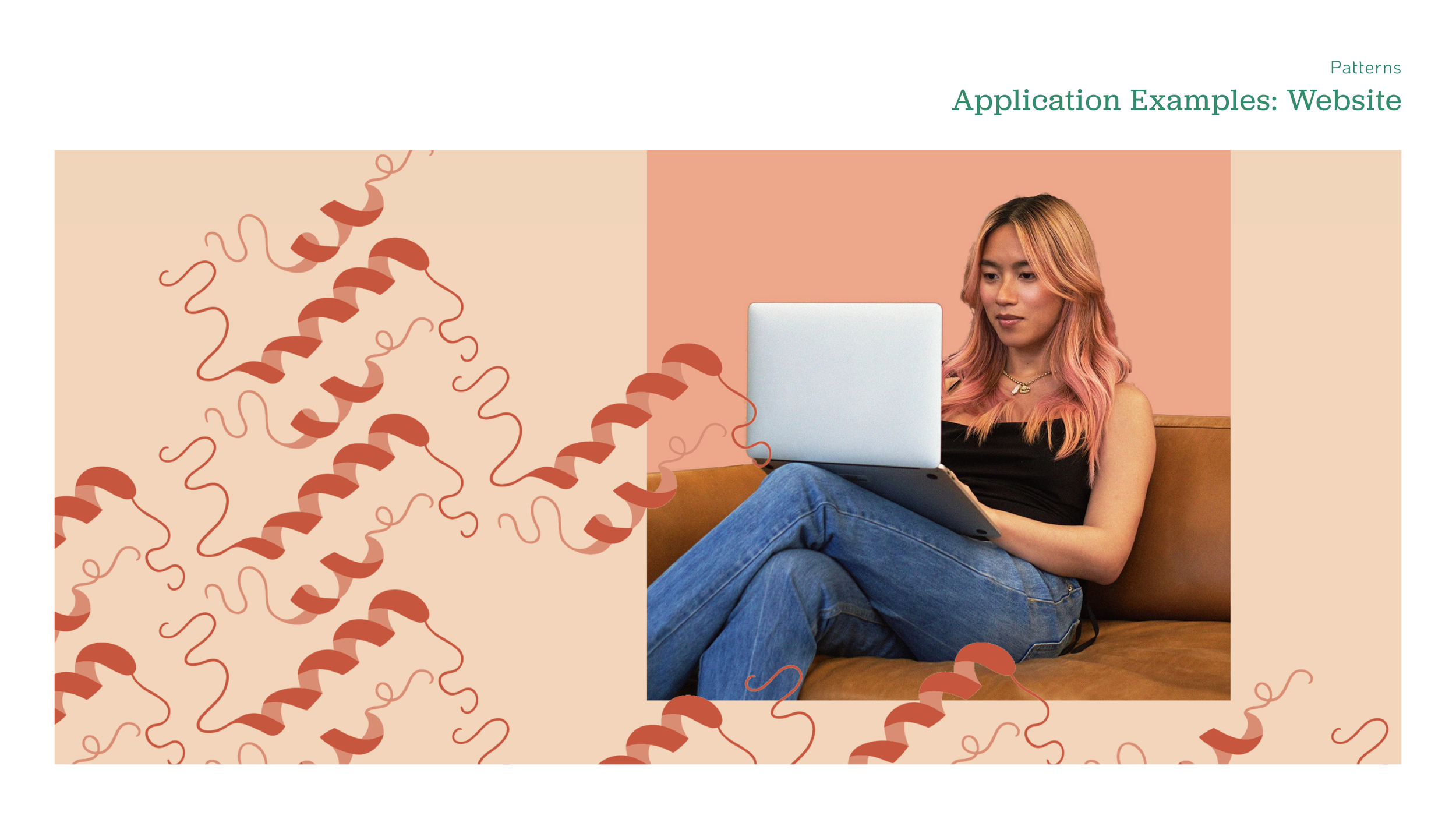
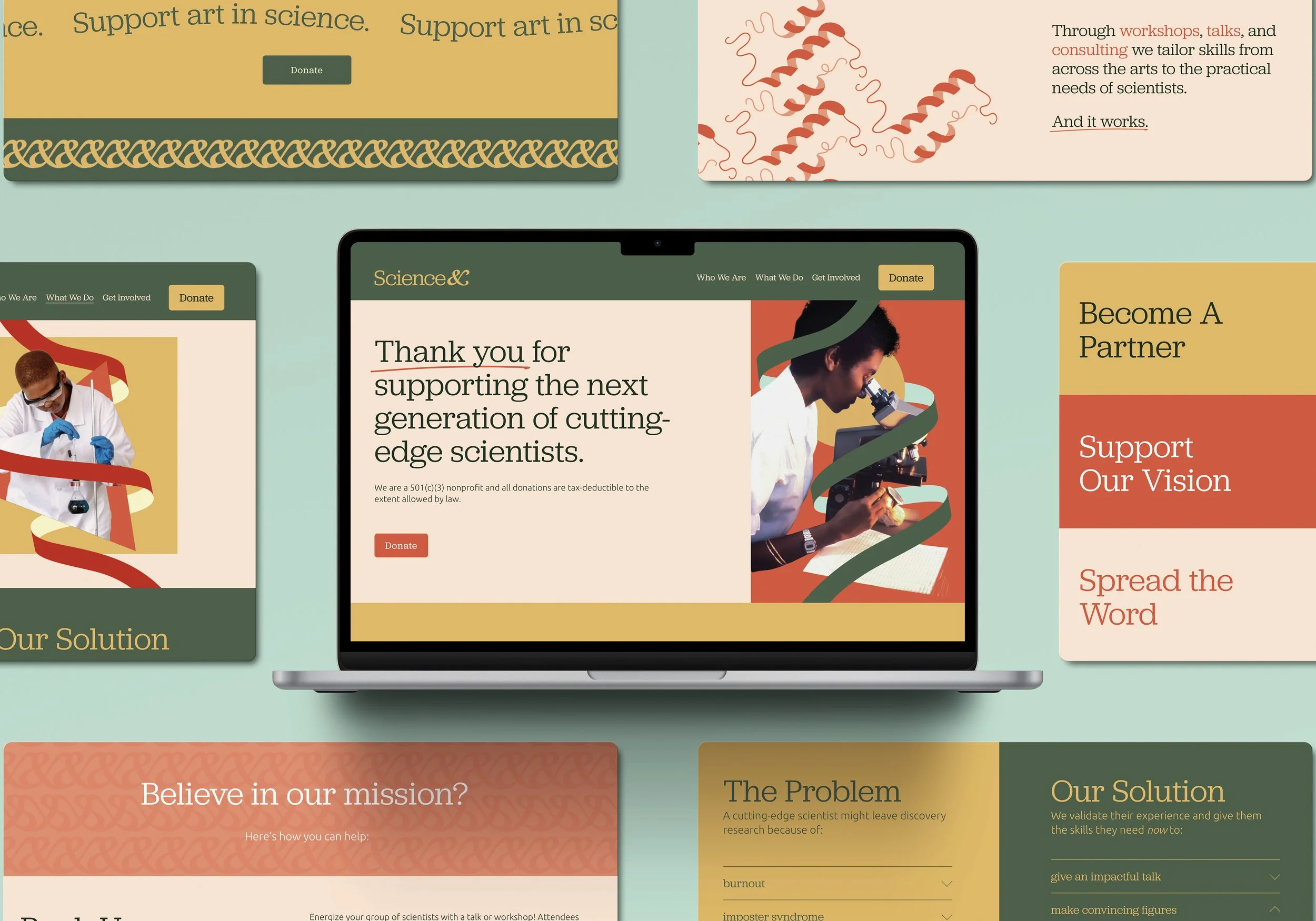
Website
Collateral
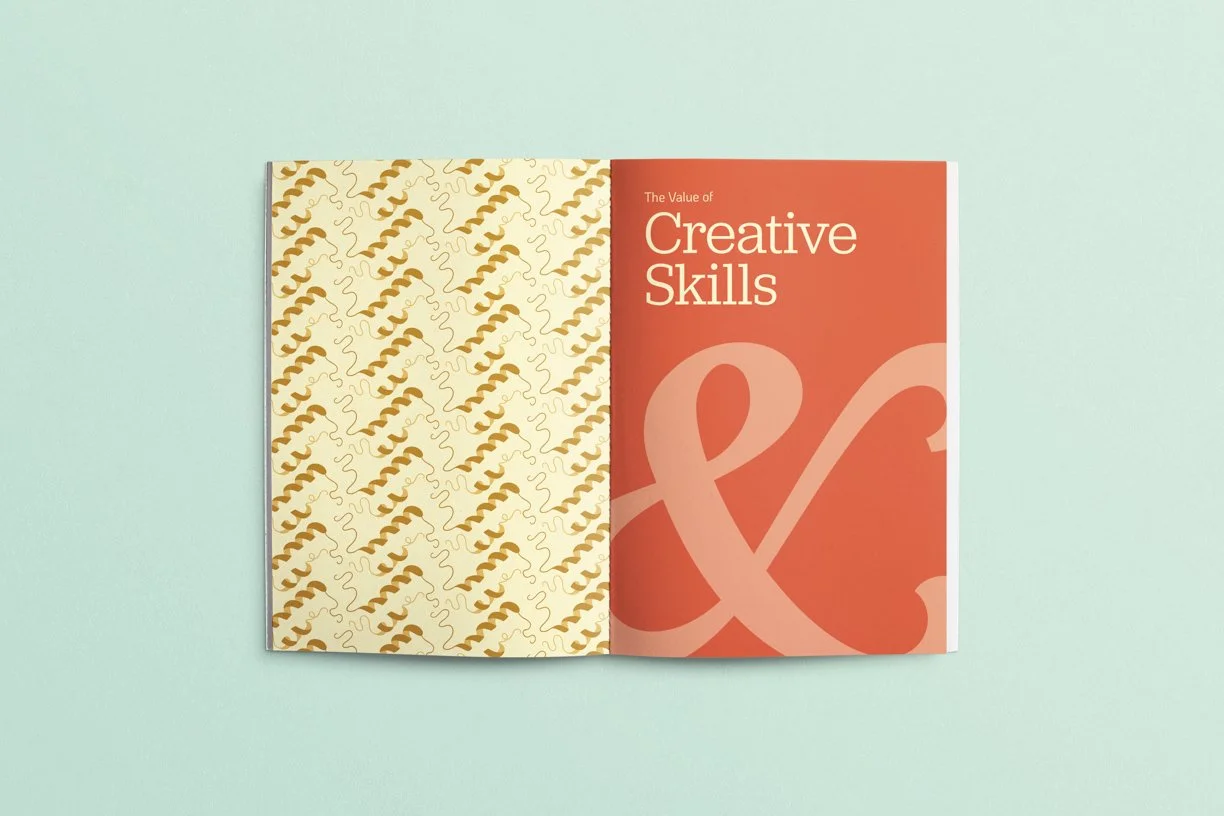
Brand Book